
Tuesday, 1:00pm
5 August 2008
A raid on sacred cows
The Táin demonstrates how design can contribute to a nation’s sense of itself
Graphic design heroes might be, as Martha Scotford noted, Western white men, but they’re a particular kind of Western, white, man: there are few Finns, Greeks or Irish in the canon. As a 1992 article in Graphis asked: ‘Where are the Paul O’Rands, the Milton McGlasers?’
For a country that prides itself on its literary heritage, Ireland tends to overlook the material form of that literature. Yet, in common with the writers, designers in Ireland in the twentieth century developed a new, hybrid national language, combining modernity with the pre-colonial past.
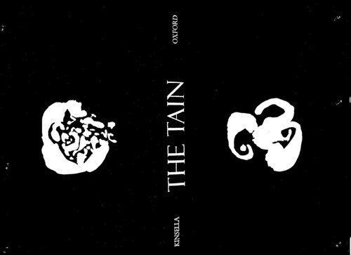
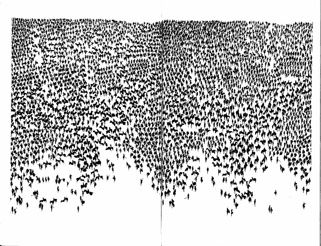
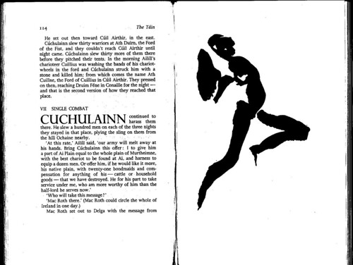
The Dolmen Press’s 1969 The Táin, translated by the poet Thomas Kinsella, was designed by the press’s founder, Liam Miller, and illustrated by the painter Louis le Brocquy. In a time of intense modernisation in Ireland, tradition was something to be ashamed of: redolent of ‘cow shite and altar candles’ as the novelist Tana French puts it. On every level, The Táin countered this assumption, presenting tradition as radical, contemporary and international.
The story centres on a cattle raid by Connacht’s Queen Medb and introduces the figure of Cúchulainn, revered as the ultimate Ulster hero by both traditions in the North of Ireland. In 1969, the first year of the subsequent ‘Troubles’, the tale of a raid on Ulster had distinct political overtones. But equally, Kinsella’s translation of this cycle of ancient Irish legends – complete with Celtic coupling– suggested that tradition could be sexy.
Le Brocquy noted what he considered a Celtic inspiration in the conception of The Táin, ‘that graphic images … should grow spontaneously and even physically from the matter of the printed text’. His spare brush illustration in black ink contested the prevailing sentimental-heroic approach to visualising Irish history, while the lavishness of the production –11 x 7.5 inch pages printed on specially commissioned paper – startled the Irish book world. The classical layout, with its wide margins and drop caps, used typefaces by Gill, one of Miller’s heroes. Employing such quintessentially British faces in something so essentially Irish gave the work a hybrid, Hiberno-English quality, like the language of Behan and Joyce.
A study of graphic design from the edge, even the edge of Europe, shows how design facilitates strategies of nation building, identity construction and decolonisation. The call is not simply to add O’Rands and Randssons to the canon: the periphery becomes central in suggesting design’s hybridity and in providing new ways of addressing the existing canon.
Táin link
www.anne-madden.com/LeBPages/printsbookstain.html
Eye is the world’s most beautiful and collectable graphic design journal, published quarterly for professional designers, students and anyone interested in critical, informed writing about graphic design and visual culture. It is available from all good design bookshops and online at the Eye shop, where you can buy subscriptions and single issues.