
Friday, 6:00am
25 January 2013
Back when the future looked bright
A printed guide to the 1951 Festival of Britain prompted Nigel Ball to consider the value placed on design by governments – then and now
Not seeing the value of investment in design is a folly of the current British government, writes Nigel Ball.
Taking education as an example, this Conservative led administration has rejected research evidence to support an innovative building project purely on the grounds of cost. Further to this, Education Secretary Michael Gove has completely ignored art and design in his proposals for a new Ebacc qualification for secondary schools and academies. This prompted the launch of the Include Design campaign, signed by leading designers and educators, which calls for the government to rethink their proposals.
This denial of design’s relevance in society is all the more demoralising when compared to the 1940s and early 50s. The postwar Labour government of that time, when Britain was shell-shocked and living in austerity, understood the value of design and promoted it.
This was brought home to me recently when I acquired a copy of a printed programme, a ‘guide’ for the 1951 Festival of Britain in London.
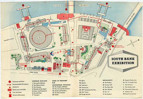
Spread from London Festival of Britain guide with map of exhibition site.
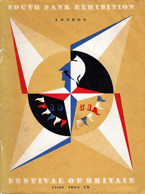
Top: Abram Games’s design for the guide cover.
The Festival of Britain was a nation-wide event, for which each region had its own programme of activities. This London edition is a fascinating document of its time that demonstrates enthusiasm for building a better future.
Displaying Abram Games’s famous ‘Festival Star’ on the cover, the guide champions Britain’s achievements and culture. The future looked bright in the eyes of the Festival of Britain Office; the government department set up to organise, co-ordinate and market the event.
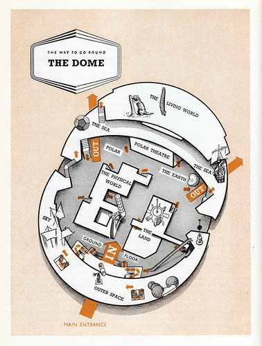
‘The Natural Scene’ exhibition maps.
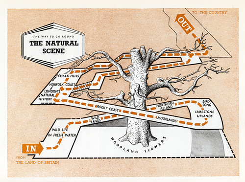
Much like the Millennium Dome exhibition in Greenwich at the turn of this century, there were different themed zones throughout the entire site. They included: The Land of Britain, Dome of Discovery and The People of Britain. These embraced topics that covered nearly every aspect of British life, culture and creativity. Exhibition titles were: ‘The Natural Scene’, ‘Minerals of the Island’, ‘Outer Space’, ‘The New Schools’, and ‘Telecinema’, etc. Newly commissioned works from artists such as Henry Moore were integrated into the exhibition zones, which emphasised the relationships between art, design and society.
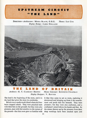
‘The Land’ exhibition map.
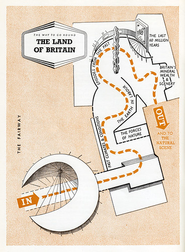
‘The Land’ article.
To help steer crowds through the zones, beautiful maps were produced for the programme which, even to today’s eyes, can not help but intrigue the viewer. This was not purely a visual affair though, and informative articles written by leading thinkers of the day underpinned the rationale and context of each space.
One of the prevailing attitudes one immediately perceives in the programme is a sense of optimism for the future, as well as the Modernist ideal that design benefits all society. This compares badly with the prevailing attitude – austerity is the only solution – at the heart of the present British government. The forward-looking nature of the Festival of Britain is uplifting, and the belief that Britain had the skills to succeed is visible throughout, and at times is explicitly expressed.
The programme’s opening introduction states: ‘The Festival is nation-wide. All through the summer, and all through the land, its spirit will be finding expression in a variety of British sights and a great range of British sounds. Taken together, these will add up to one united act of national reassessment, and one corporate reaffirmation of faith in the nation's future.’ It goes on to: ‘It was in 1947 that His Majesty’s Government decided that there should be displays to mark the centenary of the Great Exhibition of 1851, in the Arts, Architecture, Science, Technology and Industrial Design: so that this country and the world could pause to review British contributions to world civilisation in the arts of peace.’ This spirit can also be seen in the programme’s advertising which makes up the first and last 30 pages.
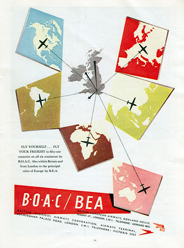
The abstract nature of the advert (above) presents a very modern 1950s aesthetic with geometric bird-like motifs. The enthusiastic copy extols a pioneering spirit. Likewise, the advert for BOAC, is on-trend for the time with jaunty angles, over-lapping type, and graphic simplification.
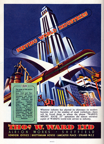
Likewise, the advert (below) asserts itself in the world, through Art Deco-inspired imagery, proclaiming a modern and prosperous nation and underpinning the message of the festival itself.
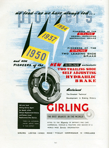
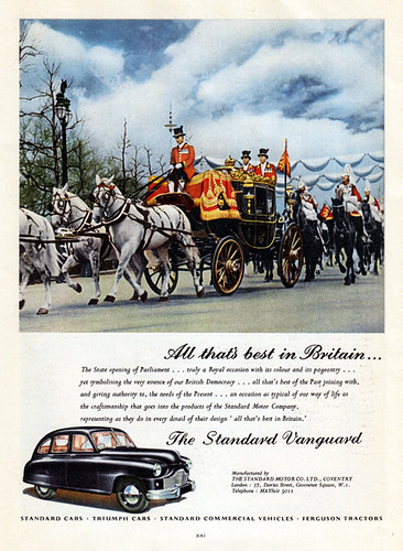
Compare these to other adverts in the same programme, such as the one for Standard Cars. Rather than looking forward the design is clearly rooted in a past that, in comparison to the BOAC advert, looks outdated, even for the early 1950s. The irony is in the name of the car being advertised, ‘The Vanguard’.
Design names now famous the world over keep cropping up throughout the programme, whether for their involvement in exhibition design, or writing for the publication. These include such F. H. K. Henrion, Jock Kinneir, Robin Day and DRU (Design Research Unit, see ‘From bombs to brands’ in Eye 77).
The Festival of Britain programme is wholly of its time, when design was central to providing a better future for all. As we enter 2013, with warnings of further economic misery, one wishes that our present leaders could take a leaf out of the past in order to help design the future.
Eye is the world’s most beautiful and collectable graphic design journal, published quarterly for professional designers, students and anyone interested in critical, informed writing about graphic design and visual culture. It is available from all good design bookshops and online at the Eye shop, where you can buy subscriptions, back issues and single copies of the latest issue. You can see what Eye 84 looks like at Eye before You Buy on Vimeo.