Thursday, 10:14am
11 June 2009
Beyond our Ken
Celebrating Ken Briggs’ colourful career at the National Theatre

Graphic designer Ken Briggs is one of the great Kens of 1960s London, writes Andrew Robertson. Possibly not quite as celebrated (or notorious) as Ken Garland, Ken Tynan, Kenneth Williams or Ken ‘Civilisation’ Clark, but always admired and appreciated by other designers for his characteristically British take on Modernism.
Wim Crouwel greeted him by saying ‘I’m pleased to finally meet the colourist’, Simon Esterson wrote a warm appreciation of his National Theatre programmes in his Inspiration piece for Eye no. 58 vol. 15, and Richard Hollis’s ‘Play and playbill’ (Eye no. 70 vol. 18) included several examples of his work.
Earlier this year, Briggs’ achievements were celebrated in ‘Designs for The National Theatre’, an exhibition at the Pump House Gallery in London’s Battersea Park. Now, as a souvenir of that show, we have an ‘Occasional Paper’ about the man and his work.
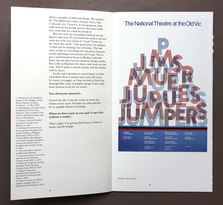
Top: spread from The Master Builder including poster for Tom Stoppard’s Jumpers, 1972.
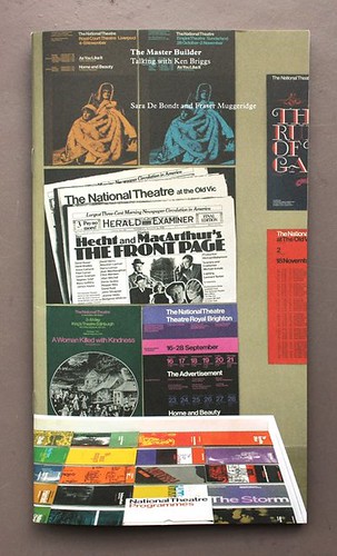
Above: cover, an installation photograph from the Pump House exhibition.
The Master Builder: Talking with Ken Briggs by Sara De Bondt and Fraser Muggeridge, is a slim (28pp. plus covers) volume, the size (and look and feel, with coated and uncoated stocks) of a typical Briggs NT programme. It comprises an interview with Briggs, a short biography and portrait, plenty of pictures (24 in colour) of his pioneering posters and programmes for the theatre in the 1960s and 70s, and a detail of Briggs’ slide archive, carefully labelled with Dymo tape.
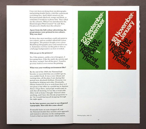
Above: spread from the Master Builder including booking leaflets, 1969-70.
Briggs is a an entertaining and articulate interview subject, a forthright (Derbyshire-born) designer who had to negotiate many obstacles to produce work of such consistently high standards. He cheerfully admits the occasional ‘cock-up’ (his horror film style poster for The National Health) and is candid about his way of dealing with NT bosses Laurence (later Lord) Olivier and Ken Tynan.
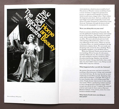
Above: spread from The Master Builder including poster for W. Somerset Maugham’s Home and Beauty, 1968.
Asked by De Bondt and Muggeridge about the design process, Briggs explains that he would ‘… run around saying “Where’s my bloody copy?” … Sometimes Olivier and Ken didn’t like the posters and I’d tell them “Deliver copy on time and I’ll give you a chance to reject the design.” ’
When asked about his structured, asymmetrical booking forms for the theatre, Briggs claims ‘I didn’t care about beauty or the lack of it. They are purely typographic,’ then goes on to explain his colour system: ‘from warm colours in winter to cool colours in summer: red, ochre, purple, bright blue and so on.’ Which is why he was known as the colourist.
De Bondt and Muggeridge have made a fine tribute to Briggs, in a well judged, printed format that evokes the pleasure of handling its subjects’ own programmes. All that’s missing, if it’s to be really true to its era, is a glossy ad for Benson & Hedges.
The Master Builder: Talking with Ken Briggs (Occasional Papers, £4.50)
Order from Central Books
Information from occasionalpapers.org
Eye is the world’s most beautiful and collectable graphic design journal, published quarterly for professional designers, students and anyone interested in critical, informed writing about graphic design and visual culture. It is available from all good design bookshops and online at the Eye shop, where you can buy subscriptions and single issues.


