Friday, 9:00am
9 July 2021
Beyond The Bell Jar

Shirley Tucker’s book cover designs, made during her long career with Faber, show a sure command of image, lettering and typography.
By Ruth Sykes

Book cover designer Shirley Tucker (b. 1930) is known for her iconic jacket for Sylvia Plath’s The Bell Jar, published by Faber & Faber in 1966. But the rest of her career is less well documented writes Ruth Sykes.
As a teenager at the Medway School of Arts and Crafts, Tucker, born Shirley Wilson, aced her exams and unofficially benefitted from hand-typesetting experience at the nearby Maidstone College of Art (though print unions tried to restrict women’s access to this skill).
A full scholarship to the RCA followed, with tutors including Abram Games and Eric Bawden, who, busy with the Festival of Britain, would hand freelance work on to their students, including Shirley. Though she originally went to the RCA as a letterer, Shirley switched to graphics because she thought it more socially useful, though she recalls that this was ‘regarded as a desertion from the true path’.
Close-Up Colour Photography, 1960.

After graduation in the early 195os, Wilson (who did not use her married name until much later) continued freelancing before joining Hans Schmoller at Penguin as designer, doing first books, and later publicity work.
After five years at Penguin, she arranged to show her portfolio at Faber & Faber, where she was told prior to the meeting that there was no vacancy available. However on seeing her work Faber swiftly made space for her to work in their production department alongside Berthold Wolpe. Until Letraset came along in the 1960s, many of her designs used her fully hand-drawn letterforms (which she talks about in this video).
The Year 2000, 1971.

Tucker was Wolpe’s equal: in another video released by Faber, Shirley notes his pique when she had more jackets up for national awards than he. After 30 years at Faber & Faber, Tucker moved to sister company Faber Music, a position she considered brought her ‘the cream’ of her cover work, producing designs until she was 70 years old.
While Faber & Faber did not credit her covers when she was in their employ, her extensive contribution will not be entirely lost to history: Faber’s archivist is often in contact with her, to correctly attribute designs. Tucker is pleased to assist in the preservation of her archive, but notes with typical wit: ‘They’d better hurry up though – I was 90 last year!’
Boon, 1964.

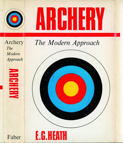
Archery, The Modern Approach, 1966.

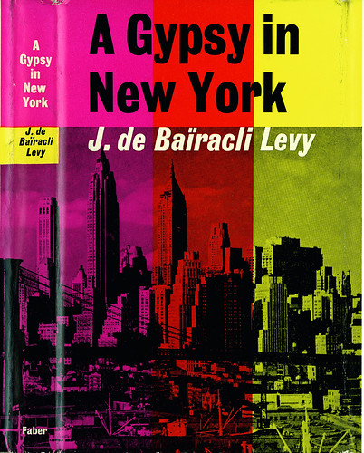
A Gypsy in New York, 1962.

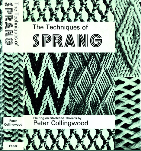
The Techniques of Sprang, 1974.

Thanks to Shirley and Michael Tucker, plus Donna Payne, Paddy Fox and Robert Brown at Faber.
Ruth Sykes, graphic designer, co-founder REG, lecturer and design historian, London
Eye is the world’s most beautiful and collectable graphic design journal, published for professional designers, students and anyone interested in critical, informed writing about graphic design and visual culture. It is available from all good design bookshops and online at the Eye shop, where you can buy subscriptions and single issues.
