
Thursday, 8:07am
9 June 2011
Bliss in that evening to be alive
rebecca wright
Design education
Graphic design
Information design
New media
Technology
Typography
The founders of GraphicDesign& describe their inaugural event.
It’s strange that graphic designers rarely seem to talk about one of the most interesting aspects of the job – that it involves working with and learning about so many other areas and disciplines beyond graphic design, write Rebecca Wright and Lucienne Roberts. We founded GraphicDesign& to foreground the relationship between graphic design and the extraordinarily wide range of subjects to which it connects.
Top: Social scientist Nikandre Kopcke at GraphicDesign&’s inaugural event
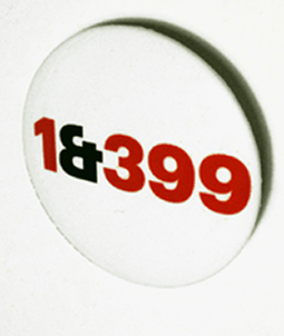
Below: David Shaw used statistics gleaned from a recent Design Council survey to arrive at the figures shown on this giveaway badge, roundly calculating that 1 in every 400 in the UK population is a communication designer. The badge is set in Graphik, designed by Christian Schwartz and also used for the GraphicDesign& identity. The ampersand was redrawn by Schwartz to foreground the ‘et’ ligature and emphasise the connectivity that underpins the social enterprise.
However, GraphicDesign& does more than show graphic design where it already exists. Rather, it is concerned with demonstrating what graphic design is capable of because of this interconnectivity. To achieve this, GraphicDesign& brings together graphic design practitioners with experts in other fields to collaborate equally as peers, engaging in exploration with the intention of producing new and original work.
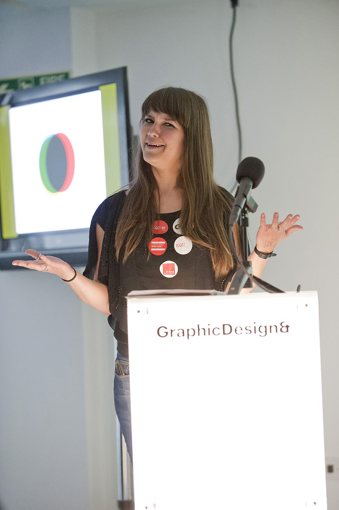
The first projects were previewed to a sell-out audience at the GraphicDesign& inaugural event at London’s Design Museum on 15 April 2011. Writer and philosopher Alain de Botton and graphic designer Anthony Burrill – invited because of their shared concern with words, wisdom and how to live a happy life – introduced their collaborative double-sided poster exploring optimism and pessimism and challenging the stereotypes of these seemingly opposing approaches to living.
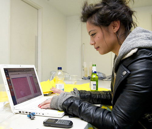
Above: A team of 12 graphic design students from Kingston University worked behind the scenes to input the 129 survey responses and generate data sheets for Kopcke and information designer David Shaw to analyse.
Below: Photograph of the audience at the 15 April event.
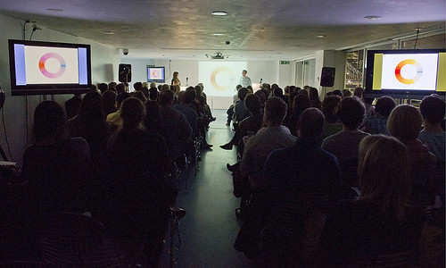
Social scientist Nikandre Kopcke and information designer David Shaw involved the audience in an ambitious project that ran live during the event. At the start of the evening they were invited to complete a survey asking questions about work, life and happiness. The pair then worked against the clock to input the answers from the 82 graphic designers and 47 non-graphic designers present, and then analyse and transform their findings into graphic form.
Frustrated by the reductive nature of many statistical studies, their aim was to develop a way of graphically interpreting data that would more faithfully represent the complexities and nuances statistics contain. Kopcke explains: ‘The key objective was to be truthful – to not only show the audience as honestly as possible but to be transparent in our process and not play any tricks or take any shortcuts.’ The resulting visuals are refinements of conventional graphic devices but show more subtle and revealing relational overlays than we are used to seeing.
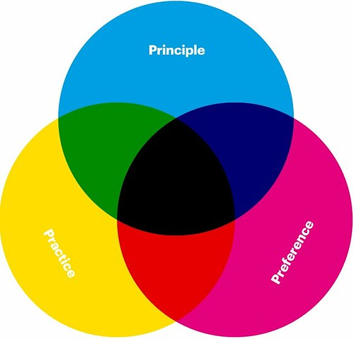
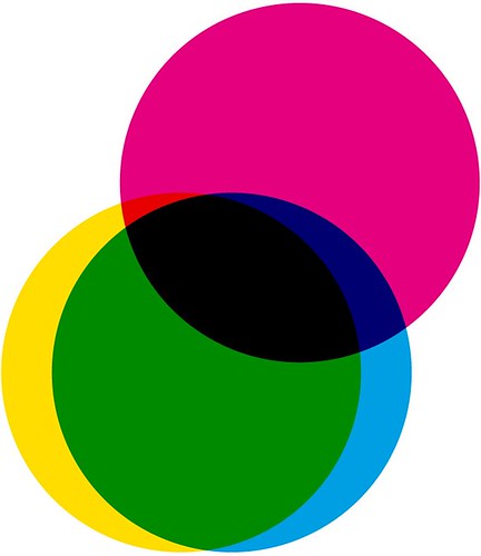
Above: Venn diagrams, constructed manually in InDesign and produced in CMYK colours, were used to show the three-way agreement between responses to principle, preference and practice questions.
Below: Contrary to Kopcke’s expectations, the agreement between principle, preference and practice responses about work was unusually high. The Venn diagram suggests audience members think their working patterns are right (very large overlap between principle / cyan and practice / yellow) but they would nevertheless like to make some changes to them (smaller overlap with preference / magenta).
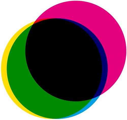
Above: The Venn diagram for responses about family / friends suggests a strong desire to make changes to present arrangements. Shaw used Kopcke’s agreement percentages to calculate the relative positions of three pairs of circles (principle and preference, principle and practice, preference and practice). He then fixed the position of one pair, placed the other pairs so common circles with the fixed pair coincided, and finally rotated these two pairs on the coinciding axes until the third circles coincided too.
Lucienne Roberts is director of the studio LucienneRoberts+, and co-founder of GraphicDesign&.
Rebecca Wright is course director of Graphic Design at Kingston University, and co-founder of GraphicDesign&.
Eye is the world’s most beautiful and collectable graphic design journal, published quarterly for professional designers, students and anyone interested in critical, informed writing about graphic design and visual culture. It’s available from all good design bookshops and online at the Eye shop. For a taste of no. 79, see Eye before you buy on Issuu. Eye 79, Spring 2011, is out now.