
Tuesday, 9:00am
26 January 2016
Books received #17
Logo Modernism, DixonBaxi, Cries of London, deValence and No Words Posters
Here are a few books that caught our attention in recent weeks.
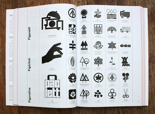
Logo Modernism (Taschen, $69.99), edited by Jens Müller and Julius Wiedemann, includes 6000 logos from 1940-1980, all reproduced in black ink on white paper. Müller’s introductory historical analysis looks at the origins of signs and symbols ‘back to the dawn of human history’ through to makers marks on pottery, mason’s marks on tombs, branding livestock, coat’s of arms and much more. This trilingual edition (English, French, German) continues with design historian and educator R. Roger Remington’s essay ‘Viva Modernism!’ before plunging into page after page of logos (30+ per spread) organised into three main sections: ‘Geometric’, ‘Effect’ and ‘Typographic’.
Spread showing ‘figurative’ logos from the ‘Geometric’ chapter. Examples include Herbert Prüget’s 1965 logo for Das Aktuelle Bild der DEWAG, Bob Gill’s 1967 logo for AGM and Ingo and Christine Friel’s 1960s logo for Paclett (left column). Design Jens Müller.
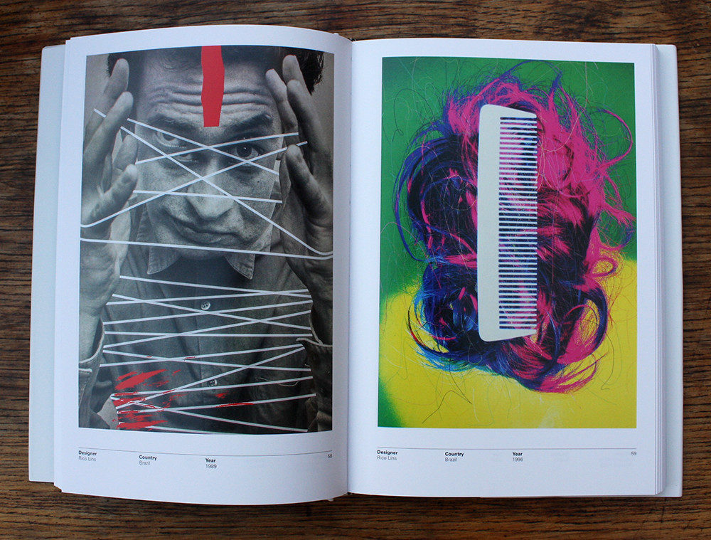
Top: Spread from No Words Posters showing work by Brazilian designer Rico Lins.
Cover of Taschen’s Logo Modernism, showing a selection of logos from 1954-1982. Design: Jens Müller.
DixonBaxi’s limited edition portfolio book We make creative work (only available to the studio’s friends, clients and collaborators), is chock-full of testimonials, samples of their work, and a quick peek behind the scenes, with writing by Eye contributor Tom Harrad. The DixonBaxi methods are summarised as a series of six ‘I’s: Initiate, Insight, Interpret, Inspire, Implement and Impact.
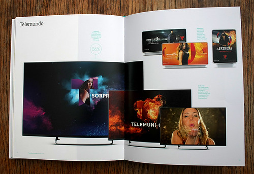
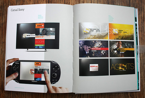
DixonBaxi (see ‘Power of two’ in Eye 70) has worked for several international brands such as UKTV Gold, Canal Sony and Telemundo in the US. Founder and director Simon Dixon and creative director Dan Capstick made a recent appearance at Eye’s Type Tuesday at St Bride Library on 1 December 2015.
DixonBaxi’s identity and broadcast design for Hispanic American television network Telemundo.
Interactive design and ‘texture’ for Sony Pictures Entertainment’s Canal Sony.
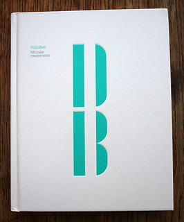
Cover of Dixon Baxi: We make creative work.
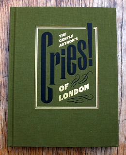
Cries of London (Spitalfields Life Books, £20) is a crowdfunded book from the prolific pen of the anonymous publishing powerhouse known as The Gentle Author. Designed by David Pearson (see Eye 77) and set in Matthew Carter’s Miller, and Paul Barnes’s Brunel & Chiswick, the casebound volume bears all the hallmarks of The Gentle Author’s unmistakable style and his customary concern for the hidden treasures of East London life.
Fifteen richly illustrated chapters include paintings by William Marshall Craig, ‘street-wise’ woodcuts by Luke Clennell and cigarette card portraits of ‘types’ by war artist Julius Mendes Price. The final chapter brings us up to the present with a bump with a sympathetic account of ‘Tony Hawkins, Retired Pedlar’, arrested (and acquitted) 87 times, and in the The Gentle Author’s words, ‘an unacknowledged hero of the London streets.’
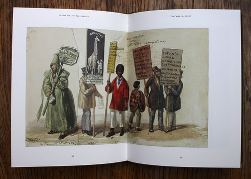
Spread showing pages from George Scarf’s sketchbook of London street life in the early 1800s at the dawn of public advertising.
Video about Cries of London.
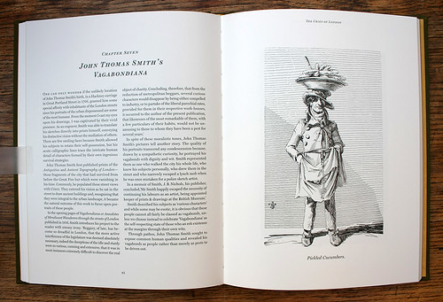
Image entitled Pickled Cucumbers from John Thomas Smith’s Vagabondiana or Anecdotes of Mendicant Wanderers through the streets of London (1816).
Cover of The Gentle Author’s Cries of London, designed by David Pearson.
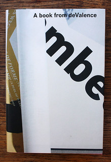
French graphic design studio deValence celebrates nearly fifteen years of work in this busy, multilayered monograph, A Book from deValence (Édition B42, €24), which features a foreword by Robin Kinross. Texts in French and English are printed monochrome, with a few tiny images. A coated colour section in the middle of the book features a big and slightly chaotic array of overlapping work from this prolific practice.
In Pulp 05, Sébastien Morlighem described their approach as ‘resolutely Modernist … animated by a desire to reinvigorate rules, positions and forms.’ In addition to prolific work for cultural clients and their own publishing house B42, deValence’s Alexandre Dimos also edits and designs Back Cover magazine. He is collaborating with Eye magazine on a series of graphic design lectures in Paris (which took place on 12 and 13 November 2015) and London (later in 2016).
Spread from A book from deValence.
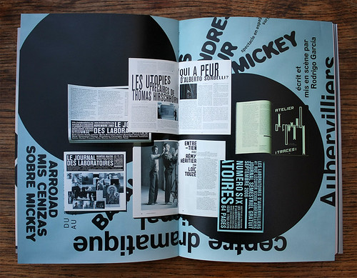
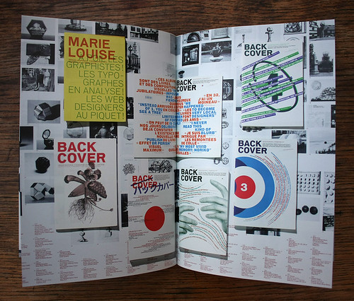
Spread showing covers of Back Cover magazine.
Cover.
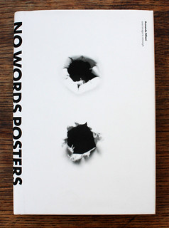
No-one quite knows the origins of the idiom ‘a picture is worth a thousand words’ but a quick examination of Armando Milani’s No Words Posters (RIT Press, $39.95) shows that the phrase is more pertinent than ever in the world of graphic design. Posters are a ubiquitous part of visual culture, designed to plant messages into the public sphere.
This book takes the medium to a new level by compiling posters that do away entirely with text, even going so far as to edit out lines. Hilppa Hyrkäs’s bright blue polar bear poster makes a clear reference to the dangers of global warming while the issue of gun crime mortality is effectively communicated with François Robert’s full sized skeleton assembled as a pistol.
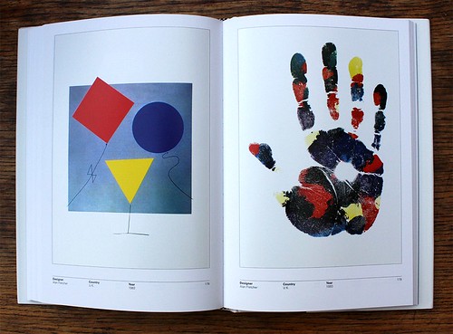
Spread showing Alan Fletcher posters: one from 1982 promoting Designers Saturday and a 1992 poster which used Fletcher’s right hand was announcing a retrospective exhibition of 100 posters held at the Design Museum by G&B Arts, a London screen printer.
Cover of No Words Poster: one image is enough. Book and cover design: Armando Milani.
Eye is the world’s most beautiful and collectable graphic design journal, published quarterly for professional designers, students and anyone interested in critical, informed writing about graphic design and visual culture. It is available from all good design bookshops and online at the Eye shop, where you can buy subscriptions and single issues.