
Monday, 4:00pm
2 December 2013
Books received #5
Alphabet postcards, type geeks as ‘birders’, post-digital letterpress, understanding type basics and calligraphy
Here is a brief look at some type-oriented titles that recently arrived at Eye’s Shoreditch office.
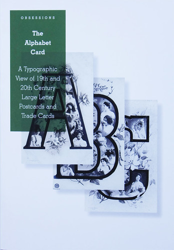
The Alphabet Card (Studio Hinrichs, $12.50) is the first book in an ‘Obsessions’ series produced by Studio Hinrichs. The paperback, 32-page book shows numerous reproductions of ‘ornately decorated letterform’ picture postcards from the early 1900s. The postcards, originally printed using chromolithography, feature Edwardian ladies, cherubs, and children set against utopian landscapes and floral motifs.
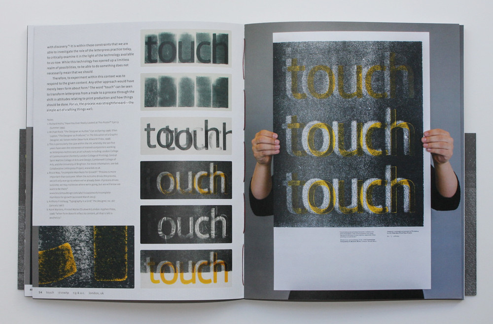
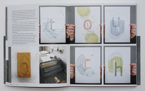
The Alphabet Card, a series of picture postcards collected by Kit Hinrichs, is designed by Studio Hinrich and written by Delphine Hirasuna. Top: Spread from Touch featuring Rose Gridneff and Alex Cooper’s letterpress response to the brief of exploring type in a ‘post-digital’ setting.
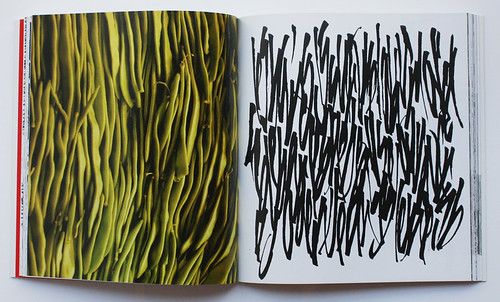
Calligraphy: A Book of Contemporary Inspiration (Thames & Hudson, £16.95) by calligrapher Denise Lach, exists to demonstrate the ‘design potential of handwritten script’. This largely visual book is filled with calligraphy inspired by nature.
A spread from Denise Lach’s Calligraphy: A Book of Contemporary Inspiration, showing an example of expressive calligraphy, inspired by green beans (left), executed using a cola pen (a nib made from an aluminium can).
Cover of Calligraphy: A Book of Contemporary Inspiration.
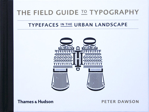
The Field Guide to Typography: Typefaces in the Urban Landscape (Thames & Hudson, £16.95) by Peter Dawson, is a guide to more than 125 typefaces commonly seen on everyday objects and in the built environment. In the foreword, type expert Stephen Coles, who was a schoolboy ‘birder’, compares birdwatching to typography, saying that birdwatchers, ‘are acute observers … but they are also preoccupied with identification, classification, anatomy and minute details’ – traits often found in type geeks.
Each typeface is accompanied by photographs (many by Dawson himself), information and tips to help readers spot fonts in the ‘field’.
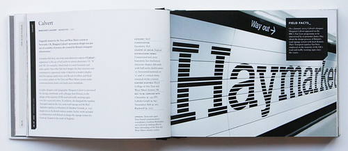
Spread from Peter Dawson’s The Field Guide to Typography: Typefaces in the Urban Landscape featuring Margaret Calvert’s Calvert, 1980, spotted in Newcastle, UK.
Cover of The Field Guide to Typography: Typefaces in the Urban Landscape. Book design by Peter Dawson and Louise Evans.
Michael Harkins’ Understanding Type, part of AVA Publishing’s ‘Basics’ series, is predominantly aimed at graphic design undergraduates struggling to use type in their work for the first time. After a brief contextual section – type today, the development of type and a brief history – the book comprises six case studies interspersed with sections that outline basic principles.
Cover of Michael Harkins’ Understanding Type.
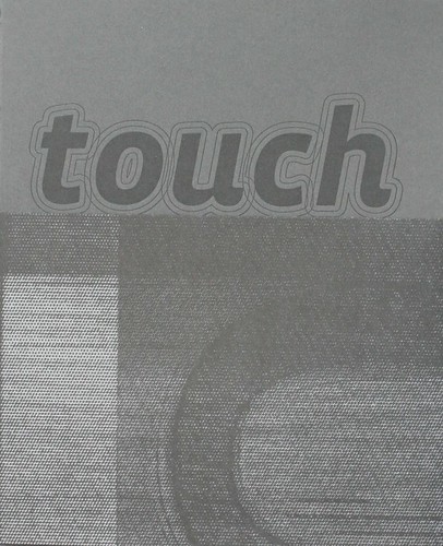
Touch: The Vista Sans Wood Type Project Book (Pointed Press Studio, $55) is a 132-page hand-bound book with a letterpress cover and offset belly band. The Touch project follows a number of collaborations that explore type in a ‘post-digital’ setting, combining traditional techniques and technology, digital and physical. The book’s introduction covers the technical aspects of building a computer-numerically-controlled (CNC) router from open-source plans in order to cut a contemporary typeface into wood, noting that Emigre’s Vista Sans had the right qualities – ‘mechanical forms’ and ‘humanist idiosyncrasies’ – with which to express the project.
There are also letterpress interpretations of the word ‘touch’, from 21 international practitioners, including Firecracker Press, Karen Zimmerman and Rose Gridneff & Alex Cooper. The whole project was initiated by Tricia Treacy and Ashley John Pigford.
Spread from Touch: The Vista Sans Wood Type Project Book, featuring prints by Macy Chadwick: ‘Looking at each letter as a tangible object, I was reminded of classic type design and the main elements or shapes that make up each letter of the alphabet.’
Cover of Touch: The Vista Sans Wood Type Project Book. Editors: Tricia Treacy & Ashley John Pigford. Copy-editor: Carrie Wicks. Essays by Steven Heller, John D. Berry, Catherine Dixon and Amze Emmons.
Eye is the world’s most beautiful and collectable graphic design journal, published quarterly for professional designers, students and anyone interested in critical, informed writing about graphic design and visual culture. It is available from all good design bookshops and online at the Eye shop, where you can buy subscriptions and single issues.