
Sunday, 8:53am
29 August 2010
Brief. En. Counter
#graphicdesignmovies and Twitter’s chronicles of wasted time
Most of the Earth’s 6.79bn inhabitants know nothing of Twitter, but for those of us with accounts, it’s a dangerously addictive time-waster – a kind of interactive daytime TV.
This gets even worse (or better) when Tweeters are challenged by a tempting hashtag – a verbal theme that prompts ingenious variations – preferably funny, if occasionally laugh-out-loud. (Recent hashtags have included #missinglettermovies – Cash of the Titans – and #addedlettermovies – Braiders of the Lost Ark.)
We thought it might be fun to start a #graphicdesignmovies meme and see what Eye’s friends and followers might come up with, from Midnight Cowgum to Get (Matthew) Carter. It began quietly.
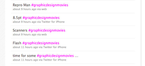
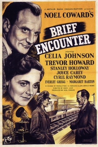
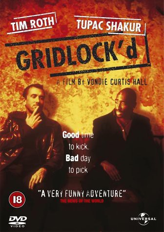
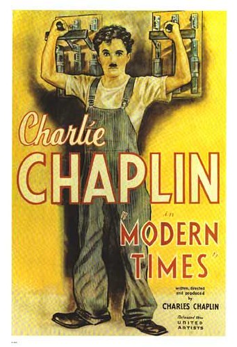
Just over a week ago (20 August 2010) we kicked off the theme with movies such as Scanners, Brief Encounter, Gridlock’d (below) and Modern Times – titles that don’t have to be changed to sound like #graphicdesignmovies. This was soon followed by small variations and puns: Gridfellas, St Bride And Predjudice, True Grid (yes, lots of grid puns), The Good, the Bad and the Cult of the Ugly and Vignelli Sky.
Calverts chipped in with The Corrections and Mr GF Smith Goes to Washington and @NoSugarStudio came up with an early favourite: ‘Wuthering xHeights, starring HeathGlyph.’
It wasn’t long before @meghunt commented: ‘#graphicdesignmovies may b one of the nerdiest hashtag memes I’ve seen in a while. Kudos, guys!’ and @moretto was pleading: ‘@eyemagazine pls! i beg you! gridfellas was enough!’. But by then it was too late.
Maybe it was the timing: Friday lunchtime at the end of a long week, with lots of bored designers thinking of ways they could add pts or dpi to any movie with numbers in the title (as in 300dpi and 300pts). Or specifying colours, as in Clockwork Pantone 021, Pitch #000000 and Moulin PMS 186. As @DeborahCasswell put it ‘Yes... #graphicdesignmovies stole my Friday afternoon... :)’
It was still going strong the following week, prompting comments such as @crossapple’s ‘#graphicdesignmovies = the most fun I’ve ever had on the internet. (Not sure what that says about me....)’ and @cedarseed’s ‘I think I spent my daily quota of wit on those #graphicdesignmovies this morning’.
Lots of new Tweeters entered the fray, including @iantruelove, responsible for ‘Back to the Futura’ (actually, it seems as if everyone Tweeted that one), THE CURIOUS UPPER CASE OF BENJAMIN BUTTON and the inspired S t a r T r a c k. Which prompted @gil3s to respond: ‘surely it should be S T A R T R A C K II - The Wrath of Ke r n ?’
Eye magazine is available from all good design bookshops and at the online Eye shop, where you can order subscriptions, single issues and back issues.
The summer issue, 76, out now, is a music special – full contents here, and you can see a selection of visual details on Eye Before You Buy on Issuu.
Student subscriptions are half price, see bit.ly/EyeStudentOffer.