
Thursday, 9:51am
23 December 2010
Calling cards
How 76 graphic designers have art-directed their own identities
Logos, business cards, letterheads, brochures, websites, packaging: designers spend a lot of time creating other people’s identities, but what about their own? Liz Farrelly’s new book, Designers’s Identities, examines the way 76 practices from around the world have approached their own branding.
Packing in 1048 colour illustrations, the book sets an introduction to each studio on a copy of their letterhead, followed by examples of their printed and virtual presentation. It’s organised alphabetically, (and doubles up as a directory for the participating studios).
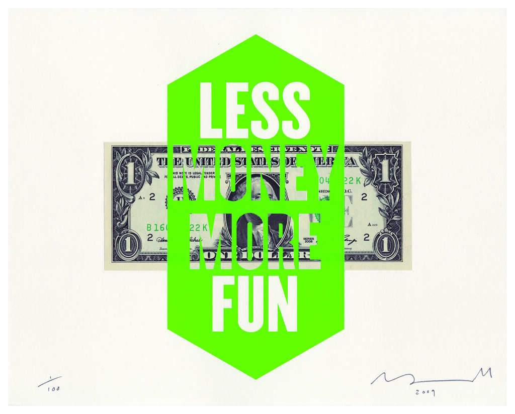
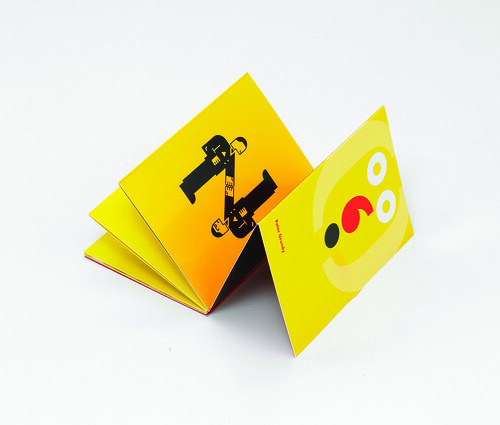
Top: NB: Studio make each New Year mailer a collectable. For 2009, they highlighted the collapse of the global economy using a single dollar bill. Creative directors: Ben Stott, Nick Finney and Alan Dye; designer: Daniel Lock; illustrator: Anthony Burrill.
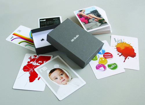
Below: NB: Studio’s pack of cards – this mini portfolio contains images from favourite projects over the decade, packaged in an embossed box. Creative directors: as above; designer: Alan Dye.
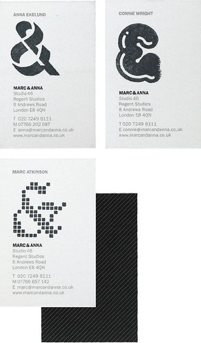
Above: Marc&Anna customise business cards and correspondence with their collection of rubber stamp ampersands (below).

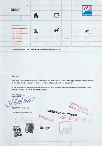
Above: Fourpack’s letterhead: icons that match the nature of the letter are taken from the company’s massive library and added to the grid. Once the document has been printed, they hand stamp the word that sums up the letter’s purpose. In this case ‘brief’, which is Dutch for ‘letter’. A similar technique is used on their website.
Below: Mini portfolio by Peter Grundy, used to announce his new company Grundini
Some of Grundy’s work is featured in Steve Hare’s ‘Drawn into conversation’ in Eye 72.
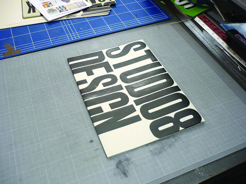
Above and below: Studio8’s brochure has a letterpress jacket, and is printed in short runs of 50 copies.
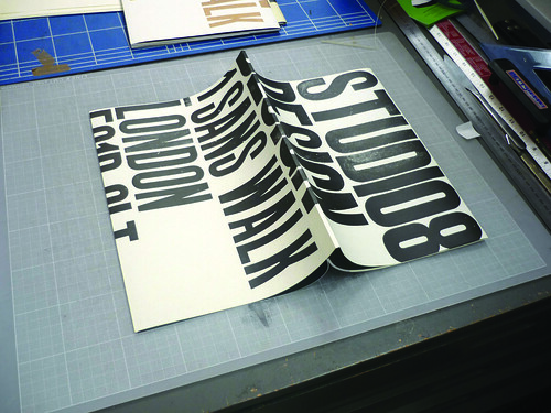
See ‘Wanted: self-images’ about a project by Studio8’s Matt Willey and Giles Revell in Eye 66 and ‘A handbag?’ on the Eye blog.
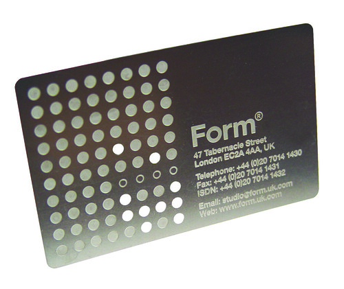
Above: Form’s etched and die-stamped stainless steel business card: ‘Because people pay little attention to business cards these days, we wanted to make a lasting impression,’ write partners Paula Benson and Paul West.
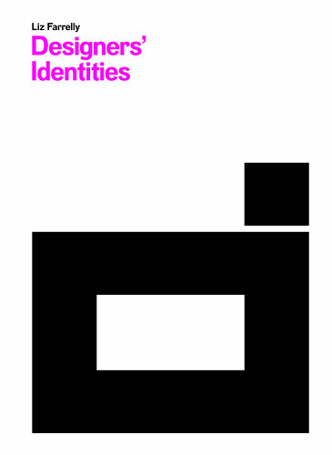
Below: The cover design for Designers’ Identities functions as an abstract logo: ‘It is a representation of the letters “d” and “i”, referencing the three main elements of a stationery system: the letterhead, compliments slip and business card.’
Designers’ Identitites by Liz Farrelly. Laurence King Publishing, £25.95. Design: Intercity.
Eye is the world’s most beautiful and collectable graphic design journal, published quarterly for professional designers, students and anyone interested in critical, informed writing about graphic design and visual culture. It’s available from all good design bookshops and online at the Eye shop. (A gift subscription makes an excellent present.) For a taste of the latest edition, no. 77, see Eye before you buy on Issuu.