Thursday, 4:52am
1 November 2012
Common ground: a designer’s letter from Venice
John Morgan explains the thinking behind his visual identity for the 13th Architecture Biennale in Venice (director David Chipperfield).
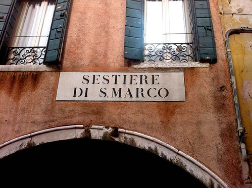
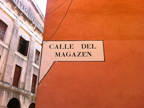
The Venetian stencil street signs or nizioletti don’t prevent you from getting lost in the labyrinth. But they allow you to get lost in the most elegant way writes John Morgan.
The signs speak not in an Italian voice but in a Venetian dialect – Calle rather than Via. Given their frequency, that they don’t irritate or disturb is a measure of their visual properties – they must be the most beautiful of city sign systems. (The v-incised Bath street names, defined by light and shade alone, follow closely behind).
The stencil text is contained in a white plaster panel – nizioletti means white sheet or cover – roughly framed in black. The text is also painted black, but this black, like so much in Venice, has undertones of Prussian blue – the blue used in blueprints.
To the passer-by, the white rectangle often appears to be positioned in alignment with the interior ceiling, ribbed with beams. The sheets expand and contract to fit the content. There’s a hierarchy in size: the larger type of a sestiere (district) would sit above a smaller bridge name.
The black-blue text switches to brick red for key directional signs (and to a more recent reflective yellow). These point with a beautiful arrow, whose head is spliced from its own tail, leaving the bony silhouette of a Vorticist fish.
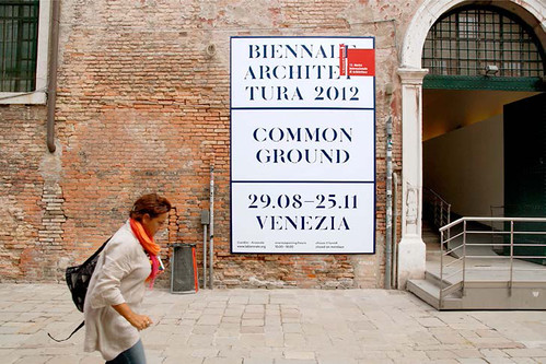
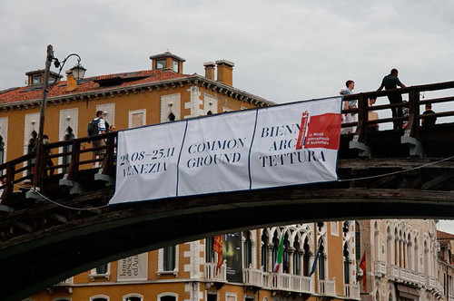
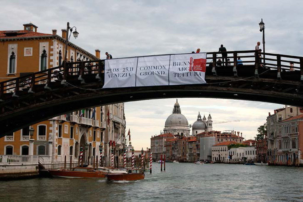
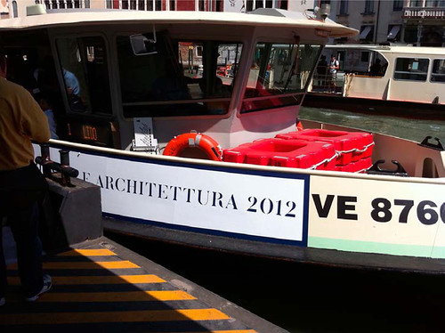
These forms were irresistible to me when David Chipperfield, the director of the 13th Venice Architecture Biennale, invited my studio [John Morgan Studio] to create a graphic identity for ‘Common Ground’. The body of work spans four publications, exhibition graphics, signage, posters, printed matter and, more unusually, banners for bridges and wraps for Vaporettos (below).
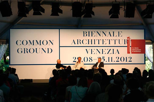
The theme ‘Common Ground’ celebrates interconnected architectural culture and explores the things architects have in common, from the conditions of practice, to influences, collaborations and histories.
The graphic identity did not have to have its roots in Venice, but the city was impossible to ignore. The nizioletti, like the Biennales, are an integral part of the city fabric. We are familiar with the common associations of architects and stencils, part of the attraction perhaps being that stencils appear built and engineered. (See Eric Kindel’s ‘Fit to be Seen, Stencils for Architects, Engineers and Surveyors’, in AA Files 61.)
The zinc stencils manufactured by Thévenon & Cie are now redolent of Corbusier. Stencils have traditionally been used as a convenient and economical form of public lettering as ‘everyday letters’ (literally lettres à jour, through which you see daylight when they are held up).
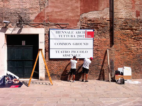
On a practical level, for exhibition design, the stencil makes a letterform well suited to temporary signs and public notices. When applied as a stencil there’s a painterly quality that can’t be matched by vinyl.
Our stencil was not a faithful revival. Through a process of reflection and refraction we produced a letterform that was similar but not the same. From the many variants we chose those characters that suited us. To begin with we focused on those with the highest frequency in the title, selecting an ‘O’ with a perverse double cut, and a ‘R’ with a loose curled tail (clipped from the mane of St Mark’s lion).
I set up studio in San Polo for a month (August 2012) to oversee production. The stencil was both sprayed and paint-stamped using a vinyl mask throughout the Giardini central pavilion and the Arsenale.
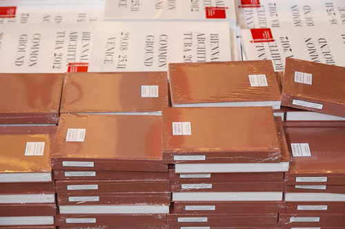
The ideas behind the Biennale have been published in a critical reader, a book of essays bound in brick red with endpapers in marble grey (below). As a counterpart, in a city full to the brim with photographers we introduced another, Juergen Teller, to record and celebrate the Vernissage in magazine form.
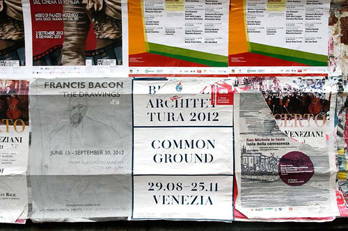
In the weeks leading to the Biennale and through the Vernissage, the ‘Common Ground’ graphic material began to cover the waterfront – posters at Rialto, over the grand canal on the wooden Ponte dell’ Accademia, outside the gothic palazzo of the Biennale offices at Ca’ Giustinian (San Marco) and wrapping vaporettos on journeys to and from the Lido. Like the sweat and tears of the exhibitors and contractors, the Common Ground identity began to merge with the city.
Common Ground 29 August – 25 November 2012.
13th Venice Architecture Biennale.
See ‘Devil in the detail’, a profile of John Morgan in Eye 83.
Eye is the world’s most beautiful and collectable graphic design journal, published quarterly for professional designers, students and anyone interested in critical, informed writing about graphic design and visual culture. It is available from all good design bookshops and online at the Eye shop, where you can buy subscriptions, back issues and single copies of the latest issue. You can also browse visual samples of recent issues at Eye before You Buy.


![image[1]](http://farm9.staticflickr.com/8474/8147422644_8699d5d513.jpg)

