
Sunday, 10:18am
17 January 2010
Critique: All mouth and trousers?
London designers show how little they care for the poster form
A few months ago, writes Rick Poynor, I was asked by the Design Museum to write a chapter on graphic design for a book entitled Design in Britain (Conran Octopus, October 2009). Wish I’d had the chance, while I was working on it, to see the posters commissioned by the London Design Festival’s founder, John Sorrell, and Pentagram’s Domenic Lippa for the festival in September 2009.
The twenty A1 images were displayed at the V&A for a short time and are now available as limited editions from Blanka. Created by leading British designers and studios, they provide an unusually concentrated opportunity to see where British graphic design is now.
One issue the posters raise immediately is the question of form. This is a subject we don’t talk about much any more in relation to graphic design. To focus on form suggests a concern with visual appearance and style, and this is much too flimsy and self-indulgent beside weighty matters such as process, strategy, identity and branding. These are the issues you can discuss with a client, not frivolous aesthetics.
Above: Jonathan Ellery, Browns. Below: Alan Aboud, Aboud Creative.
But the poster, long an endangered undertaking in Britain’s graphic culture, is an inflexible taskmaster. Four sides defining a big empty rectangle: that’s all there is. The unchanging aim is to fill the space with something surprising, memorable and visually original that communicates effectively to its intended viewers. The exercise is hard in the way that writing a really good poem or pop song is hard, requiring condensed visual thought, and the poster’s fabulous history of invention makes it even harder. Add to that the challenge, in this case, of no real client, no clearly definable audience, and being entirely responsible for the poster’s content and point of view.
Above: Bibliothèque. Below: Matt Willey, Studio 8.
Below: Tony Brook, Form.
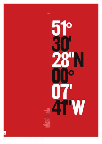
Designed in a palette restricted to red and black, the screen-printed posters made a striking collection as a set – the medium is inherently alluring. The first thing they showed, though, is that lack of practice has taken an inevitable, perhaps irreversible toll. Many of these designs aren’t posters by any traditional definition. They are morsels of graphic playfulness stretched unusually large. Pieces by Bibliothèque, Matt Willey and Tony Brook are more like enigmatic diagrams: the notional audience seems to be other designers rather than any plausible public. Quentin Newark’s plain typographic homage to the Robert Brownjohn era struggles to fill the space, as does Derek and Fred Birdsall’s single-word salute to their postcode (N1). Nice they enjoy the area, but for the non-partisan viewer, there’s not a lot to think about.
Below: Andy Altmann, Why Not Associates.
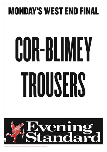
Only two projects feel entirely at home with the assertive demands of the street poster: Andy Altmann’s absurdist ‘Cor-blimey trousers’ jest (courtesy of Lonnie Donegan) imposed on an Evening Standard latest edition poster (above); and Alan Kitching’s ‘Taxi!’ (below), the sole image that convincingly expresses London’s excitement, although that was surely one of the project’s more obvious tasks. You can hear the clash and clamour of the streets in the explosive arrangement of letterpress type, and the energy of the graphic treatment more than redeems the obviousness of the subject matter.
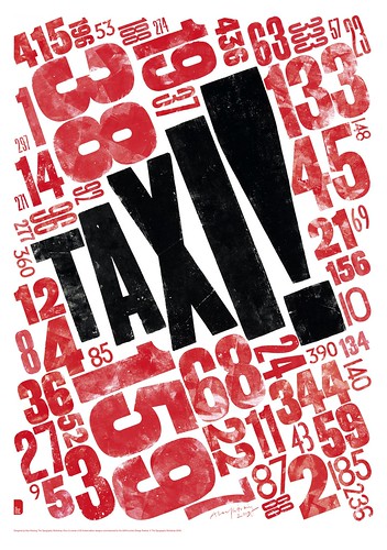
Above: Alan Kitching, The Typography Workshop.
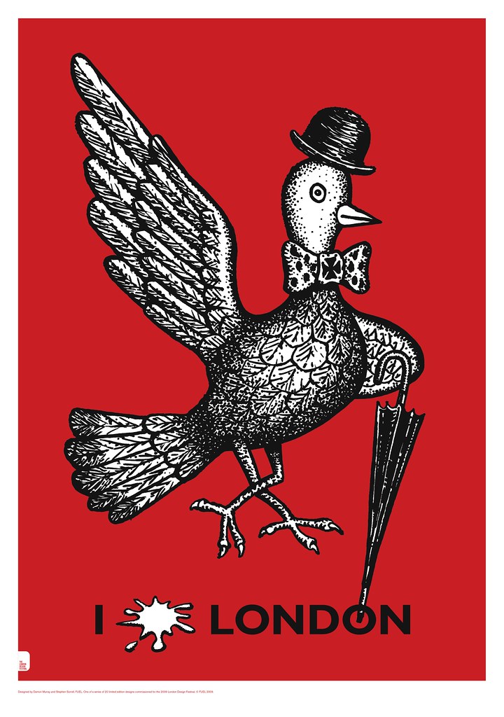
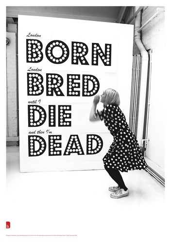
While graphic design has always traded in the already familiar (less charitably, in the cliché), the choice of subject matter here is often predictable. Piccadilly Circus comes up a couple of times, London Underground twice, London buses three times, and even the pigeons rate a couple of mentions. Fuel’s amiable pest – some kind of comment on the City’s moneymen? – cocks a snook at us with an ‘I (splat) London’ (top).
Below: Frith Kerr.

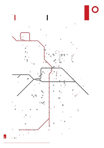
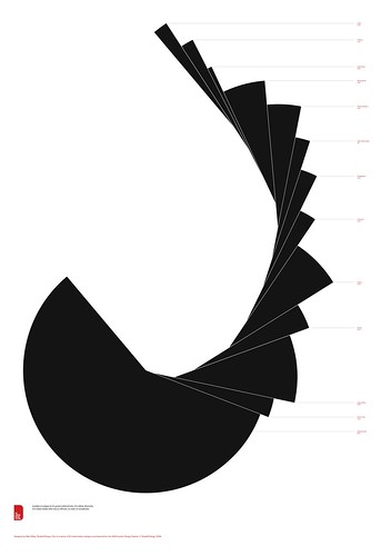
Here, again, the project that milks the cliché most vigorously proves the most diverting: Frith Kerr’s eccentric setting of Ian Dury’s version of ‘The Bus Driver’s Prayer’ (above) is easily the warmest, wittiest, most durable idea of the bunch, though is it really a poster? For that matter, is Nick Bell’s initially confounding graphic representation of the seventeen ‘lost’ rivers of London (below), where the vertical red strokes stand for the Thames? Poster or not, the refusal to settle for a trite, tourist’s interpretation puts this project in another league.

Above: Nick Bell, Nick Bell Design. Below: Mike Dempsey.
I also admired Mike Dempsey’s willingness to cast aside the restraints of professional decorum and broach the problem of prostitution (above). No one else is anywhere near this impassioned and provocative. Why hide it away in the small print?
If the London posters are representative of the best graphic design in Britain, then we seem to be stuck in a collection of ruts. These pieces were created for a high-profile festival in a city that often proclaims itself a world leader in design, yet there is nothing here that could be acclaimed in such terms. Circumscribed thinking seems to be leading to circumscribed treatments of form.
None of these designers is an image-maker, which a poster-maker ideally should be, and the reliance on typography only makes this more obvious. For as long as graphic communication remains the aim of graphic designers, formal invention will be as crucial as clay is to a potter. On this evidence, British designers need to take its challenge more seriously.
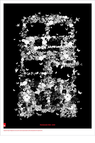
Above: Tom Hingston Studio. Below: Morag Myerscough, Studio Myerscough.
All posters available from Blanka.
This Critique appears in the printed edition of Eye 74 (Winter 2009), available now and on the Eye website. You can read all Rick Poynor’s Critiques for the magazine at bit.ly/Critiques.