
Friday, 1:02pm
17 April 2009
David Hillman
Gems from a master of magazine and newspaper art direction
There has been a lot of talk about golden ages on the Eye blog recently, writes Simon Esterson, and at last night’s D&AD conversation between editor Patrick Baglee and designer David Hillman, another golden age flashed before the audience’s eyes: the golden age of magazines and magazine art directors.
David Hillman has been designing for almost half a century and in 45 minutes we heard and saw not just his influences and his editorial work, but also highlights from nearly 30 years as a partner at Pentagram where magazines and newspapers were just part of a portfolio that includes retail interiors for the travel agent Wakefield Fortune, signage for the National Maritime Museum and the complete redesign of Phaidon’s identity and book publishing programme.
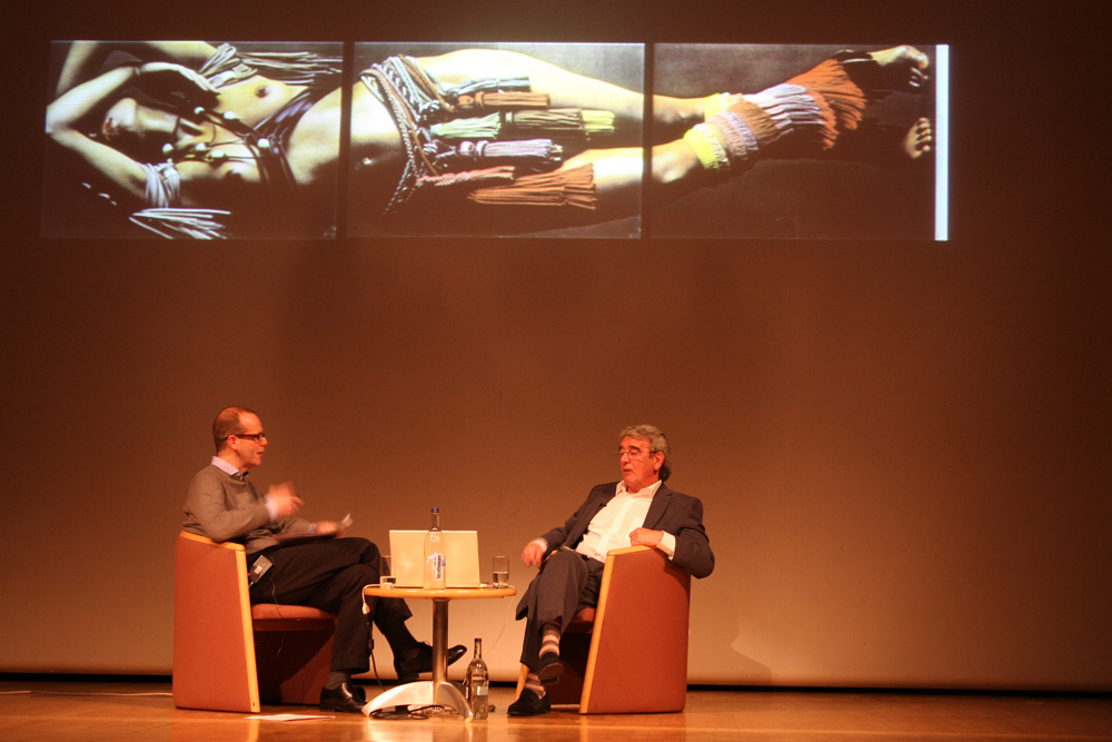
But as the pages from Nova (where Hillman was art director from 1969-75) appeared on screen there was a realisation that this was art direction at its best and that, over 30 years later, we don’t make magazines as bold as this today. Nova was billed ‘as the thinking woman’s magazine,’ said Hillman ‘but actually we wanted to make a general interest magazine for men and women, tackling every taboo of the time . . . abortion, paedophilia, lesbianism.’
And there was fashion, too: not simply spreads of good pictures, but sequences of fashion spreads by Peter Knapp, Sarah Moon and Helmut Newton that worked as narratives and told a story.
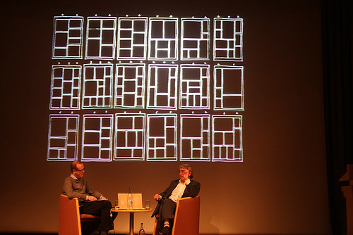
Hillman explained how at The Guardian in the 1980s he used the restrictions of the paper’s typesetting technology to define the modern newspaper: grid based, systematic and acknowledging Swiss influences in its use of sans serif headlines.
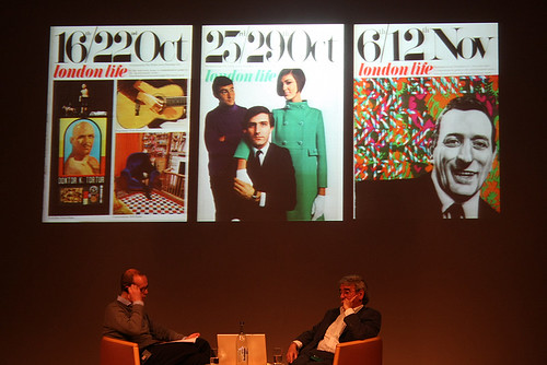
We also saw the less well known gems: the short-lived weekly London Life where the dateline was bigger than the magazine title, and the French daily Le Matin de Paris whose tabloid format and bold picture or type fronts anticipated both The Independent and The Guardian’s G2 section.
A member of the audience asked about the decline of print. Hillman blamed it as much on the publishers as the internet. ‘The magazines have got boring,’ he said, ‘what they lack today is imagination. I go to the supermarket: all the covers have blue-eyed blondes and pink logos.’
Eye is the world’s most beautiful and collectable graphic design journal, published quarterly for professional designers, students and anyone interested in critical, informed writing about graphic design and visual culture. It is available from all good design bookshops and online at the Eye shop, where you can buy subscriptions and single issues.