
Tuesday, 11:59pm
4 December 2018
Drawing up Modern man
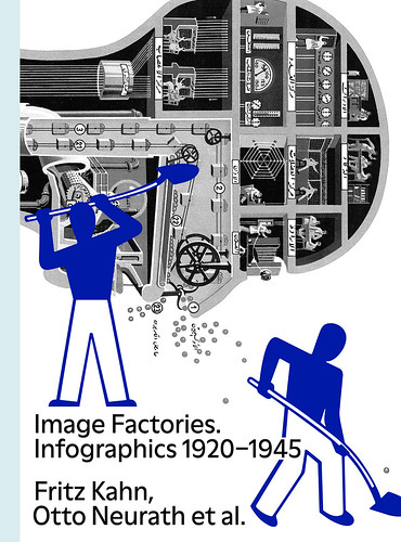
Image Factories. Infographics 1920-1945: Fritz Kahn, Otto Neurath et al.
Edited by Helena Doudova, Stephanie Jacobs and Patrick Rössler. Designed by Kay Bachmann. Spector Books, €26, $35, £24Neurath and Kahn – the impresarios of early twentieth-century infographics. Review of Image Factories. Infographics 1920-1945
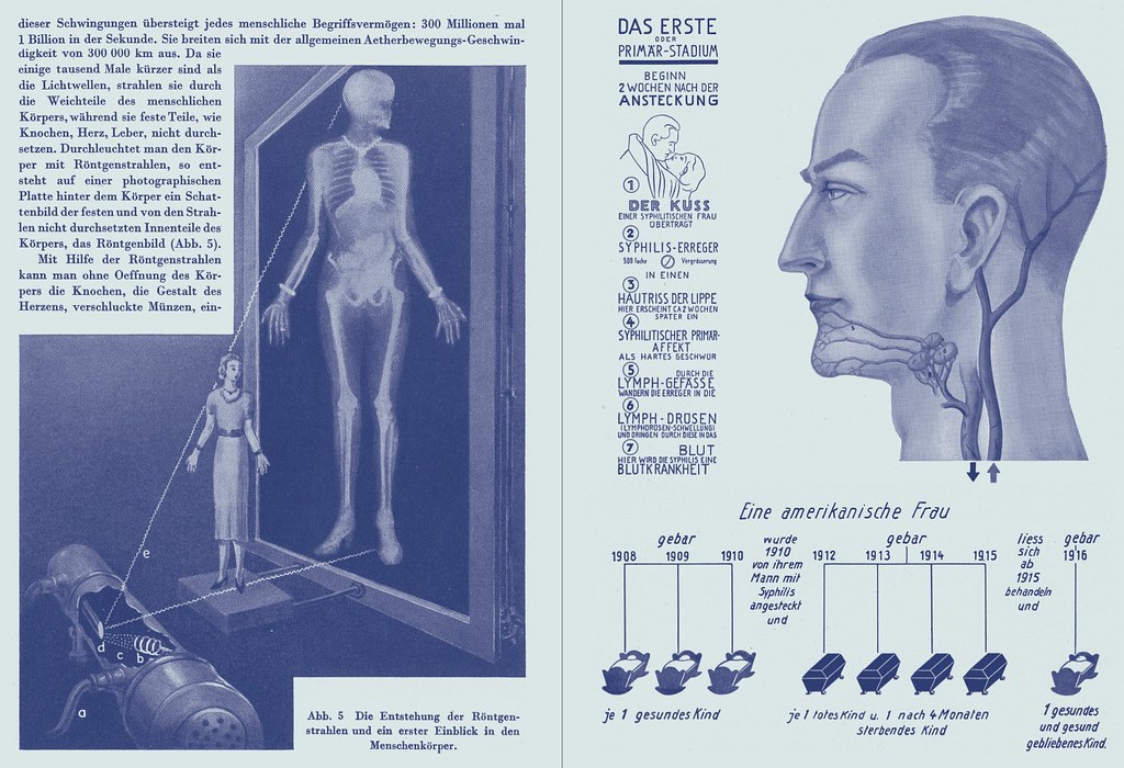
Image Factories. Infographics 1920-1945’s humble appearance belies its contents – a wealth of precious knowledge and visuals, and an elaborate inner design that uses three different papers and special colour prints, writes Sandra Rendgen.
Unlike most sumptuous tomes on the history of design, it is more akin to a pocket guide in format. This, combined with the somewhat clunky title – Image Factories. Infographics 1920-1945: Fritz Kahn, Otto Neurath et al. — might leave the reader wondering what on earth it could be about. But the two names in the title make it instantly clear that this small volume deserves attention, as it focuses on two of the most interesting impresarios of early twentieth-century infographics: Otto Neurath and Fritz Kahn. The book was published to accompany an exhibition in the German Museum of Books and Writing in Leipzig.
Born in the 1880s in Germany and Austria, respectively, Kahn and Neurath both started out as scientists and embarked – for very different motives – on long-term campaigns for public education. In their work they both relied heavily on a graphic language to explain complex issues to a wide audience, cooperating with designers and illustrators to create their information graphics. Notwithstanding these biographical parallels (which further include their shared fate as exiled emigrants during the Third Reich which substantially hindered their careers), their notions of popular education and – accordingly – their respective ‘visual cosmos’ differed fundamentally, as is demonstrated by showing their work together.
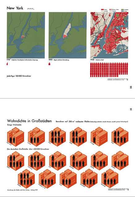
Otto Neurath. Two charts from Gesellschaft und Wirtschaft. ‘Bildstatistisches Elementarwerk’ (1930), showing the growth of New York City and population density.
Top. Fritz Kahn. Chart explaining X-ray technology (from Der Mensch, gesund und krank, 1939), left, and chart showing the development of syphilis, from Unser Geschlechtsleben (1937).
Otto Neurath was an energetic and well connected organiser. Educated as a philosopher and economist, he engaged in left-wing urban politics in his home city of Vienna in the 1920s. One of his main motives was to educate the masses on social matters such as population, health, housing or employment. It was this very goal that prompted him to found the Vienna Museum for Society and Economics in 1925, hoping to reach a wide audience with informative exhibitions. Searching for appropriate communication methods, he set out to create a visual language for showing statistics, which later became known as the Isotype system.
He and his long-term partner and wife Marie Reidemeister collaborated with a team of illustrators and designers (among them the well known Gerd Arntz) to create a system of standardised signs, each of which signified recurrent statistical items, e.g. population groups such as women, children, or citizens of different countries, or economical entities such as factories or types of products. It is particularly interesting that Neurath was striving for an ‘emotionally neutral’ visual language, devoid of any subjective features or remnants of an individual artistic style.
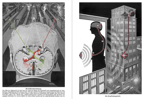
Fritz Kahn: spread from Das Leben des Menschen (1926), showing perception of light (left) and sensory pathways.
How different from this was the approach of Fritz Kahn! Kahn trained as a physician, but made his first forays into writing on scientific topics for wide audiences very early in his career. Working with publishers who, like him, were aware of the extent to which appealing scientific illustration could boost the reach of any given publication, he soon began to consider which diagrams, images and schemata should be included alongside his texts. He subsequently acted as a creative director, not just setting topics and writing copy, but also creating the framework for the visual language employed in his publications. He even set up an artistic studio in his apartment in Berlin, in order to work as closely as possible with his small design and illustration team.
Looking at the extensive selection of Kahn’s infographics, one thing is particularly clear: Kahn’s impetus was mainly to arouse interest, emotion, even engagement in his readers. The infographics he created with his collaborators were not trying to be neutral or devoid of individual features. On the contrary, Kahn drew heavily on the aesthetics of the modern avantgarde and mass media, featuring many contrasts, bold perspectives and cuts in his infographics. Furthermore – and this really has become his unique selling point – he became very creative about thinking up analogies to explain scientific matters. There was almost no technical device he didn’t use to explain various human bodily functions: the eye as a camera, the muscle as a gas engine, and – more generally – man as industrial palace. Very often, his graphics would invoke situations of modern urban life, such as fast trains, street traffic, dancing couples or machines.
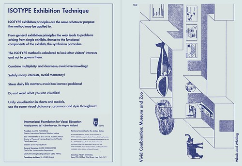
Otto Neurath. Spread explaining the Isotype Exhibition Technique (undated, left) and spatial model for exhibition design (ca. 1938).
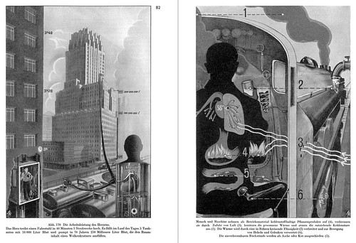
Fritz Kahn. Spread from Der Mensch, gesund und krank (1939), showing the heart’s work rate (left) and an analogy of manpower and machine-power (right).
While these different approaches have already been well documented in individual publications, a unique achievement of the exhibition was to show both oeuvres alongside each other, and furthermore to unearth a wealth of unpublished correspondence and sketches from various archives, which serve to illuminate the working processes of both teams exceptionally well. The book features three extensive sections of plates, thereby beautifully juxtaposing the visual worlds of Kahn and Neurath. It is a pity that only single pieces of the unpublished sketches and correspondence have made it into Image Factories. Infographics 1920-1945. The seven texts included however provide a concise overview of the topic: interviews with the most eminent scholars on both oeuvres, along with two original texts by Otto Neurath and Vilém Flusser and a very informative introduction.
Cover: Image Factories. Infographics 1920-1945. Fritz Kahn, Otto Neurath et al. designed by Kay Bachmann.
Sandra Rendgen, author, editor, Berlin
Eye is the world’s most beautiful and collectable graphic design journal, published quarterly for professional designers, students and anyone interested in critical, informed writing about graphic design and visual culture. It is available from all good design bookshops and online at the Eye shop, where you can buy subscriptions and single issues.