Monday, 9:00am
4 April 2011
Exquisite discourse
Poet meets graphic artist meets type designer, and the consequence is …
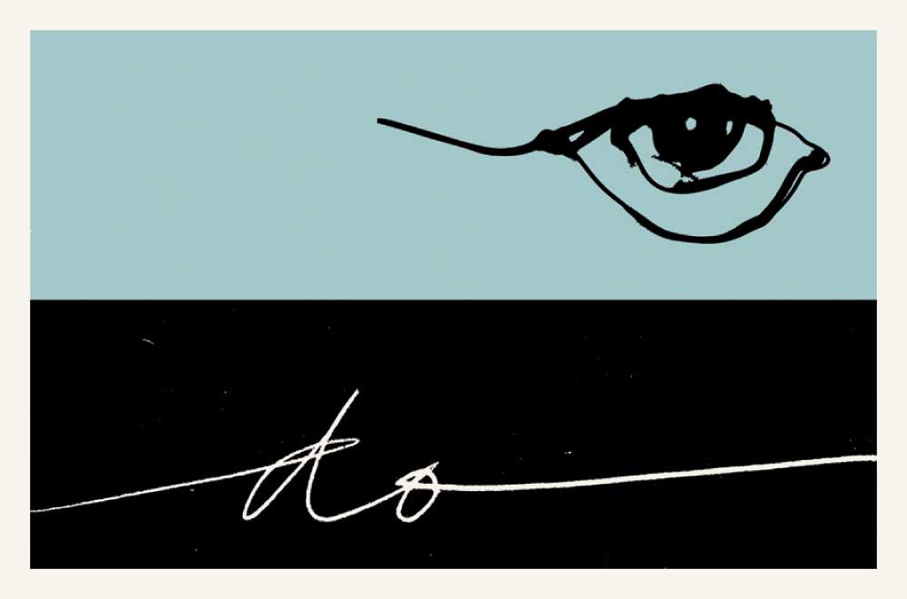
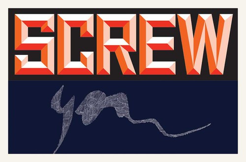
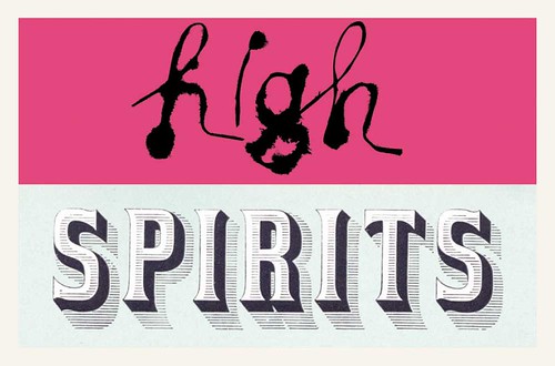
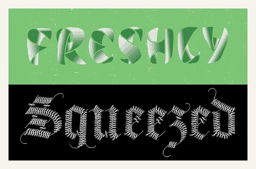
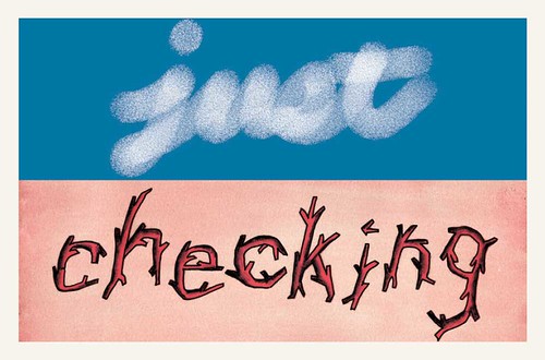
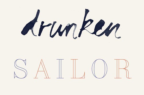
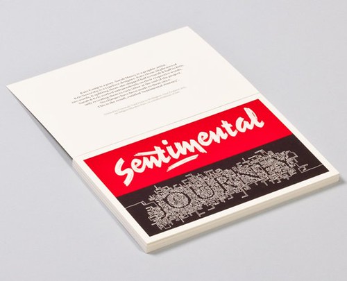
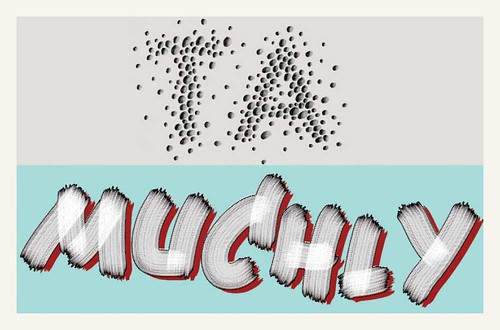
A graphic artist and a typeface designer, working blind to each other, design two-word typographic postcards illustrating a poet’s turn of phrase, writes Hamish Thompson.
There were many serendipities, say Sarah Maxey and Kris Sowersby. The process used to create the twenty typographic postcards in the Sentimental Journey set is reminiscent of the game of drawing creatures in a relay (also known a ‘Consequences’ or ‘Exquisite Corpse’) with the part you’ve added folded over so the next person can’t see what you’ve done. The results that I recall were mostly absurd, sometimes hilarious.
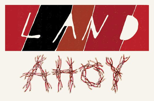
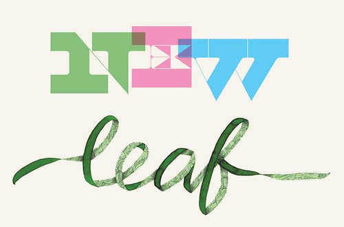
Turn that process over to poet Kate Camp, graphic artist Maxey and typeface designer Sowersby, and the result is quite extraordinary. From the title page: ‘Kate chose twenty phrases of two words, and splitting them, she shipped half to Sarah and half to Kris. Sarah and Kris worked independently on their respective words, only revealing them to each other at the end of the project. No changes have been made to them since.’ The postcards are sold as a limited edition set. As Sarah Maxey says: ‘There’s one to suit any occasion. Although I haven’t had reason to send out “Screw you”. Yet.’
Hamish Thompson: Were there any particular sources of inspiration used?
SM ‘Some were immediate responses to the word, like ‘ahoy’ or ‘leaf’. Some were unrelated flights of fancy.’
KS ‘I mined my specimen books for quite a few of them, even re-creating Excoffon’s terrific Calypso [see cover of Eye 79] for “freshly”. Some are continuations of logotypes I’ve done; others are works-in-progress.’
What about techniques and materials?
SM ‘I used florist’s wire on a couple, and an old eraser. Otherwise good old ink and pencil on paper.’
KS ‘I used the Brushes app on the iPad to make “just” and “muchly”. It was rather enjoyable to spontaneously finger-paint! Most of my normal work is highly structured & considered— typically drawn with Bézier curves on the computer.’
What was your reaction when you saw them together?
SM ‘I was delighted, there seemed to be many serendipities. There’s only one that I really hate and regret. Which just so happens to be one of Kris’s favourites. That tickles.’
KS ‘I was rapt! It was a great surprise to see them in pairs. There were so many happy coincidences.’
Kate Camp is a poet, and her first collection, Unfamiliar Legends of the Stars, won the NZSA Jessie Mackay Award for Best First Book of Poetry at the 1999 Montana New Zealand Book Awards. She is currently in Rajasthan.
Sarah Maxey is a graphic artist based in Wellington, New Zealand. Recent commissions include typographical drawings for clients including The New York Times and City Gallery Wellington.
Kris Sowersby started the Klim Type Foundry in 2005 and is based in Wellington. Sowersby’s work has included projects with Christian Schwartz, Erik Spiekermann, Chester Jenkins, House Industries and Pentagram. Read Mark Thomson’s Reputations interview with Kris in Eye 79, out any day now.
You can buy Sentimental Journey here.
Eye is the world’s most beautiful and collectable graphic design journal, published quarterly for professional designers, students and anyone interested in critical, informed writing about graphic design and visual culture. It’s available from all good design bookshops and online at the Eye shop, where you can buy subscriptions, back issues and single copies of the latest issue. For a visual sample, see Eye before you buy on Issuu.

