
Tuesday, 11:57am
24 April 2012
#FontSunday … on #TypeTuesday
The Design Museum’s Twitter contest has type geeks living for the weekend

Ah, Sunday. Day of sleeping in late, padding around the house in your jammies, and generally striving to do as little as possible in anticipation of another working week's grind, writes John Moore Williams.
But if you’re a type geek (variously known as a typochondriac, fontophile, or typenut), Sunday has now become a day to look forward to all week – with the rabidity of the most fervent American football fan.
Why? Because thanks to the Design Museum, it has become #FontSunday, an epic Twitter-driven event now heading toward its twelfth week, in which hordes of font fanatics post their typographic pics in response to a predefined theme. The reward? Eternal fame and glory on Twitter (which translates to perhaps fifteen seconds). Otherwise, it’s just the chance to revel in the joy of sharing, see some beautiful type, and have your own contribution acknowledged for its ‘awesomeness’.
The Design Museum’s Michael Czerwinski says, ‘We want to see innovative approaches and personal observations. As the weeks progress we are going to start setting tasks to get participants to do some specific designing to complement the usual stream of photos and found images.’
15 April’s #FontSunday fest focused on Friends of Type’s apt theme, ‘city type’, and brought an incredible flood of both environmental and handmade efforts ranging from rust-ravaged vintage signage to meticulously composed bundles of grass blades. The breadth of submissions proved a bit staggering for most involved, and certainly more so for Friends of Type themselves. But somehow they persisted to name three champions:
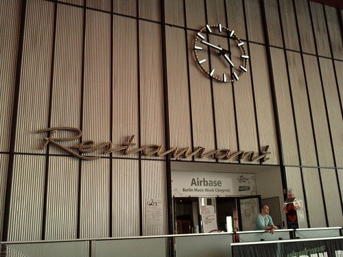
Tom Martin, a self-described freelance graphic / digital / motion designer and part-time MA student whose shot, from a visit to Berlin’s now defunct Tempelhof airport, captured both a fluid script and a rather more staid sans (below).
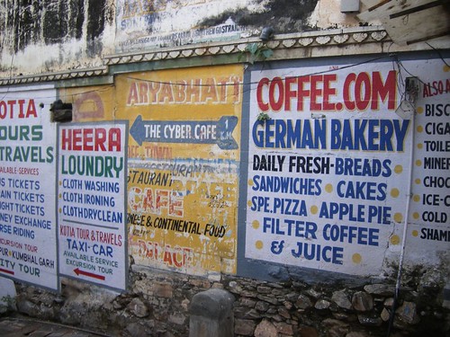
Jen Wood, a regular Renaissance woman (‘Dr Hauschka brand ambassador / occasional violinist / cake baker / coffee drinker’ according to her profile), who grabbed this effusion of colourful hand-painted type on an excursion to India (below).
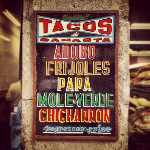
And Quique Ollervides, an ‘acomodador de tintas y pixeles’ (which translates, very roughly, to ‘print and Web designer’ for the Spanish-challenged), who grabbed this energetic shot at a Mexican restaurant (below).
Which, not coincidentally, makes me very hungry right now.
S is for Swiss graphic design
The next week switched gears (slightly—Type Tuesday readers know how often Helvetica is used for urban signage) to focus on Switzerland’s graphic design legacy. This event’s partner was the Museum für Gestaltung Zürich, tying in with their exhibition 100 Years of Swiss Graphic Design.
Here are a few (wholly subjective) highlights:
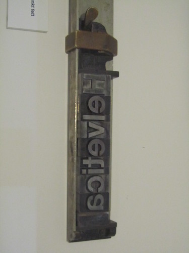
Helvetica on a composing stick, from the Museum für Gestaltung themselves (below).
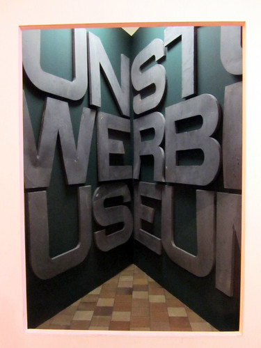
From the Kunst und Gewerbe Museum in Hamburg, via Thomas Marzano (below).
Striking typography from MB+Co, Zurich, via Andy Tye (below).

To see just how energetic the event gets, head on over to Twitter and search the tag #FontSunday. Oh, and don’t forgot to tune in next week.
John Moore Williams is a professional copywriter and blogger, infrequently published poet, and amateur typographer. He lives in the San Francisco Bay Area.
Eye is the world’s most beautiful and collectable graphic design journal, published quarterly for professional designers, students and anyone interested in critical, informed writing about graphic design and visual culture. It’s available from all good design bookshops and online at the Eye shop, where you can buy subscriptions and single issues. Eye 82 is out now – you can browse a visual sampler at Eye before you buy on Issuu.