
Monday, 12:11pm
25 January 2010
Info design before designers
Could today’s professionals learn a thing or two from the Victorians?
Paul Stiff and his colleagues at the Department of Typography & Graphic Communication at the University of Reading have been researching the everyday printed documents of Victorian life, writes Simon Esterson. The results of their journey through the archives are on show until the end of the week (Fri 29 Jan) at the St Bride Printing Library in the exhibition ‘Designing information before designers’.
The late nineteenth century was the age of the timetable and the catalogue: there was an unprecedented demand for these and other types of printed information from the increasingly literate population of Britain’s growing cities. On show at St Brides are maps, train timetables, product catalogues and business stationery all created at a time when there were no ‘professional’ designers. Yet all these items are certainly designed: they are the products of the highly skilled engravers and printer’s compositors of the time. At their best the examples on show combine function, typographic understanding and immaculate production. In fact, they put the work of many ‘professionals’ to shame.
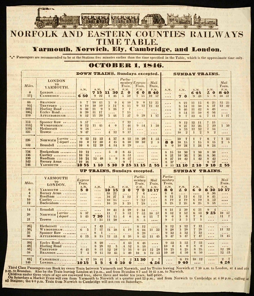
Top: Norfolk and Eastern Counties Railways time table, 1846. As rail services expanded in the 1830s, printers began to replace straightforward departure lists with tabular formats. This timetable uses a typography, solid rules, and dot leaders to help condense detailed travel information clearly. (Rickards Collection, Centre for Ephemera Studies, University of Reading)
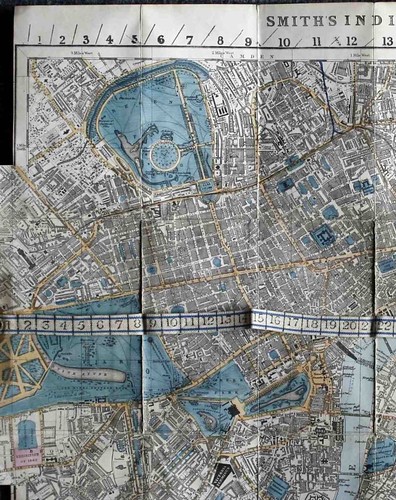
Below: Smith’s indicator map of London, 1864. Charles Smith’s map featured a strip of numbered tape that could be aligned with numbers around its edge, allowing travellers to calculate cab fares and omnibus routes. The map continued to be reissued and extended until the Second World War, a testament to Smith’s ingenuity in simplifying complex information for everyday users. (From the collection of Michael Twyman)
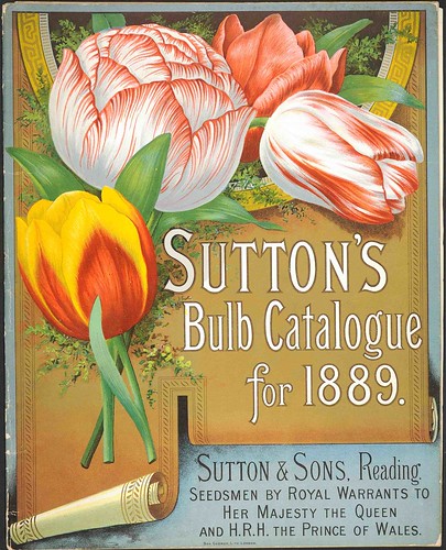
Above: Cover of Sutton’s bulb catalogue for 1889, chromolithographed by Ben George. With its lavish eight-colour cover, this expensive production testifies to the Victorians’ new-found belief in the power of advertising.
‘Designing information before designers’ continues at St Bride until this Friday, when the library will host ‘Design for music, Music and design’, curated by Eye editor John L. Walters and Catherine Dixon. For more on ‘Design for Music’, read ‘Magnificent Obsessions’ on the Eye blog.
Eye, the international review of graphic design, is a quarterly journal you can read like a magazine and collect like a book. It’s available from all good design bookshops and at the online Eye shop, where you can order subscriptions, single issues and (new!) classic collections of themed back issues. Eye 74 is a Berlin special.