
Monday, 11:09am
5 December 2011
Mind and eye ... science and design
CSM Design Science Research Group aims to bridge a gap in understanding
Scientists are often accused of making their work impenetrable. Anatomical slides bearing little resemblance to real life, inscrutable jargon and dense, Latinate passages are widespread in scientific journals and textbooks, leaving non-technical audiences alienated, writes Henry Stanley.
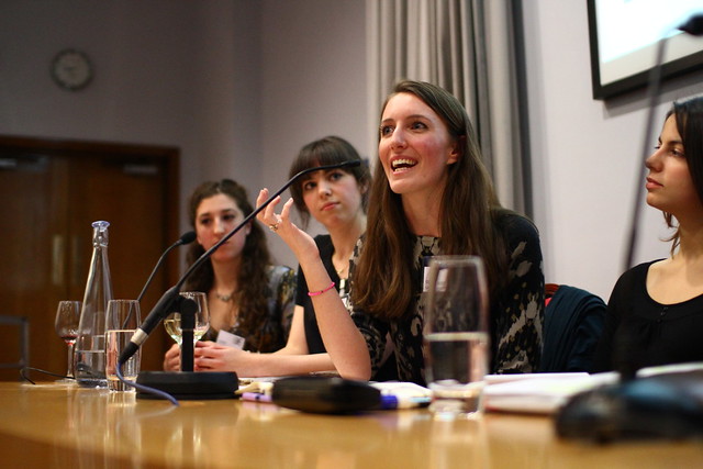
Above: Rosie Waldron. Photo by David Robertson.
The Design Science Research Group (DSRG), a collaboration between Imperial College London graduates and Central Saint Martins, aims to change that. Their inaugural panel discussion in the somewhat macabre setting of London’s Hunterian Museum at the Royal College of Surgeons saw a group of scientists and designers present their thoughts: not just on how science is best presented, but how design ought to be part of the way modern science is done. A panel of six – three science communication graduates (Lizzie Crouch, Anna Perman and Rosie Waldron, also DSRG co-founders) and three communication design students (Arianna de Luca, Joana Águas and Olga Surawska) – were joined by DSRG chair and co-director Anne Odling-Smee (below), as well as a diverse audience of science journalists, scientists and designers.

Above: photo by David Robertson.
Left to their own devices, researchers can be poor science advocates and communicators. (The ‘Climategate’ scandal which ultimately saw the accused cleared of wrongdoing, is a good example of scientists failing to make their case convincingly to a critical public.) Designers are increasingly seen as translators, cutting through jargon and intuitively representing data for a lay audience. That readers now prefer a simpler-to-grok infographic to dense text is a testament to the elegance of good graphic design. Indeed, the Guardian now dedicates a section of its website to data visualisations. (The starkest reminder of the explanatory power of good graphic design remains chemist Dmitri Mendeleyev’s periodic table, whose layout established repeating patterns in elements’ chemical properties which predicted the existence of substances long before they were discovered.)
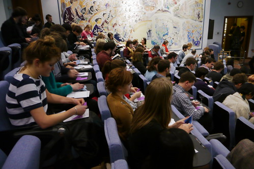
Above: photo by Essi Salonen.
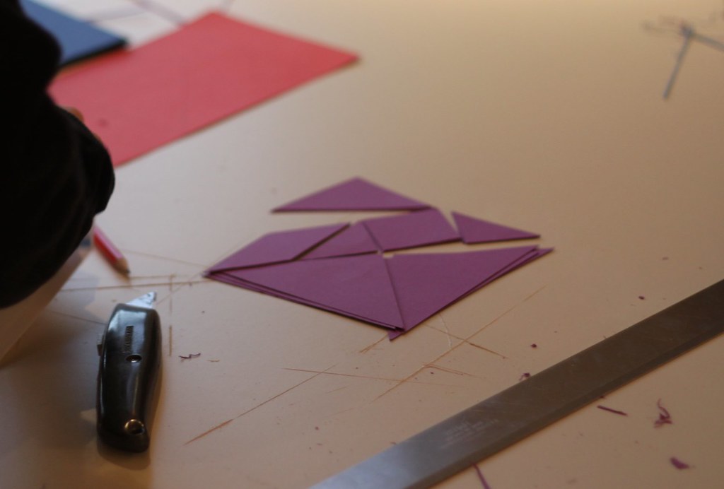
The event itself was symbolic of the process behind both science and design: attendees were handed envelopes containing card shapes (above and top) which they had to assemble into a square. The best method for doing so, one shared by science and design, is iterative: to attempt to assemble the pieces, get it wrong and try again.
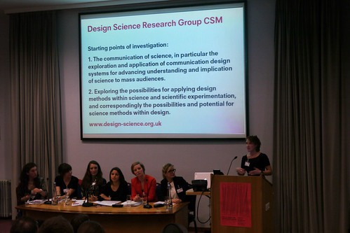
Above: l to r: Lizzie, Anna, Rosie, Joana, Olga, Arianna. Photo by David Robertson.
Not everyone was satisfied. Some audience members thought science and design involved wholly different core processes, while some mentioned scientists who were never satisfied that infographics (which by design are simplifications) precisely represented their data. While requiring great skill to perfect, the data visualisation trade has drawn scorn from those who see it mostly as ‘design-deficient’ and a gimmick for attracting readers. And science communicators can themselves end up failing to engage new audiences: the panel complained that most science museums are family-oriented, with few attempting to draw an older crowd (with more adult themes and later opening hours, for example).
But as the session drew to a close, there were some encouraging conclusions, including the view that technology might be the height of science-design synthesis. Good industrial design seamlessly marries technology with the user experience, and platforms such as iPhone and iPad make interacting with everything from anatomical drawings to MRI scans simple and elegant. As the panel aimed to convince us, playful communication requires the scrutiny of both the scientist’s mind and the designer’s eye.
Henry Stanley is a freelance science writer.
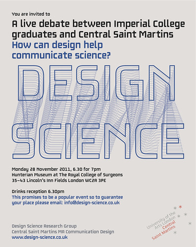
See Design Science Research Group website. Design science logo designed by Stefanie Schwarz, communication design student at CSM. Main photo (top) of tangram by Ed Prosser.
Anne-Odling-Smee interviewed Ken Garland for Reputations in Eye 66.
Eye is the world’s most beautiful and collectable graphic design journal, published quarterly for professional designers, students and anyone interested in critical, informed writing about graphic design and visual culture. It is available from all good design bookshops and online at the Eye shop. The new issue, Eye 81 is out now – see Eye Before You Buy for a visual sample.