
Wednesday, 7:00am
21 January 2015
Mirror on the wall
The global financial crisis sparked the creation of O Espelho (The Mirror) – a wall newspaper for the streets of Lisbon. By Rose Epple
The first appearance of the Portuguese wall newspaper O Espelho – on 12 November 2012 – was timed to coincide with Angela Merkel’s visit to Lisbon, writes Rose Epple.
At that time, the anger of Portuguese people with regard to the financial crisis was erupting into big demonstrations. ‘You could feel the negative energy in the air,’ remembers architect Diogo Lopes, one of the founders of O Espelho.
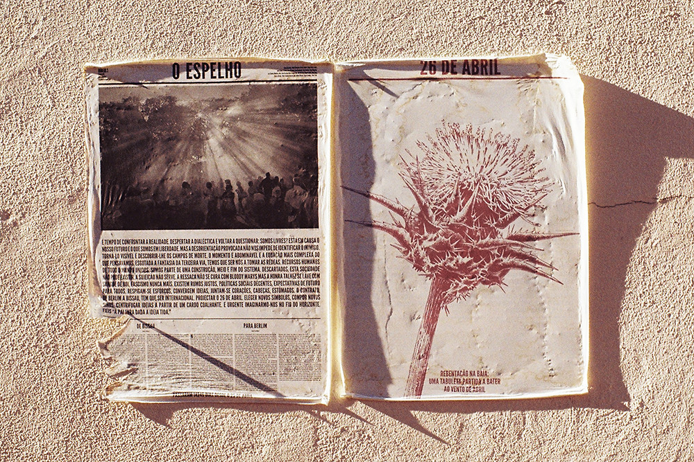
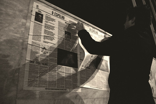
Lisbon wall newspaper O Espelho. Photo: Rose Epple.
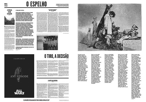
Top: The thistle drawing was commissioned from a scientific illustrator.
All photographs by O Espelho unless stated otherwise.
The collective behind the creation of the paper was formed spontaneously during this period of social unrest. ‘We all wanted to write, or say, or do, or show things in a way that wasn’t possible in other newspapers,’ explains Lopes.
So, in less than three weeks of urgent meetings and discussions, the idea of a wall newspaper was conceived and produced. Everyone in the collective contributed money to finance the first 2000 copies. And when the paper was printed the group set off one evening to fly-post it in strategic places around Lisbon’s historic city centre.
‘Searching for places to put up the paper made us realise how little public wall space was left in our city,’ recalls filmmaker Maria João Guardão, another member of the collective. But the wall newspaper helped demarcate and defend this space, and people soon picked up the message. Lopes says, ‘O Espelho created a big splash, both in mainstream media and with the general public.’
A page from the first issue of O Espelho.
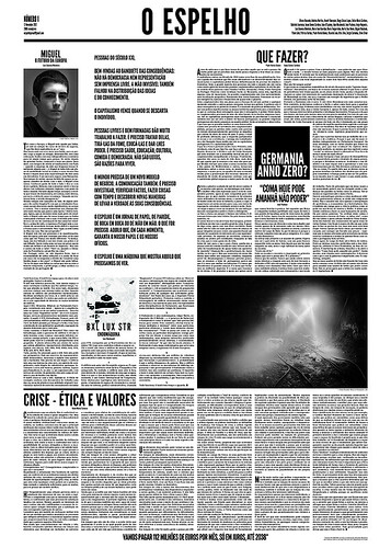
Yet little is user-friendly about O Espelho. The type on this wall newspaper is small and distorts when it is pasted, and the copy is long. Yet these design decisions were only partly due to limited resources; mainly they were strategic. ‘This was all part of being an alternative to mainstream media, and it was confrontational. Not only towards mainstream media but even towards the reader – if he wants to read, he has to work for it’, says Lopes. And the readers did ‘work for it’. People were seen with magnifying glasses in front of the paper.
There is no single designer of O Espelho. According to Lopes, the editorial process is a ‘discussion between all people, regardless of their skills, about politics and about how to convey a message.’ The newspaper’s black and white layout is based on stark contrasts between large headlines (League Gothic) and small print (Meta Serif); between white space and big images.
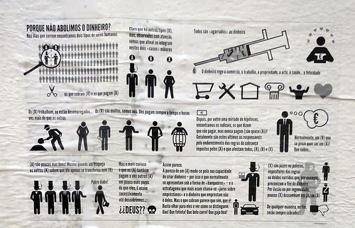
Issue no. 2 uses pictograms to explore the question ‘Why don’t we abolish money?’.
Diogo Lopes says its aesthetic references were nineteenth-century newspapers with their dense typography; oversized fashion magazines from the 1980s; and Soviet agitprop. ‘It isn’t coming from the informal DIY aesthetics of the 1960s, because this was something that we in Portugal didn’t experience – at least not at full scale.’ This was because Portugal was ruled by the Estado Novo regime from 1933 until 1974.
O Espelho employs large images to great effect. Sometimes they are sourced from the archives of photographers within the group. Sometimes they are commissioned, as in the case of the full page illustration of a thistle – a reference to the symbol of the Carnation Revolution. ‘It was an editorial idea’, explains Lopes. ‘We were going to distribute this on 25 April 2013, the celebration of the day of the revolution. But we were going to show a different flower and put 26 April instead. It was a little bit, like: “with all due respect, it is time to turn the page”.’
The O Espelho collective fly-posts the paper at night.
The paper continues to be published at irregular intervals, with each publication marking a politically significant date. The latest issue came out on 11 September 2014, and had the theme of war.
In an era when anyone can read The New York Times online, anywhere in the world, at any time, a broadsheet that can only be read by local people standing together on the street is an anachronism. Yet O Espelho’s ‘micro-scale intervention’, as Lopes calls it, shows the difference an independent, local publishing venture can make. Not despite but because local problems are so often global.
O Espelho no. 6 lists Francisco Goya as a contributor in the masthead and reproduces an etching of his Disasters of War.
Rose Epple, designer, scenographer, educator, Berlin
Eye is the world’s most beautiful and collectable graphic design journal, published quarterly for professional designers, students and anyone interested in critical, informed writing about graphic design and visual culture. It is available from all good design bookshops and online at the Eye shop, where you can buy subscriptions and single issues.