
Friday, 1:00pm
11 December 2015
Noted #72
A New Type of Imprint, Hue, Sabor, Recens Paper and Works That Work
Here are a few publications that caught our attention in recent weeks.
Norwegian magazine A New Type of Imprint, edited by Veronica Mike Solheim features interviews with and profiles of contemporary Norwegian makers, from philosophical furniture makers and prison theatre producers to beekeepers and bakers.
Spread from A New Type of Imprint vol. 4 showing photography by Veronica Mike Solheim.
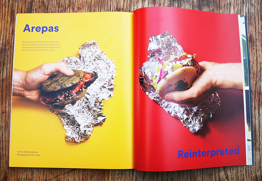
Top: Spread from Sabor showing arepas photographed by Dale Grant.
A New Type of Imprint is divided into three chapters. There is nothing new about this convention except for one genius decision: the editor, Solheim, outsources the design of the second chapter (as well as the cover) to new graphic designers for a fresh take on every theme. It provides a visual break in a hefty publication. The beautifully designed first and last chapters (by parent agency Anti) are clean and well paced, behaving much like parentheses; frames for something important, but full of meaning themselves.
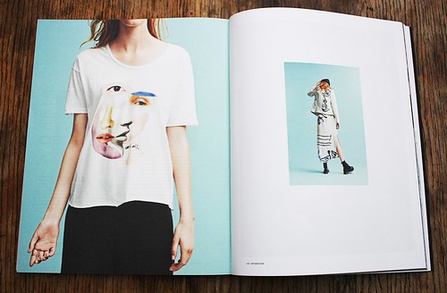
Spread from A New Type of Imprint vol. 4 showing photographs by Trine Hisdal.
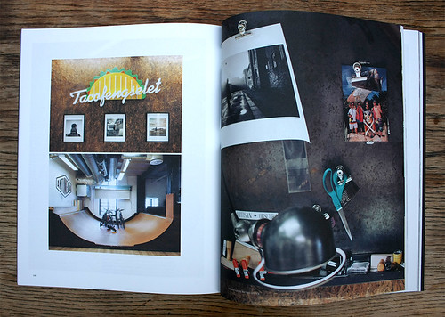
Spread from ‘Mancave’ showing photographs by Andris Søndrol Visdal.
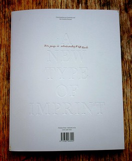
Cover of A New Type of Imprint vol. 4, published and designed by Anti.
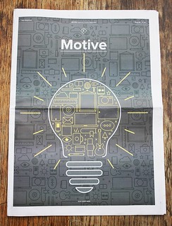
The creative industry is hard to break into. And once you have done that, it is hard to keep up. So what drives people towards it? The Creative Arts Network’s newsprint title Hue, edited by Chris Smyth, has the theme of ‘Motive’. It features artists, designers, photographers, a singer, filmmaker, songwriter and a dancer, all linked by their community, the church and their faith. But there’s something that runs deeper, the thing that drives all creative people, religious or otherwise, to pursue their industry.
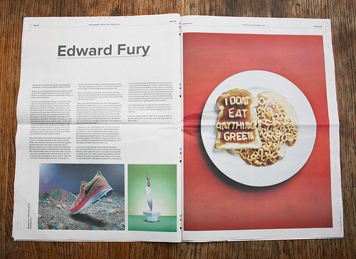
Spread from Hue showing the opening spread from ‘Edward Fury’, a still life and commercial photographer, 2015.
Hue cover, 2015. Cover design: Ollie Hoff.
The Creative Arts Network is now accepting submissions for its annual Creative Arts and Design exhibition. The theme this year is ‘madebymotive’ and invites open submissions from artists in all areas. More information can be found here. The deadline for submitting work is on 10 January 2016.
In an increasingly food-conscious culture, indie food magazines are everywhere. There’s Kinfolk, Fool (Swedish and stylish), Root + Bone and dozens more. Lucky Peach even published a cookbook that came out earlier in October – because what else is David Chang going to do when he’s not busy running Momofuku, or eating dry ramen noodles? The Gourmand recently won ‘Magazine of the Year’ at the Stack Awards, where founder Steve Watson told us that the magazine might not be mainstream, but it’s what mainstream should aspire to. (For more about foodie mags, see ‘Raw like sushi’ in Eye 87.)
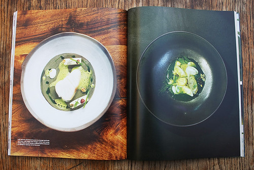
Spread from Sabor showing a Utah beach oyster in pea juice with turnips and a plate of cabillaud, asperge and ail des ours photography by Julien Grignon.
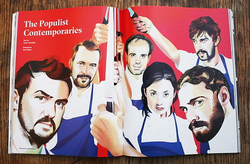
Spread showing illustrated portrait by Dan Wilton, 2015.
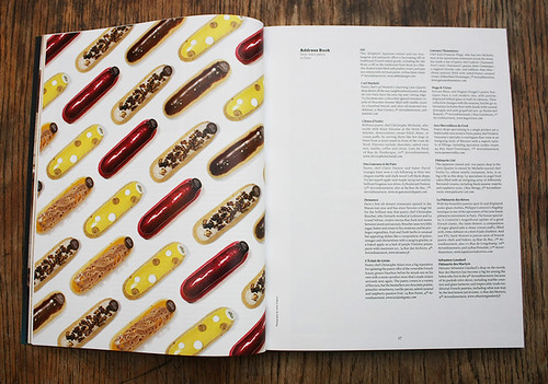
Spread from photograph of eclairs by Julien Grignon.
Sabor no. 1, 2015. Cover photo of Edoardo Cafasso by Julien Grignon. Art direction and design: Fermin Albert.
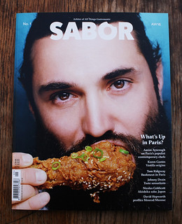
Sabor has recently launched its first issue, with features on the future of Paris’ food scene. Is it dying out, or do the delicacies of Paris have a bright future ahead? Sabor is divided into sections of ‘First’, ‘Culture’, ‘Features’, and ‘Travel’, each featuring articles and interviews with the people behind the food. Sabor has solid stories, great photographs of food, vibrant illustrations and Korean Fried Chicken on the cover.
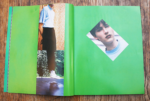
Spread from Recens Paper no. 3 showing photographs by Name A Moon After.
Cover of Recens Paper, 2015, showing model Carl Hjelm photographed by Jakob Landvik.
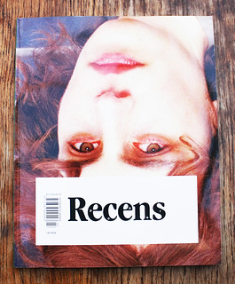
Recens Paper, another magazine from Norway, has published its third issue, which has a photography theme. Apart from its sophisticated cover and quality of print, you can tell that this is a magazine for young people by young people. There’s a naivety in its approach to the subject of society, with a defiantly post-internet aesthetic. Along with a copy of Recens Paper, we received a CD (but no download code), with an audio file that we are meant to listen to while reading the magazine: ‘The CD aims to reflect the observation of this issue through analysing sounds, tones and vibrations. It gives the reader an audible impression of the atmosphere, mood and spirit,’ say the editors.
Spread from Works That Work no. 6, 2015.
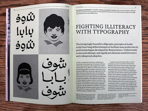
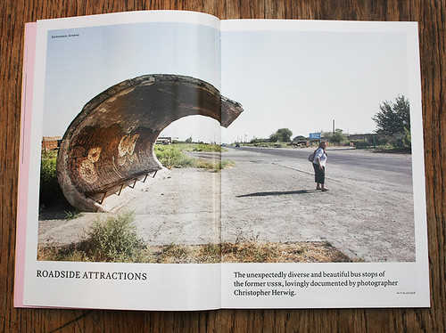
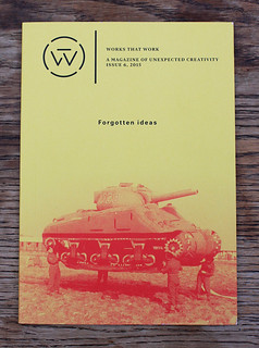
Works That Work covers its themes in a timeless journalistic manner, with design at its heart. The sixth issue, ‘Forgotten ideas’ looks at the role of creativity in everyday life, from Nasri Khattar’s pioneering approach to Arabic typography, making the written word easier to read (see ‘Beyond Latin’, Eye 90 and ‘Noted #71’ on the Eye blog), to the postwar concept of a ‘world passport’. It looks at the first uses of colour photography (a portrait of Tolstoy) and the beautifully eccentric bus stops of the former USSR, nutcrackers in the Amazon rainforest and cars powered by trees.
Works That Work no. 6 feature showing photography by Canadian-born photographer and videographer Christopher Herwig of a bus stop in Etchmiadzin, Armenia.
Cover of Works That Work no. 6, designed by Atelier Carvalho Bernau, showing photograph by Roger Violet / Hollandse Hoogte.
Eye is the world’s most beautiful and collectable graphic design journal, published quarterly for professional designers, students and anyone interested in critical, informed writing about graphic design and visual culture. It is available from all good design bookshops and online at the Eye shop, where you can buy subscriptions and single issues.