
Friday, 2:00pm
30 May 2014
Of monumental proportions
Lettering Large: Art and Design of Monumental Typography
By Steven Heller and Mirko Ilić<br>The Monacelli Press, $45.00
Lettering Large is a graphic designer’s coffee table book, easily read in one sitting but worth revisiting regularly, writes Sarah Snaith.
Illustrations of two-dimensional and three-dimensional lettering installed in public spaces both inside and out demonstrate an interplay between old and new. Heller and Ilić show how ‘monumental’ type can scream at passers by from the façade of a building, or can recede into the shadows until sunlight hits it at the right time of day.
Gastrotypographicalassemblage, CBS Cafeteria, New York, 1966. Concept design: Lou Dorfsman. Designers / typographers: Herb Lubalin and Tom Carnase.

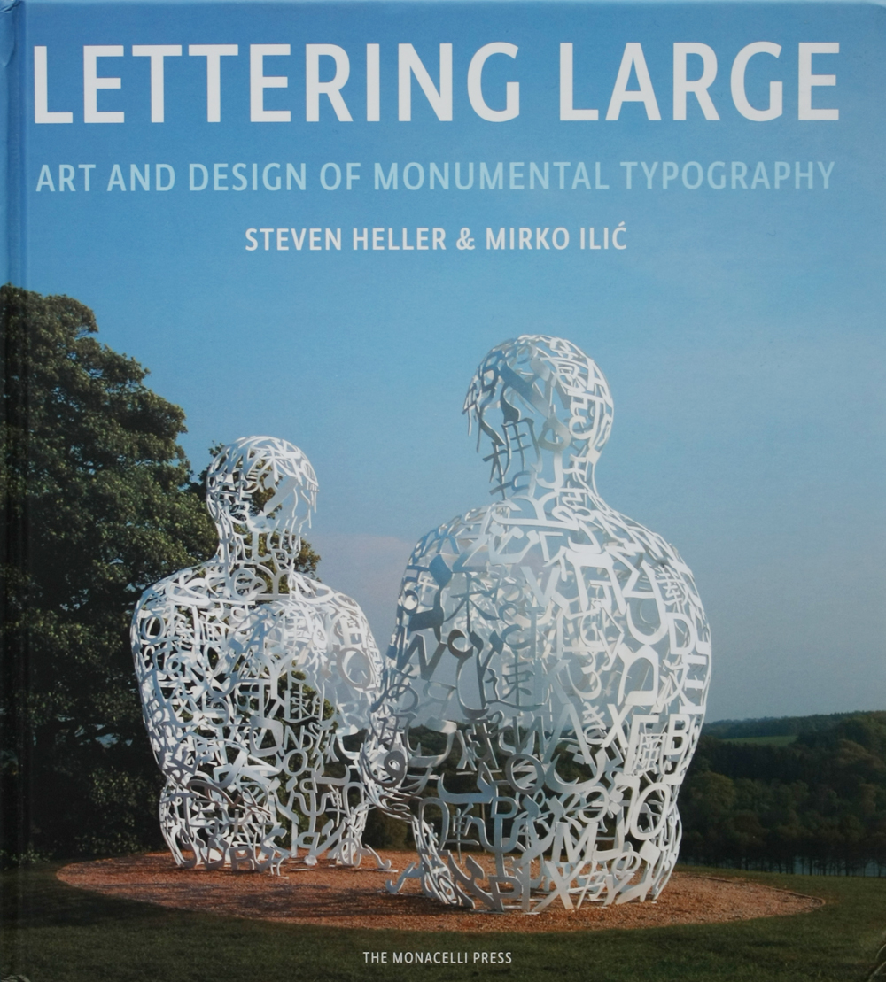
‘Between’, Foksal Gallery in Warsaw, 1977, by artist Stanisław Drożdż, set in Helvetica (left) and Archiscriptura, Leipzig, Germany, 1991, by designer Andreas Stötzner (right).
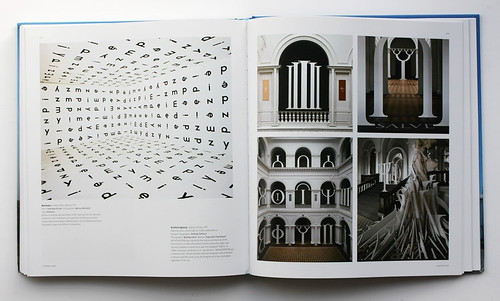
Belupo fountain, Croatia, installed in 2011 and designed by Studio Rašić; ‘I amsterdam’ designed by Erik Kessels, 2012; ‘A Memorial Bowing’ designed by Snarkitecture in Miami, 2012.
The book has an international scope (thanks in part to Google Earth) and includes typographic installations in and out of the hands of graphic designers; architects and artists appear equally responsible for placing monumental type in the environment.
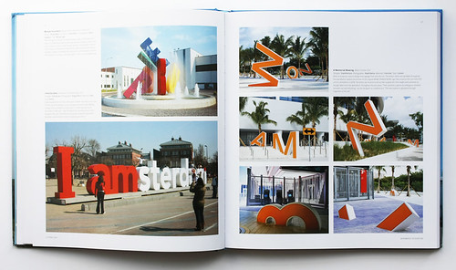
Spread showing ‘Hamad’ in Abu Dhabi, by artist Sheikh Hamad Bin Hamdan Al Nahyan, 2011(captured using Google Earth, left) and the AIGA poster designed by Timothy Eaton, photographed by Paul Shambroom, in Minnesota (right). Type: Garamond.
There are many familiar examples in Lettering Large, such as Barbara Kruger’s Picture This for the North Carolina Museum, 1997; Ivan Chermayeff’s famous red number nine at 9 West 57th Street in New York, 1979; the Blackpool Comedy Carpet by Why Not Associates and Gordon Young, 2011. There are also lesser known, deliberately impermanent fixtures, such as Thonik’s identity for Museum Boijmans van Beuningen in Rotterdam (2008-09) and Timothy Eaton’s AIGA type in snow, frozen for all time as a photographic poster.
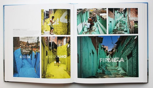
Light in The Alleyways, painted in Avant Garde Bold and designed by Boa Mistura Collective, Brazil, 2012.
Sarah Snaith, design writer and editor, London
Eye is the world’s most beautiful and collectable graphic design journal, published quarterly for professional designers, students and anyone interested in critical, informed writing about graphic design and visual culture. It is available from all good design bookshops and online at the Eye shop, where you can buy subscriptions and single issues.