Wednesday, 7:48am
28 March 2012
Pop panel
Music design session at Pick Me Up with Malcolm Garrett & Kate Moross

On Friday night, as part of a ‘packed programme’ of events, talks and workshops at Pick Me Up (the graphic arts fair at London’s Somerset House, now in its third year), I chaired a ‘Music x The Graphic Arts’ panel discussion, writes Liz Farrelly.
Since the digital revolution of the 1980s, the music industry has undergone radical changes in formats, distribution, style and substance.
The panel: designer Malcolm Garrett (Buzzcocks, Duran Duran); critic (and Varoom editor) John O’Reilly; the prolific Kate Moross; and Tom Oldham (label boss at No Pain in Pop and Berserker, an online music / comics magazine).
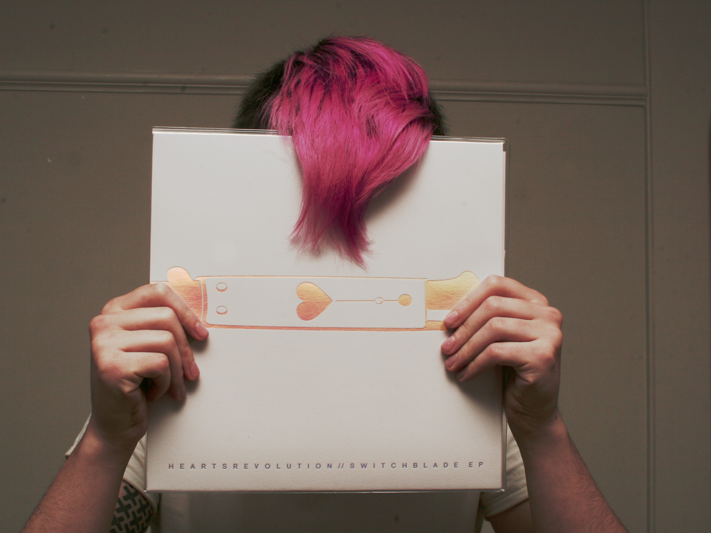
Top: Kate Moross and vinyl art.
Malcolm kicked off with his schoolboy Hawkwind obsession, which led him to Barney Bubbles. Highlighting the polarised nature of Britain’s tribal counter-cultures in the 1960s and 70s (naming IT and Oz magazines – seen above – as ‘the birth of blogging’), he suggested that with Punk, ‘it all changed’. In the 1980s, the zeitgeist was celebratory; the music industry sold lifestyles, with video and ‘merch’ paramount, and the first sponsored tour was by Duran Duran, brought to you by Coca-Cola.
Malcolm and his cohorts can claim a string of firsts: the first TV ad for an album (Duran Duran), the first pop webcast (Spice Girls), the first CD-ROM album (Peter Gabriel). Now it’s all about crossover. He cites the giant trade-show-festival, SXSW, as barrier breaking; interactivity is all. ‘I’d like to link the counter-culture of late-60s to the digital counter cultures of today.’
Above: three slides from Malcolm Garrett’s presentation.
John O’Reilly stated ‘Music is an early warning system for culture, society and commerce.’ What starts out in the nerdy, rarefied world of fans – file sharing, re-making bands in their own images (the gig poster phenomenon), launching micro-labels, breaking new acts online – has repercussions for the mainstream not too far down the road. John showcased image-makers creating ‘fantasy worlds’, via obsessively contrived (in a good way) visual languages. Julian House’s Ghost Box label approximates the British Modernism of Penguin Books, but his world is both a good joke and a dark place. Australian illustrator Dan McPharlin (see Eye 70) uses sleeve design to explore a ‘space opera’ future, ‘quoting’ Roger Dean’s Yes albums of the 1970s. His intricate paper models of analogue recording equipment reveal an attempt to ‘own’ a long-gone world.
John then explored the phenomenon of gig posters, and how fan-designers explode the careful branding of mainstream labels by reinterpreting their favourite brands in style after style after style. The White Stripes get it, embracing the visual diversity that slots them into so many cultures. Without the internet and gigposters.com, this global phenomenon may have stayed local, but digital communication has prompted an uptake of the hands-on, silk-screen print mode (see ‘Grab the hook’, Eye 76).

Kate Moross (top) made her first gig poster aged nineteen but made up for lost time: before long her posters ‘were all over London’. As a second-year Illustration student at Camberwell College of Arts, her street-level / MySpace fame (‘Every new band with a MySpace page needed a logo. I was the Logo Machine’) earned the commission of a lifetime; to re-imagine Cadbury. With the ‘loads of money’ earned, she started a record label, Isomorph, the intension being to release vinyl, and lavish much care and attention on its packaging.
Then the collaborations began, and Kate found herself on the road, VJ-ing live graphics, teasing out a vision, with the band as muse to their designer. With a savvy business head, Kate realised that merchandise is the way to make money in the music industry, and set up her T-shirt firm. She designs and prints, the band buy some, she sells the rest online. Kate cites her DIY attitude and ‘mini projects’ as prep for working with the ‘big time’ music industry.
Tom Oldham is a man of many hats. Five years back, he discovered the electronic end of the New Cross music scene while still a student at Goldsmith’s. He launched No Pain in Pop with the proviso that ‘everything’s got to look beautiful’ and he’s built a label with a wildly creative reputation. He described the agony and ecstasy of running that label as, ‘lots of little deaths, lots of little births’ and he’s credited with breaking new bands online by way of the label blog.
Having worked for the lobby group UK Music Oldham had a close-up view of how the music industry and government were resisting the online digital uptake, via the Digital Economy Act 2010. He quit to work in a comic shop and now combines two obsessions, music and comics, in online magazine, Berserker, soon to be published on paper, too. His parting shot was to suggest we are ‘living in an ontologically creative age’. Everything we do is creative, thanks to all those means and media, at our fingertips, ready to make stuff happen. The thought left the panel, and audience, on a high.
Pick Me Up continues until Sunday 1 April 2012 at London’s Somerset House.
Eye is the world’s most beautiful and collectable graphic design journal, published quarterly for professional designers, students and anyone interested in critical, informed writing about graphic design and visual culture. It’s available from all good design bookshops and online at the Eye shop, where you can buy subscriptions and single issues. Eye 82 is on its way to bookstores and subscribers worldwide. For a visual sampler of the new issue, see Eye before you buy, eyem.ag/EBYB82 on Issuu.


