
Thursday, 11:30pm
24 February 2011
Port of entry
the magazine department
Graphic design
Illustration
Magazines
Typography
Visual culture
Two art directors and an editor launch a brand new men’s magazine
You could be forgiven for thinking that the cold Spring of 2011, with its cutbacks, closures, price hikes and app-frenzy is not the best of all possible times to launch a new magazine, writes John L. Walters.
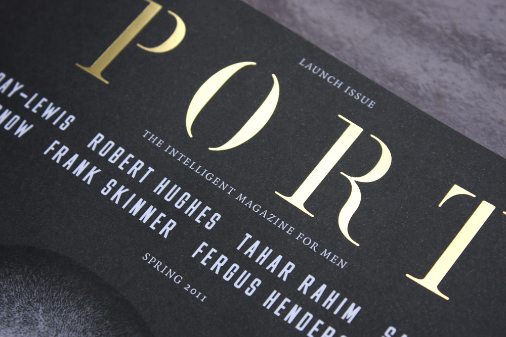
Especially a beautifully printed quarterly targeted at affluent, stylish city-dwellers. Yet here comes Port, an independently financed start-up spearheaded by two art directors and an editor, brimming with confidence, big pictures and long articles.
Sure, there’s an iPad app (about which more later) and a website, but it’s the 192-page print manifestation that lies at the core of what the founders hope will become an enduring, collectable artefact and brand – perhaps closer to Tom Wolsey’s Town or early American Esquire than any more recent titles serving the now-dwindling popular market for men’s mags.
The men behind the idea may be familiar to many Eye readers. Matt Willey is a principal of Studio8 and the art director of Elephant magazine; Kuchar Swara was formerly a designer at Wink, where he art directed and re-designed Case da Abitare with Tyler Brûlé; and Dan Crowe was the editor of literary journal Zembla, which is where he and Willey, then employed by Frost Design, first met.
For Crowe, Port is the solution to a ‘massive gap in the market’. He and his collaborators love magazines, and have been appalled by the ‘disintegration of mainstream men’s style magazines’ that began in the 1990s. ‘With the demise of content, you see the demise of design,’ says Crowe. ‘You need to have great content to have great design.’
Port’s solution to this crisis is to assemble an expensive-looking product for next to nothing. They gently persuade the writers, photographers and stylists in their high-profile address books to write in return for, say, a ‘very nice bottle of wine’ (Martin Amis), a first edition (Frank Skinner) or a colourful tie (Jon Snow). The cover star is Daniel Day-Lewis, who ‘hasn’t done a cover for six years,’ with whom Crowe worked on a book for publishers Rizzoli. Day-Lewis contributes a piece of reportage about the time he visited Gaza with Médecins sans frontières.
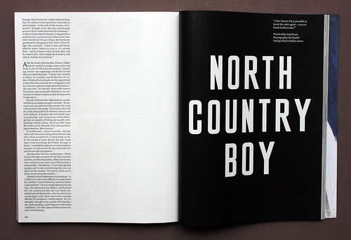
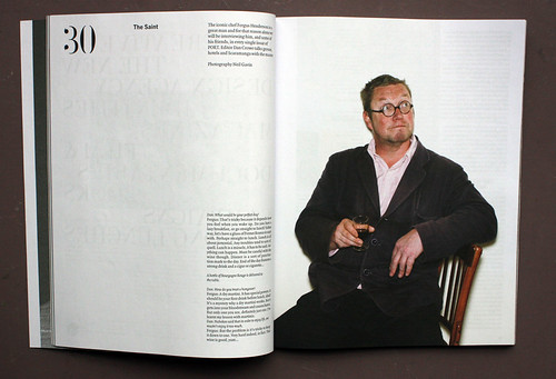
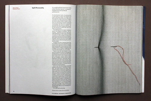
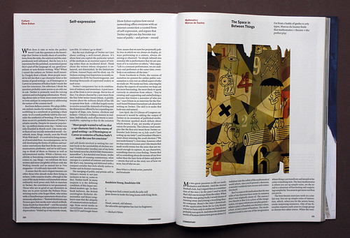
The art direction and typography is spacious, considered, serious without being too solemn, with two custom display typefaces designed by Willey. A centre section is devoted to writing: fiction and non-fiction are set soberly in a three-column grid with calm headers.
But isn’t this the worst of all times to launch a new men’s magazine? Willey emphatically thinks not. ‘It’s a brilliant time to launch a magazine!’
The launch issue will be on sale from around 4 March 2011. Port’s website: port-magazine.com

More about Port, its creators and its iPad app (designed by MagCulture’s Jeremy Leslie) in Eye 79.
UPDATE: You can now get the free Port app for iPad here.
2nd UPDATE. The app died.
Eye is the world’s most beautiful and collectable graphic design journal, published quarterly for professional designers, students and anyone interested in critical, informed writing about graphic design and visual culture. It’s available from all good design bookshops and online at the Eye shop.