
Friday, 6:30am
17 April 2009
Revival! preview
Design history
Graphic design
Photography
Posters
Technology
Typography
Visual culture
Speed-dating, craft, obsessive photography and The DFC

Revival!: Eighth Annual Friends of St Bride Library Conference
St Bride Library, London, 23 and 24 April 2008
This conference, explain the organisers, explores how we reinvigorate contemporary design thinking through a reconsideration of what it is we think we do best. The past has a part to play in such a reconsideration. On offer at this event then are a series of talks and displays, which set out the stories of key practitioners and their re-engagement with what it is they do as designers, writers and makers by looking backward to find fresh creative directions, renewed enthusiasm and a way forward.
A contemporary book design theme is set in context by an overview from Alan Powers of the contribution to design revivalism made by The Curwen Press. The ‘mock-historic’ so prevalent in cover design is explored by Eleanor Crow. David Pearson and designer John Morgan respectively set out their very individual responses to the challenge of confounding expectation in book design.
How exactly are we to have conversations with our elders is the theme of Paul Stiff’s look at revivalism in typography, which questions whether speed-dating is our best bet.
Claudio Rocha looks at the place past technologies play in current reconsiderations of typography, describing the work of the Oficina Tipográfica in São Paulo, Brazil, where digital designers are encouraged to find creative freedom through engaging with the limitations of letterpress.
Counter-intuitive formatting is a thread common to several talks. That, and a passion for print. David Fickling and Sarah McIntyre will be talking about the determined and hugely successful launch of a new comic, The DFC, against, it would seem, everyone’s better judgment. And Ben Terrett and Russell Davies of the Really Interesting Group discuss the rationale behind their almost perverse project to put into print only material generated online. The newspaper they made sold out almost instantly.
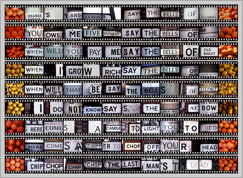
Above: Oranges and Lemons by Martin Wilson. Wilson captures words and letters from urban typography (road markings, billboards, rubbish, etc) frame by frame on 35mm film strips to spell out messages. Top: Look Both Ways.
On a micro-level, revival in type design has been a preoccupation from the time of William Morris. Both James Mosley and Will Hill bring new perspectives to the business of type design revivals – the good, the bad and the very, very ugly – while Henrik Kubel sets out the joyful business of reviving a classic 1960s Margaret Calvert type.
The business of just what to do with age-old brands in the here and now is elaborated upon by Kath Tudball and Julia Woollams of Johnson Banks.
John Hannah and Yulia Brodskaya each, in turn reflect upon the revival of the hand-made in contemporary graphics. Hannah shares his need to constantly find inspiration from the past, while Brodskaya shows her extraordinary country craft skills made chic in paper quilling illustrations and lettering. And artist Martin Wilson (illustrated) shows works that recapture words and lettering from urban typographies in the creation of unexpected, though often familiar, messages.
The full conference programme is now available on the St Bride website (stbride.org), where you can also book online.
The latest issue of Eye (no. 71 vol. 18) is a Type special. Get it today!
Look out for more type articles during Eye’s seemingly never-ending ‘Type week’.