
Monday, 6:30am
20 April 2009
Rue Britanica
Typeface name changes after Eye magazine goes to press
It’s the moment every journalist and editor dreads. You decide to write an article, writes Eye editor John L. Walters.
You do the research and interview the people concerned. Commission the portrait and gather the relevant images. The piece is written, checked, subedited, laid out and trimmed; hours are spent fine-tuning the headline, standfirst, captions and pictures, until it’s ready for further photography, retouching and corrections at the repro house before the final PDFs are sent to the printers. Where the feature is printed alongside all the other articles, ads and reviews. And then comes a polite email saying that the name of the subject of your piece, which is also printed in the contents, spine, colophon and back cover of your magazine, has changed.
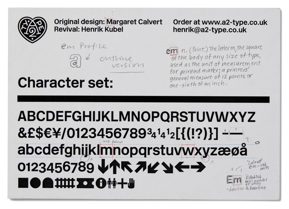
This happened to us with ‘Britain’s signature’, (Eye no. 71 vol. 18) my short feature about the first commercially available typeface from A2 in London, a collaboration between Margaret Calvert and Henrik Kubel (read the Eye article for the full story).
Late last month, while the magazine was being bound, we received this polite email from Margaret Calvert:
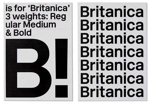
‘Regrettably, on the advice of lawyers, we felt it prudent to rename the revival of the original British Rail Alphabet (Britanica) “New Rail Alphabet”, thus avoiding any possible objection from Encyclopaedia Britannica, regardless of the omission of the second “n”. This, at least, relates to common practice . . . Consequently, any interested party opening up the website noted in your article will discover that the name has changed.’
‘Britanica’ is now a footnote in graphic design history. Or maybe the answer to a trick question in a type quiz? Even if you copy the URL www.britanica.co.uk from the article in Eye no. 71, it changes to www.newrailalphabet.co.uk/index.html before you can say ‘Jock Kinneir’ (see Eye 34).
‘What’s in a name?’ asked Shakespeare’s Juliet. ‘That which we call a rose / By any other name would smell as sweet.’ Puff Daddy became P Diddy. Prince changed his name to a squiggle (not such a good move), then changed it back again.
Admirers of Margaret Calvert’s signing alphabet for British Rail, also used by British airports, hospitals and the Danish railways DSB (where Henrik’s Dad worked), can still appreciate (and buy) the six weights of Brit— sorry, New Rail Alphabet without any lawyers breathing down A2’s necks.
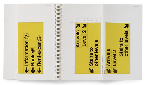
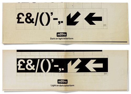
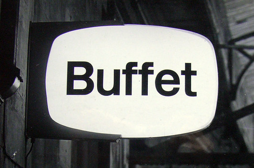
Above: examples of Rail Alphabet from various style manuals, plus our brief encounter with an old British Rail ‘Buffet’ sign (Margaret doesn’t like this example of her typeface in use, preferring the airport signs shown in the final article and on the back cover of Eye 71).
The latest issue of Eye (no. 71 vol. 18) is a Type special. Get it today!
Look out for more type articles during Eye’s ‘Type week’.
Eye is the world’s most beautiful and collectable graphic design journal, published quarterly for professional designers, students and anyone interested in critical, informed writing about graphic design and visual culture. It is available from all good design bookshops and online at the Eye shop, where you can buy subscriptions and single issues.