Monday, 12:58pm
1 March 2010
Signs of a city
Eye revisits the typography of Athenian street signs
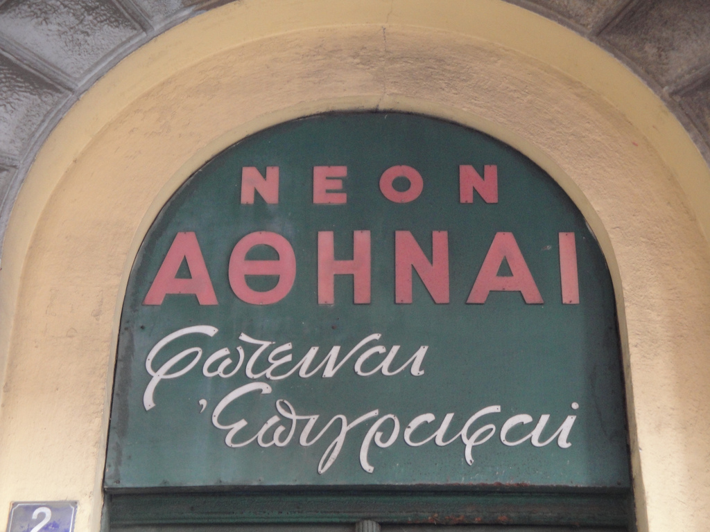
When Minos Zarifopoulos wrote about Athenian street signs in Eye 45, he worried that a project to remove modern billboards and other ‘visual disturbances’ could give the impression of ‘walking around an open-air museum of how Athens used to be’, writes John Ridpath.
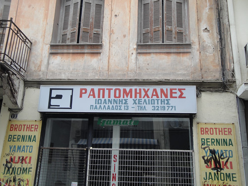
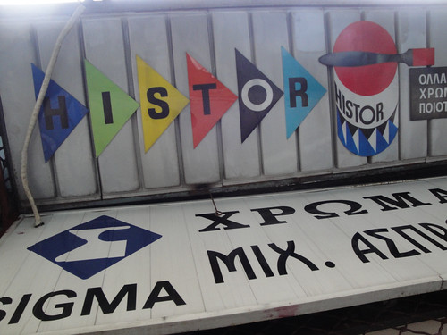
Eight years on, it’s still up for debate whether tidying up the main squares and thoroughfares has rejuvenated the city or glossed over its recent history. But in the back-streets of central Athens a rich history of shop sign typography is still everywhere to see, and still evolving.
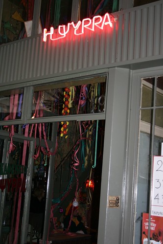
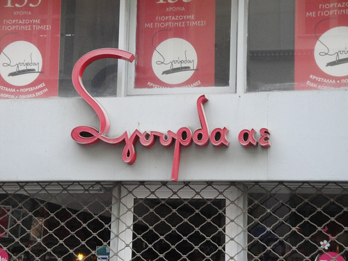
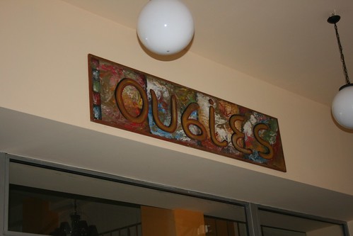
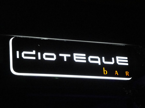
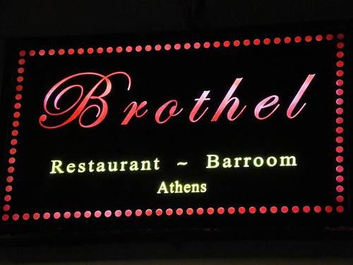
Eye revisited Athens for this year’s Design Walk (see ‘Athenian walkways’). While we were out there, we took some new photos of the signs (see below, more images on Flickr).
‘The visual language used manifests the passage from tradition to modern life – from the art of the signwriter to digitally produced letters on aluminum light boxes. Early forms of signs showed the title of the service and name of the owner. These were followed by a westernised type of sign vocabulary with trendy foreign words written in Greek characters and the “all singing, all dancing” animated neon signs together with more recent, ethnically targeted signs set in Russian, Indian or Chinese.’ (Minos Zarifopoulos, ‘Urban renewal’, Eye 45)
Photographs by John Ridpath and Kirsty Allison.
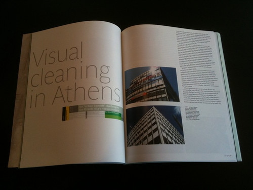
Below: Spreads from ‘Urban renewal’, Eye 45.
Eye, the international review of graphic design, is a quarterly journal you can read like a magazine and collect like a book. It’s available from all good design bookshops and at the online Eye shop, where you can order subscriptions, single issues and classic collections of themed back issues.

