
Wednesday, 3:31am
24 October 2012
The Bloomsbury set
De Bondt, Boom, Burrill, Butterick, Garland, Kubel, Scher and many more make Typo London 2012 a highly ‘Social’ affair. No question about it.
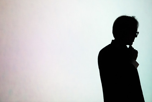
Typo London commenced with graphic designer Sara De Bondt’s fittingly understated introduction, writes Sarah Snaith.
With less fuss, fewer visible sponsors and a shorter, tighter schedule, FontShop’s international design conference returned to Logan Hall (at the Institute of Education in Bloomsbury) for the second year running.
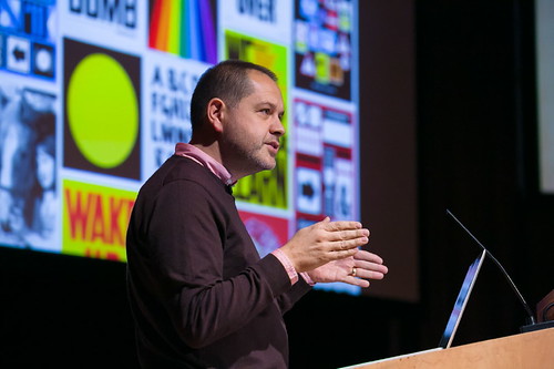
The highly sociable Anthony Burrill presents a body of his poster designs on day one of the conference. Photograph: Gerhard Kassner.
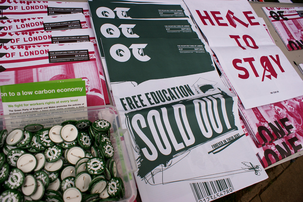
Top: A selection of Occupied Times printed material displayed at the TUC demonstrations on Saturday.
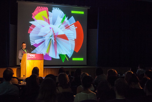
Marius Watz’s presentation ‘Co-discovering with Machines (Or Algorithms, our Beautiful and Problematic Friends)’. Photograph: Jason Wen.
Originating in 1995 in Berlin, the conference spread to London in 2011 and San Francisco earlier this year. While some speakers appear to do a Typo ‘circuit’ of sorts, less familiar names such as Vaughan Oliver and Henrik Kubel became conference highlights. Speakers very loosely adhered to the theme ‘social’, that was represented by the conference’s ‘pie chart’ visual identity.
‘It’s important to think about the image of movements’ said Noel Douglas of Occupy Design UK. Douglas, joined by the designer of the Occupied Times magazine Tzortzis Rallis, gave an impassioned presentation in the Drama Studio on Friday afternoon. The pair showed covers, spreads and posters that referenced popular culture with a political twist. Openly critical of both Typo’s student pricing and D&AD’s recent student award brief to rebrand the city of London, the talk drew the attention of fellow speaker Ken Garland, who jumped up to the microphone to voice his support.
This was a rare moment of audience participation. One criticism voiced by many attendees was the lack of opportunity for questions at the end of most sessions: Typo London (like ‘Here’ in September) was a conference in which little ‘conferring’ took place in public.
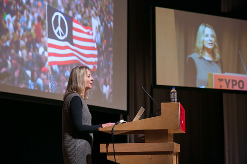
Paula Scher of Pentagram presenting her ‘Breakthroughs, successes and failures’. Photograph by Gerhard Kassner.
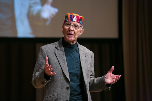
Early on Saturday, under the title, ‘word and image’, Garland (see ‘Last things last’ in Eye 83) gave a two-part presentation that began with him perched on the edge of the stage, reminiscing about the ‘quirky’ speakers he had encountered over the years, Buckminster Fuller or ‘Bucky’ being one of them.
Taking to the altar, Garland requested dimmed lighting before bringing tears to the eyes of many audience members with a poetry reading set to a colour palette of white, green, blue, red and black. The last poem told the story of a young boy dressed in a black vest and shorts who incessantly rings his front doorbell. The unique and personal atmosphere Garland created in the auditorium can be experienced via the Typo Video Blog.
Saturday’s first speaker Ken Garland, captivating the audience with poetry. Photograph: Gerhard Kassner.
Matthew Butterick. Photograph: Gerhard Kassner.
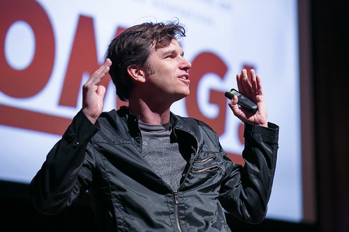
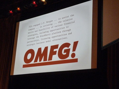
Author of Typography for Lawyers, American designer / writer / lawyer Matthew Butterick gave one of the most persuasive presentations of the conference. A highly compelling and quotable speaker, Butterick shared his opinions of social media, digital technology and typographic integrity with statements that criticised the way ‘indirect nonsense’ (illustrated by a Blackberry press statement, below) is preferred to the risks of honest communication’.
Butterick’s position on the future of print came from a fresh perspective. Lambasting the repetitive template of newspaper websites he blamed a lack of ambition and the inhibiting influence of Web standards, taking serious issue with designers who ‘give up control for consistency and reliability’. (See Matthew Butterick’s website for more about the subject). ‘What we lose to technology, we are going to lose forever’ he said, ‘we will lose the possibilities of paper’.
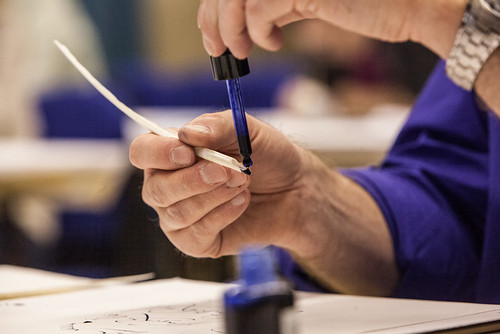
A goose quill calligraphy workshop with Andreas Frohloff. Photograph: Jason Wen.
Typography specialists who presented in the Jeffery Hall on Saturday afternoon included Gerry Leonidas, Freda Sack and Paul Barnes, each who offered insights into their approach to the discipline.
Type designer Henrik Kubel of A2 (see ‘A2’s type design’ in Eye 67) won over the audience in Jeffery Hall almost immediately by proclaiming his nervousness and rocking slightly on the podium, threatening to fall off the edges. The quality and precision of his typographic work, paired with his humour and honesty, was highly engaging.
Suddenly realising that time was running out, Kubel sped through his final twenty or so slides with condensed descriptions. ‘This is Antwerp, I developed it in Antwerp, it’s a book face’, earned him a roar of laughter from the crowd.
Henrik Kubel. Photograph: Jason Wen.
Closing speakers Paula Scher (on Friday evening) and Irma Boom (Saturday), presented enticing yet very different bodies of work. Scher spoke with the confidence of a well versed speaker, accustomed to sharing her work to crowds of willing listeners.
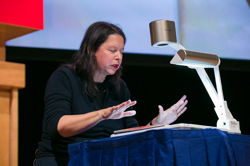
Boom, with closed eyes and an overhead projector, demonstrated her love for making books that are ‘intriguing and challenging to pick up.’ She ran over her slot by 45 minutes, finishing with a book (from an unknown designer) that was smaller than the tip of her finger.
Irma Boom with one of her book designs under the projector. Photograph: Gerhard Kassner.
 To read about work from other Typo London speakers, read ‘Type Tuesday: Forward to page 1’ from the Eye blog about GraphicDesign&’s Page 1: Great Expectations, a review of Karlssonwilker’s design of Creative Time: The Book in ‘NYC outside the box’ from Eye 65 and ‘Over the rainbow’ about Anthony Burrill from Eye 75. Read also Gerry Leonidas’s ‘Telling it like it is’ review of Typo London 2011 in Eye 82.
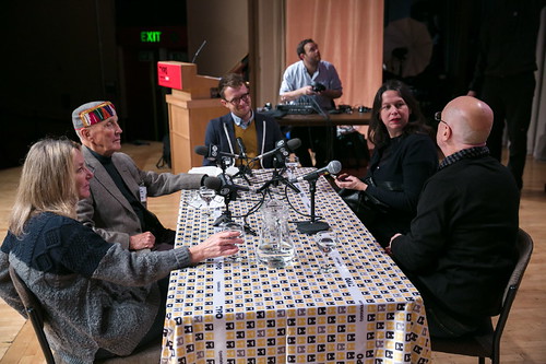
Panel discussion.
Eye is the world’s most beautiful and collectable graphic design journal, published quarterly for professional designers, students and anyone interested in critical, informed writing about graphic design and visual culture. It is available from all good design bookshops and online at the Eye shop, where you can buy subscriptions, back issues and single copies of the latest issue. You can also browse visual samples of recent issues at Eye before You Buy.