
Monday, 11:50am
27 July 2009
The Form of the Book 6
Fully Booked vs. Jan Tschichold’s
The Form of the Book; it’s a knockout
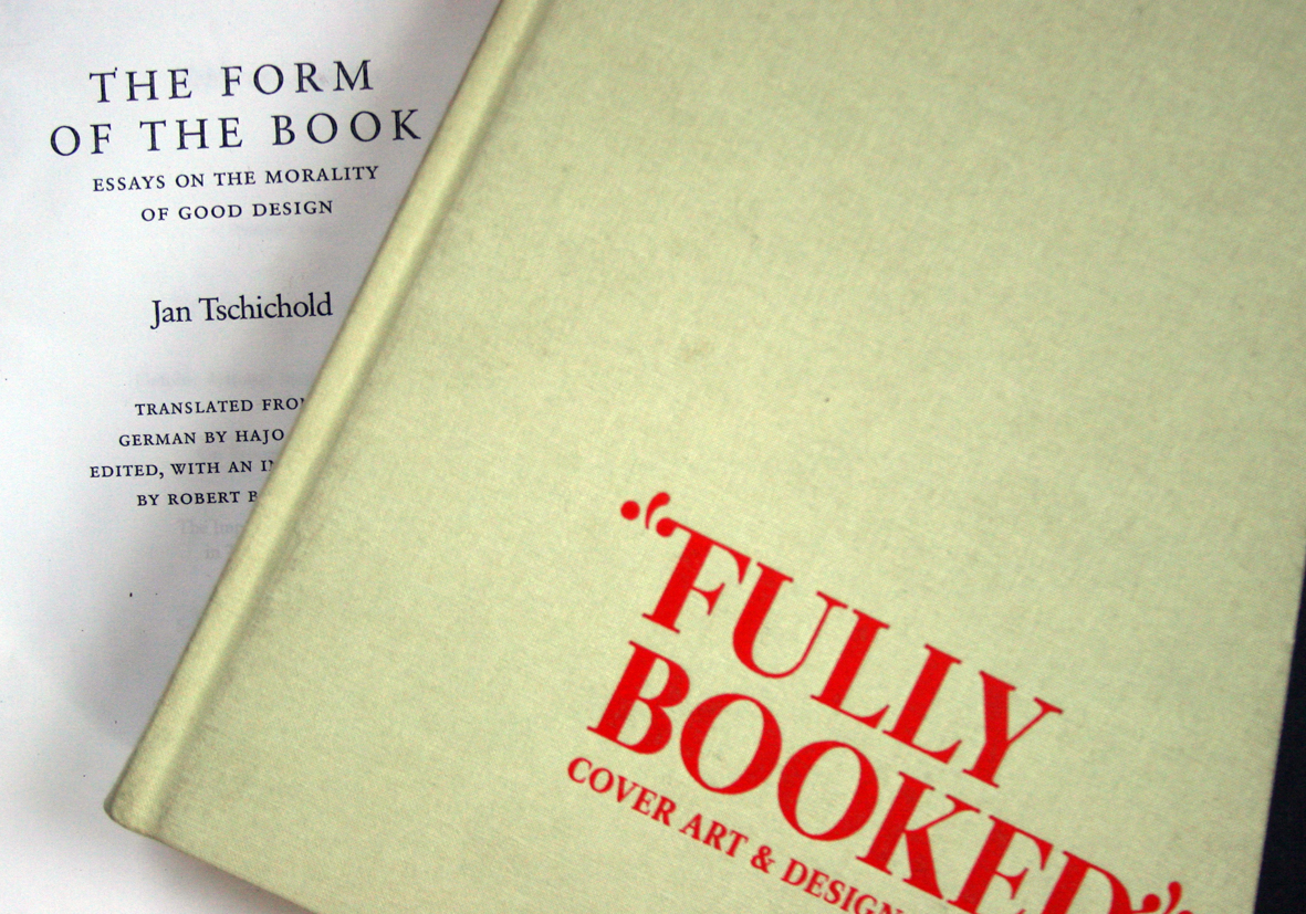
In the red corner we have The Form of the Book by Jan Tschichold in 1975 (English translation published by Lund Humphries in 1991) weighing in at 182 pages.
In the blue corner we have Fully Booked (see ‘Page turner overdrive’ in Eye 69) edited by Robert Klanten and Matthias Hübner, published by Gestalten in 2008 weighing in at 272 pages.
I design books for a living, writes Fraser Muggeridge, but admit with embarrassment that I don’t actually read many from cover to cover.
However The Form of the Book is a brilliant read. When I read it in bed at night, I know why I’m a book designer – I can’t put it down. I know why the choice of typeface is so important and I know why Tschichold was such a master. Why can’t all books be like this?
The names of the chapters are so straightforward and to the point, I love it:
‘The Importance of Tradition in Typography’
‘Consistent Correlation Between Book Page and Type Area’
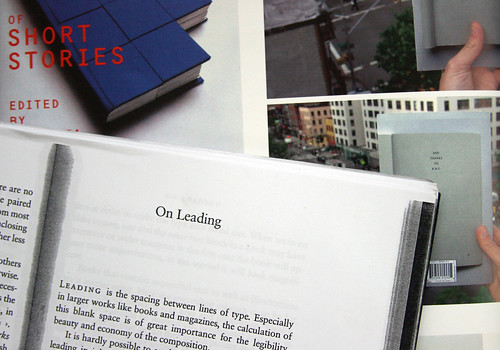
‘On Leading’
‘Printing Paper: White or Tinted?’
‘Ten Common Mistakes in the Production of Books’
The book is limited to a small number of illustrations: title pages and sketches of page layouts and that’s about it. As well as telling us what to do, Tschichold also tells us not what to do, it’s like this is his Ten Commandments. As a designer, I am grateful for his lessons, tips and advice, and am ready to start work on the next book. This book goes the whole twelve rounds.
So that was 1975, now to the present day (well, 2008 is close enough). Fully Booked looks good on the outside but is rather flaky on the inside. We are presented with countless examples of book designs, pictures and more pictures, blah de blah, blah de blah. Nothing about the process, just the finished thing. When I look closely I am shocked by the poor quality of typesetting (auto hyphenation creating terrible line breaks) and a number of basic typographical mistakes (Tschichold will be turning in his grave by now).
Then on page 106 the text just stops mid-sentence, I am ‘fully shocked’. But there is one book that I’m interested in, Truck and Type, so I track down the designer and asked him where I can get a copy, only to find out that he couldn’t find a publisher for it.
I’m on the floor. What’s going on? Fully Booked all about the concept and nothing about the content whereas The Form of the Book is all about the content.
What Tschichold wrote in 1975 was so right then and more importantly is so right and even more relevant today. Technological advances in the way books are designed and in the way they are produced have changed drastically but the basic fundamentals of book design: text and image on a page, have not altered.
This is the knockout punch.
We can still learn a great deal from The Form of the Book, the winner and its writer, the undisputed champion: Jan Tschichold.
Sara De Bondt and Fraser Muggeridge curated the book design conference ‘The Form of the Book’ at St Bride’s in January 2009. The book about the conference, The Form of the Book Book will be published by Occasional Papers in Autumn 2009.
See ‘Beyond our Ken’, the Eye blog about The Master Builder: Talking with Ken Briggs by Sara De Bondt and Fraser Muggeridge.
Fraser Muggeridge, www.pleasedonotbend.co.uk
See Richard Hollis’s ‘Tschichold: contention and celebrity’ in Eye 71.
Eye is the world’s most beautiful and collectable graphic design journal, published quarterly for professional designers, students and anyone interested in critical, informed writing about graphic design and visual culture. It is available from all good design bookshops and online at the Eye shop, where you can buy subscriptions and single issues.