Monday, 9:00am
20 October 2008
The Independent: too gaudy for words
An exclusive, Web-only Critique by Rick Poynor for the Eye blog

I always liked the idea of The Independent and there have been a couple of periods, especially after it launched in 1986, when I defected to it from The Guardian. Even so, it has been a long time since I read it regularly, although the campaigning front pages produced since its 2005 redesign by Cases i Associats were eye-catching and occasionally led me to buy it. My main stumbling block is the tabloid page (and that goes for The Times, too). No matter how these two papers might rationalise the switch from broadsheet, the smaller size – also used by the Daily Mail – remains inherently down-market. The Guardian’s brilliantly managed move into new territory with the Berliner format underlined how dowdy, unimaginative and old-fashioned its rivals had become.
New editor Roger Alton’s revamp of the Independent, announced with the strapline ‘New full-colour edition’, made me look again – not because I see colour as a vital inducement but because I wanted to know why the paper thought it was. While colour throughout the news pages might now be the norm, from an editorial perspective colour is helpful only to the extent that it encourages you to read the news, perhaps because it looks more accessible. Beyond this, there is the tricky business of using colour to add some extra layer of interest, drama or explanation to the stories. This requires a high level of design skill combined with journalistic insight. If a picture is not well chosen, not well sized or cropped, not placed sensitively in relation to other pictures and all the page elements that surround it, then it makes no difference whether it is in colour or black or white. In fact, if it’s a colour picture poorly used, this is potentially worse, because it will be even more intrusive and distracting.

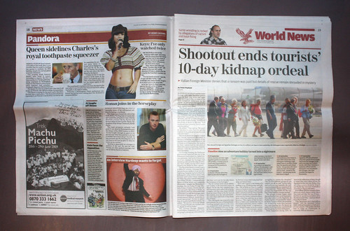
I had read some lukewarm reactions to the redesign, but nothing prepared me for quite how tacky the full-colour Independent now looks. The paper splashes colour around with no sense of control or finesse, as though more can only equal better. On every page it feels like too much is going on: the colour elements draw the eye in every direction with little sense of structure, hierarchy or focal point. The dollops of colour applied to straplines, bars and rules – there are far too many – only make matters worse. Colour ads, which take great bites out of the corners of many of the news pages, compound the visual confusion.

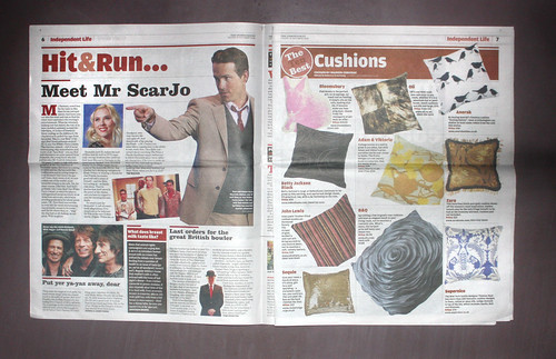
In its clumsiest moments, the main paper resembles a local paper, or one of the freesheets giving the paid-for press such a headache. The Guardian, working with the advantage of larger pages, sustains an engaging visual rhythm, counterpointing large, exciting colour images with smaller, less important pictures. The Independent is just clunky, its conviction that any colour picture is better than none leading it to stuff them into every available cranny. This is even worse in the daily ‘Independent Life’ features section, where great blocks of muzzily printed colour look soggy and unappetising. The Independent has always had some excellent writers and the reporting and analysis may be as good as ever. The trouble is it doesn’t look like it.

It is incredible that a title once bracketed with the Guardian as a socially liberal paper could fail to learn from what its rival has achieved with design: Alton worked there before editing its sister paper, The Observer. This is not to say that The Independent should copy the Guardian’s appearance, but it could certainly emulate its competitor’s boldness, originality and consistency of branding with a new design approach that instantly conveys a sense of what is different about the paper’s stance. (The Indie’s website, on the other hand, is so bland and colourless it could belong to a different paper. Meanwhile, guardian.co.uk makes exemplary use of colour.)
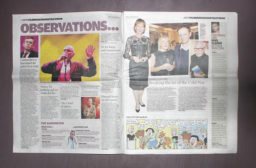
A week after it was introduced, the Independent’s redesign didn’t even appear to be finished. The education section had a new style, modelled on the main paper, with a pointlessly fussy seven-column grid, while the media section still conformed to Cases i Associat’s previous six-column design. It was less cluttered but slackly handled.
Newspapers everywhere grapple with circulations in long-term decline, as they fail to convince a younger generation of internet users that a daily paper habit is worth acquiring. If papers are to stand any chance of flourishing now, a more contemporary grasp of design is essential. The Independent opts instead for an image that mixes elements of its former sobriety, now badly mangled, with a formulaic, middle-of-the-road disregard for visual niceties. This appearance of ‘vigour’ might be enough to persuade some Times and Daily Mail readers to give it a try. But the Independent’s gaudy new set of clothes does nothing to establish a once elegant paper as a manifestly vital force.

Eye is the world’s most beautiful and collectable graphic design journal, published quarterly for professional designers, students and anyone interested in critical, informed writing about graphic design and visual culture. It is available from all good design bookshops and online at the Eye shop, where you can buy subscriptions and single issues.
