
Thursday, 6:26pm
26 July 2012
The Olympic press gang
Editorial designers get into the fast lane to deliver print for the Games
One big, but largely unsung design challenge of the 2012 Olympic Games has been the print production and design of 55 different publications, from the 196-page, perfect-bound Official Programme to an Olympics daily, the first of which is due to roll off the presses early on Saturday morning, writes John L. Walters.
 The contract fell to Teddington-based Haymarket Network, publishers of soccer magazine FourFourTwo and customer publications for Manchester United, the Champions League and the FA Cup final.
When I contacted Haymarket creative director Paul Harpin about the project he was full of enthusiasm for the job: ‘I had wanted to work on the Olympics since I traced the Mexico 1968 logo as a child,’ he said. ‘This and the Munich 1972 identity by Otl Aicher are my favourite pieces of work.’
Harpin and editorial director Simon Kanter have assembled a big team at Teddington including twelve designers. The Olympics job runs to 55 printed items – 4230 pages in all – using six different printers, and they have already completed 22 publications. The print run is enormous, and the print production continues right up to the end of the Paralympic Games in September.
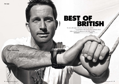
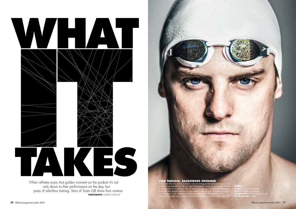
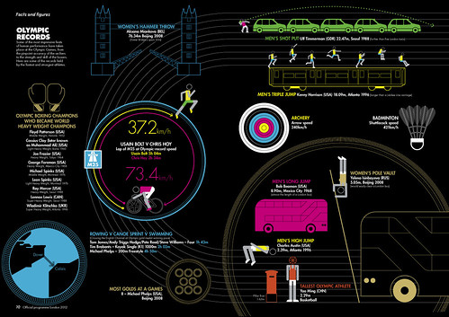
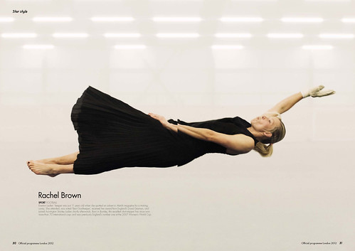 The Official Programme includes strong photography from Jonathan Glynn-Smith (above), Andrew Shaylor (top) and Michael Harvey, and illustrative infographics by Ian Dutnall (below).
There are features about kit, poster art by Peter Blake and a ten-page article about architecture and sustainability.
The typography mixes Futura with Gareth Hague’s official Olympics font. (See ‘A spiky typeface for a spiky logo’ on the Alias website.)
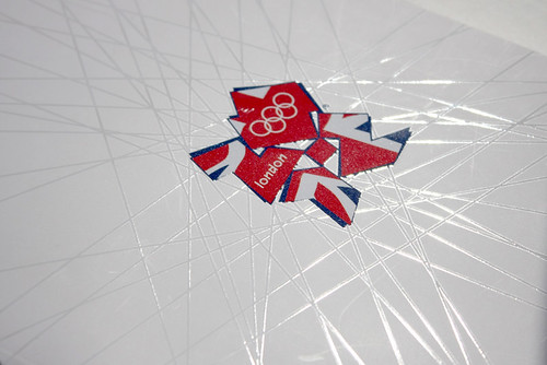
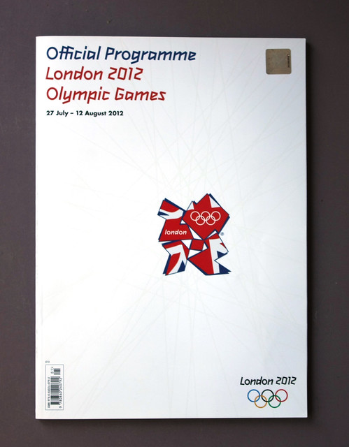
The cover (detail, below and bottom) displays the notorious Wolff Olins logo, suspended like a patriotic fly in an angular spider’s web of spot varnish which is consistent with the ‘One Look’ of the 2012 Games’ corporate identity.
 Harpin is now looking forward to working on the daily programme: ‘The dailies have been in page design for six months and next week up to 44 staff will be working [on it] like a national newspaper team.’
They will close a fresh edition every night. By 5.30 the following morning the dailies will sit alongside the main programmes in all the Olympic venues. Art director for the daily is Chris Barker; editor is David Edwards, formerly editor of Eureka.
‘Personally I think the identity has worked very well for London 2012,’ says Harpin. ‘The logo and font have high recognition and the secondary font Futura makes great magazines and programmes (remember Elle and Elle decoration!)’
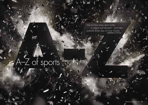
Above: illustration by Sean Freeman.
I asked Harpin what he thought about making printed materials for the Olympics, when many pundits are predicting the slow death of print, and there are plenty of apps and websites to track the events.
‘Print is far from dead,’ replied Harpin. ‘Everyone wants a physical memory of this amazing event.’
Credits: published by Haymarket Network: creative director: Paul Harpin; editorial director: Simon Kanter; group art director Martin Tullet.
Official Programme: editor: Johnny Aldred; art director: Ben Martin.
Eye is the world’s most beautiful and collectable graphic design journal, published quarterly for professional designers, students and anyone interested in critical, informed writing about graphic design and visual culture. It is available from all good design bookshops and online at the Eye shop, where you can buy subscriptions and single issues. Eye 83 is out now, and you can browse a visual sampler at Eye before You Buy.