
Friday, 12:31pm
13 March 2009
The Peter Saville principle
‘Music covers are not graphic design, they communicate nothing’
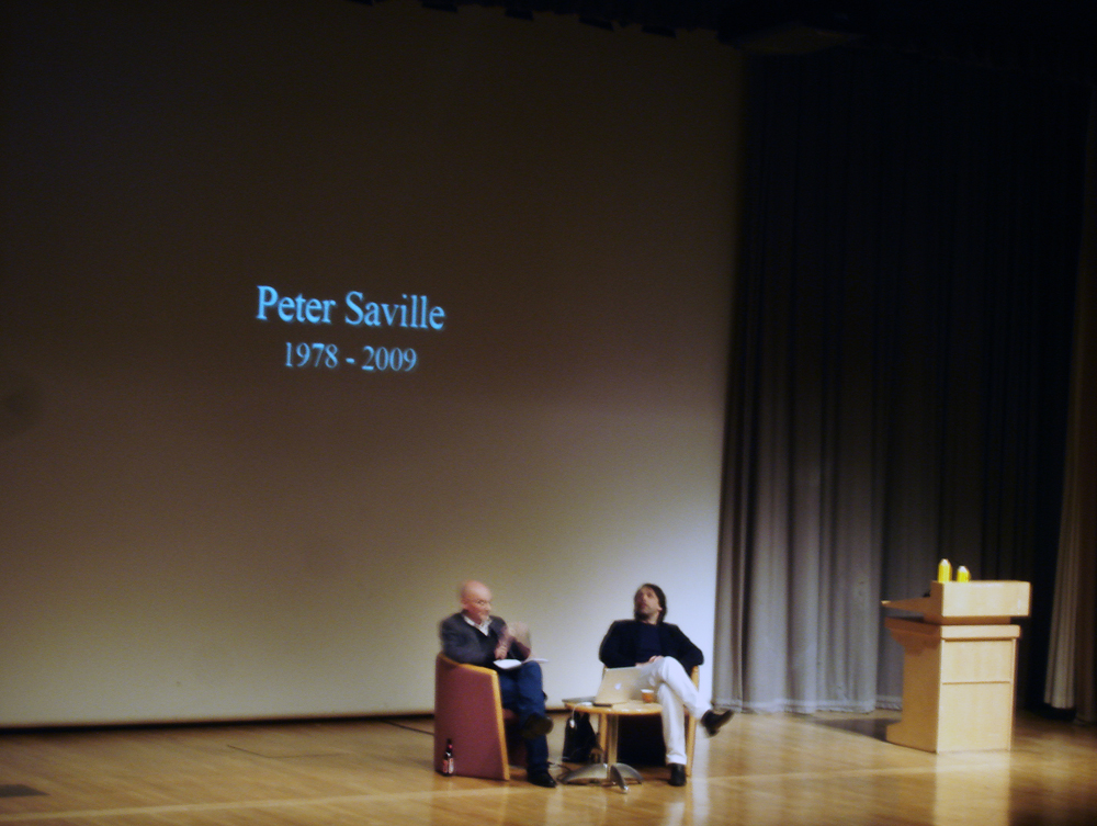
Peter Saville didn’t keep the audience waiting long last night, writes Sara Martin, only fifteen minutes, but the crowd wanting to see him at the D&AD talk struggled to fit into the large auditorium; a screen was set up outside for people who couldn’t find a seat.
Adrian Shaughnessy had the tricky task of interviewing Saville.
Growing up in Manchester in the 1960s, Saville went to art school to do what he enjoyed most. He was into punk and punk graphics, but yet also inspired by Jan Tschichold and other Modernist typographers, who influenced his first poster for The Factory, a music night in his local town.
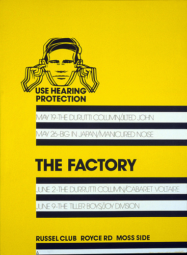
When the Factory became Factory Records, he became the art director, designing their record covers. His cover for Joy Division’s Unknown Pleasures, was ‘a cover I just wanted for myself’ and when he asked if he could leave off the name of the band and the title they agreed.
Shaughnessy pressed him to talk about the sleeves. Saville confessed that most of the time he didn’t know what he was doing in the early days.
He explained how he and his friend Malcolm Garrett (see ‘Malcolm, Peter . . . and Keith’, Eye no. 49 vol. 13), carved a place for themselves on the London graphic design scene – coming from the North, they felt they had more to prove.
Moving on to his brief period at Pentagram (see Reputations Eye no. 17 vol. 5), he maintained that what he learned in this time has been useful to him every day since then: there is so much more than ‘just designing’.
Controversially, for an audience full of designers working in the music industry he said: ‘No one should be designing record covers after the age of 30’, and ‘Music covers are not graphic design, they do not communicate anything, they have no purpose in that respect.’ Saville amused us with his directness – he was refreshingly opinionated.
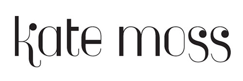
Recent work includes ‘branding’ Manchester as an ‘Original Modern city’, and the logo for Kate Moss’s Topshop collection – an offer he couldn’t turn down when it came from Moss personally.
Saville didn’t let us down – it was a fantastic start to the D&AD 2009 President’s Lectures.
Extract from Dan Nadel’s review of Designed by Peter Saville.
Eye is the world’s most beautiful and collectable graphic design journal, published quarterly for professional designers, students and anyone interested in critical, informed writing about graphic design and visual culture. It is available from all good design bookshops and online at the Eye shop, where you can buy subscriptions and single issues.