Saturday, 4:20pm
20 February 2021
The printed howl
Though locked down in London, this exhibition of letterpress protest posters has plenty of messages for the world
If the past few years have felt like one long trail of division, doom and injustice, followed by the deadly silence and devastating death toll of the pandemic, then ‘Reverting to Type 2020: Protest Posters’ is the exhibition for you, writes John L. Walters.
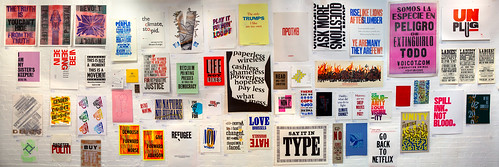
The 204 protest posters on display form a protracted howl of rage and anguish about nearly everything you can think of, from Trump to fracking, from inequality to global warming. There are 188 artworks from 105 printers in sixteen countries, plus 26 collaborations between New North Press (NNP), the initiators of the exhibition, and a variety of people who do not usually make letterpress work, including Peter Kennard (see Eye 80), Sarah Boris, Extinction Rebellion’s Art Group (see Eye 100) and an anonymous asylum seeker.
Sarah Boris and New North Press, Untitled, 2020, France / UK.
Top. ‘Reverting to Type 2020: Protest Posters’, Standpoint Gallery, London. Installation photo: Alice Doušová.

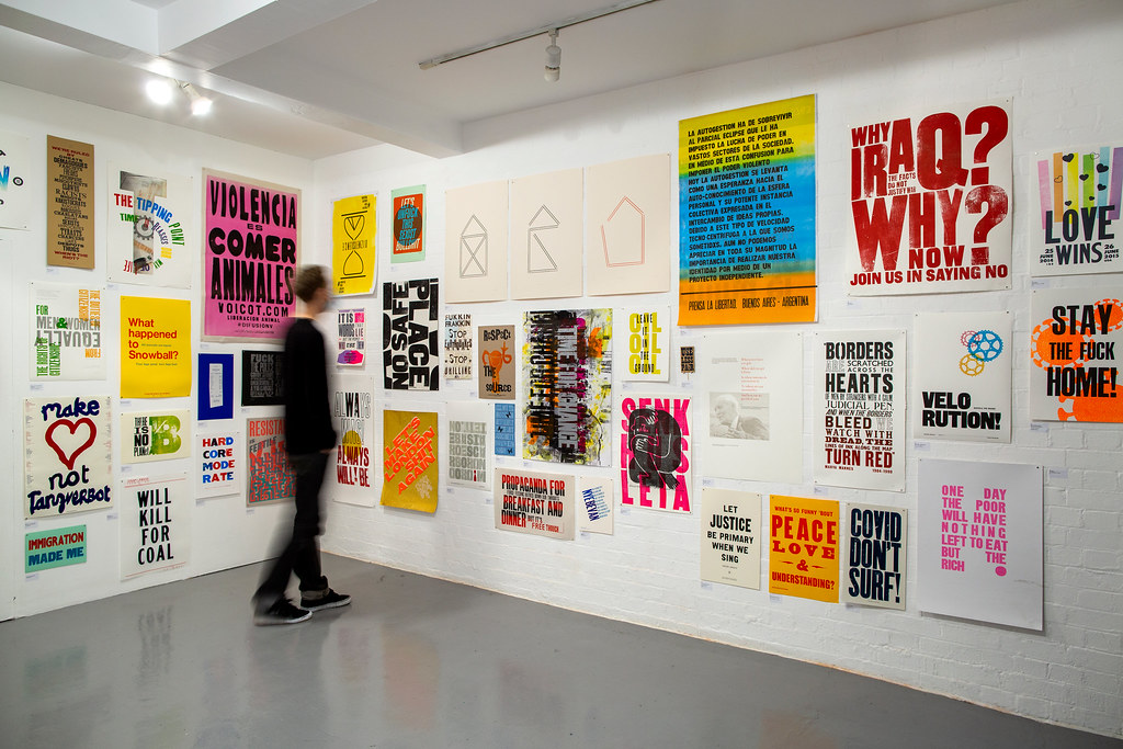
Just in front of the section featuring collaborative work (see below) stands a Harrild & Sons Albion hand press, a mute, poignant reminder of NNP’s pre-pandemic intention to host printing workshops that would introduce visitors to the joys of this ancient and urgent method of typographic communication.
‘Reverting to Type 2020: Protest Posters’, Standpoint Gallery, London. Photo: Alice Doušová. Fairness, by Extinction Rebellion’s Art Group, also used as the thumbnail for this blog post, can be glimpsed in the centre of the picture. At the far right is a Harrild & Sons Albion printing press.

Wood type poster by Helen Ingham, 2020, UK. ‘In this age, where we are increasingly monitored through digital communication, I feel the traditionally printed political broadside and pamphlet are due a revival.’

As Helen Ingham’s poster puts it: ‘Reclaim printing presses as tools for democracy.’ Sadly, hardly anyone can see the show, which was open for a couple of weeks before Christmas, but has been locked away ever since. Eye magazine was kindly invited for a (literally) private view, but the work on the white-painted walls comes down at the end of February, long before public galleries in the UK can re-open.
Cock Ups by Nicole Phillips, TypographHer, 2020, New Zealand. Phillips’s poster was partly inspired by ‘the grafitti on political billboards that litter our landscape.’

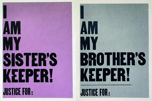
I am my sister’s / brother’s keeper by Jennifer Graves, 2020, United States. Designed and printed in reaction to the murder of George Floyd and Breonna Taylor, Graves’s poster spreads the message that ‘when we become our sister and brother’s keeper, positive changes can happen.’
Fortunately you can see every poster online at revertingtotype.com, which also includes extensive notes and a useful index, which tags each poster according to subject matter – fourteen posters for #blacklivesmatter, thirteen posters for #womensrights, seven for #policeviolence, seven for #brexit and six for #covid19, which was nameless and unknown when curators Richard Ardagh and Graham Bignell (who run New North Press with Beatrice Bless) first planned the show in 2019.
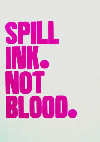
Spill Ink not Blood, Carl Middleton, Neat, 2020, UK. Middleton also co-edited the exhibition’s Long Primer catalogue with NNP’s Richard Ardagh.
Time for Change by Phil Gambrill, Fresh Lemon Print, 2020, Australia. A letterpress poster inspired by global protests for equality.

Most of the posters on display are available for sale by enquiring through the exhibition website. In addition to the small selection shown here, there are posters by letterpress printers such as Dafi Kühne (see Eye 100), Alan Kitching (see Eye nos. 15 and 74) and Ian Mortimer (see Eye 15). Anarchist poet and artist Dennis Gould, whom I met at The Story of Books Wayzegoose in Hay-on-Wye several years ago, contributed three small posters overprinted on old maps.
Fukkin Frakkin, Dennis Gould, Anarchist Press, 2020, UK. In the Long Primer catalogue, an interview with Gould discusses his early work with Peace News, Nonviolent Resistance magazine and poetry readings in the 1960s. ‘No-one should publish their own work until they have served some form of apprenticeship,’ says Gould. ‘This would cut out the dross, the repetitive copying, the boring and the academic, the clever and linguistic!’

Ladies! Being Singled Out by Gender vs. Ability is a Confidence-Boost! by Jennifer Farrell, Starshaped Press, US, 2020. ‘One of three posters in a series that uses type dating back to the ratification of the 19th amendment to the US Constitution (which celebrated its 100th anniversary in 2020) granting women the right to vote. The subject matter is a sarcastic call out.’

The catalogue for ‘Reverting to Type 2020: Posters’ is a handsome folded poster with images of all the posters on one side and information on the other, published in tandem with a booklet, Long Primer. The latter includes several thoughtful essays, plus interviews with participants, including Armina Ghazaryan, Myrna Keliher and Dennis Gould. Ben Blount quotes Toni Morrison: ‘This is precisely the time when artists go to work … We speak, we write, we do language.’ Blount adds: ‘Whether or not we think of ourselves as artists, I believe this is also the role of the printer.’
Knees off Necks by Ben Blount, 2020, US. In the Long Primer interview Blount says: ‘Talking about race and politics are the conversations that I’m having every day with family and friends. And until recently, it hasn’t been a conversation we’ve been having as a country, so it’s ripe for exploration.’

R is for Revolution by Christine Felce, GPC studios, UK, 2019. The poster’s large letters were made by the process of colograph printing ‘as part of a community-led Alphabet installation’ in Stroud, Gloucestershire, September 2019.

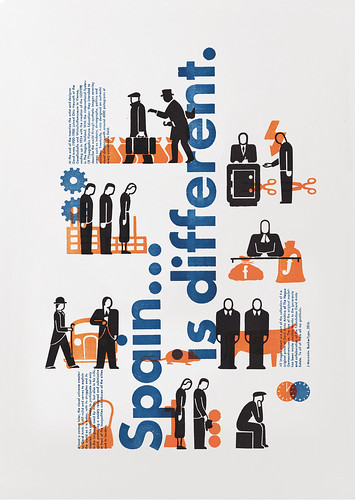
Spain is ... different by Jesús Morentin, BunkerType, Spain, 2020. Referencing the distinctive illustrations of Gerd Arntz, familiar from Otto and Marie Neurath’s Isotype diagrams, this poster uses the critical spirit of Isotype to highlight the inequalities of present-day Spain.
The exhibition’s curators took part in the Hamilton Hang on Tuesday 23 February 2021, 18:00 GMT (12 noon CST).
John L. Walters, editor of Eye, London
Eye is the world’s most beautiful and collectable graphic design journal, published for professional designers, students and anyone interested in critical, informed writing about graphic design and visual culture. It is available from all good design bookshops and online at the Eye shop, where you can buy subscriptions and single issues.