
Monday, 11:01pm
20 June 2011
Type Tuesday
Deep in the archives: Caslon Rounded Sans Serif, 1836
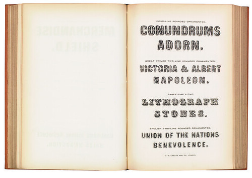
There are few new ideas in type design. Look back far enough, and there is a good chance you will find the idea done before. This rounded sans serif, which dates back to 1836, is a good example, wrote Christian Schwartz and Paul Barnes in Eye 75.
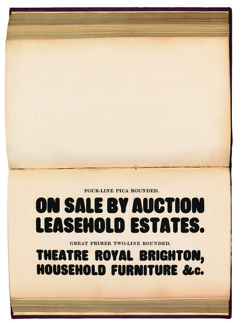
This came from the endless variations on the basic Modern forms: take a serif, make it into a slab; remove the slabs, make it a sans; condense it, make it a condensed sans; round it, make a rounded sans; inscribe a line, make a ‘shaded’; add some ornaments, make an ornamented; and so on. These days we can do such things quickly, but then it had to be done manually.
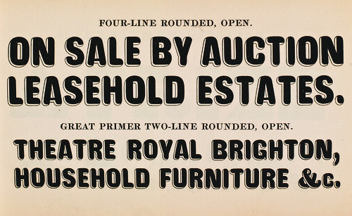
Above and top: Specimen of Printing Types by Henry Caslon, London 1842 & Specimen of Caslon & Glasgow Letter Foundry, 1861. Collection of St Bride Printing Library.
Type Tuesday is our weekly column on typography and type design, featuring a mixture of brand new articles and material from the extensive Eye archive. For more Type Tuesday articles, click here.
‘Deep in the archives’ by Christian Schwartz and Paul Barnes was written for Eye 75, Spring 2010.
Eye is the world’s most beautiful and collectable graphic design journal, published quarterly for professional designers, students and anyone interested in critical, informed writing about graphic design and visual culture. It’s available from all good design bookshops and online at the Eye shop, where you can buy subscriptions, back issues and single copies of the latest issue. The latest issue is Eye 79, a type special.