Tuesday, 8:58am
2 August 2011
Type Tuesday
Mário Feliciano’s Grotzec and Sueca: guest typefaces in the new issue of Eye
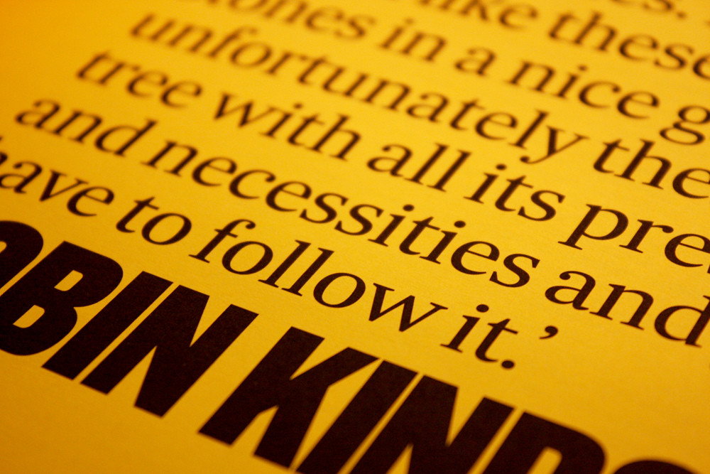
Every new issue of Eye since the redesign of Summer 2009 features different ‘guest’ typefaces. Eye 80, the latest, employs two contrasting typefaces – Grotzec and Sueca – from Mário Feliciano’s foundry, based in Lisbon, Portugal.
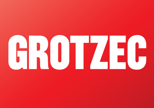
Above: Grotzec Condensed Black, by Mário Feliciano.
The headlines for the issue are set in type designer Mário Feliciano’s Grotzec Condensed. The typeface was originally designed for Surf Portugal magazine, where Feliciano worked as art director for eight years before establishing the Feliciano Type Foundry in 2001.
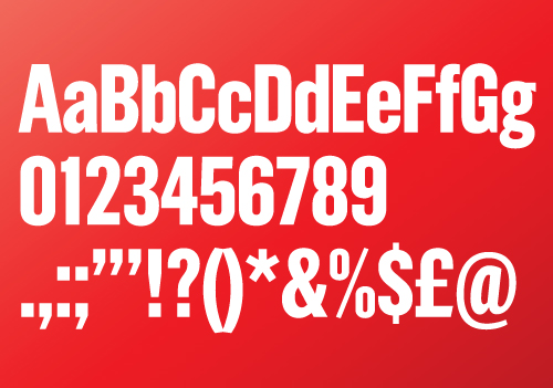
Above: Grotzec Condensed Bold.
A single black weight is used in Eye 80, but Grotzec is available in five different weights from light to black. The typeface draws inspiration from early European grotesque faces, and is designed to work for headline setting, but also at smaller sizes within different displays.
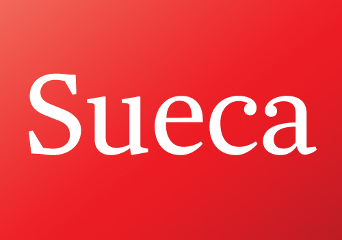
Above: Sueca Text by Mário Feliciano.
Body copy for Eye 80 is set in Feliciano’s serif Sueca Text, and standfirsts are set in Sueca Deck, for medium sizes. The typeface was commissioned for the Swedish newspaper Svenska Dagbladet in 2008; Feliciano worked closely with SvD’s art director Anna W. Thurfjell to arrive at the Sueca family.
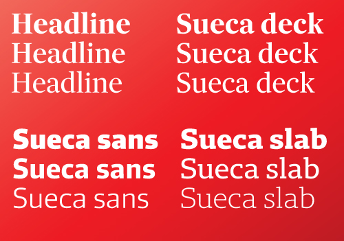
Above: Some of the styles and weights in the Sueca family.
Sueca (‘Swedish’ in Portugese) is a complex typeface that includes serif, sans and slab versions, but what sets it apart from other superfamilies is that each version was designed independently from the others, rather than being a derivation.
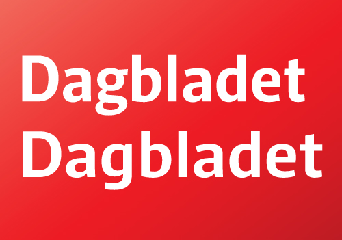
Above: differences in width and ‘g’ between Sueca Sans Headline (top) and Sueca Sans Text (bottom).
Speaking with Eye, Feliciano says he drew on no particular inspiration for the typeface, but after prior experience designing newspaper typefaces Expresso, Majerit and Mayeur, he was keen to design something ‘different from these, but including all of the best qualities from each’.
Another consideration for Feliciano was to observe how words look in Swedish. ‘There are some very odd (to me) combinations of letters in Swedish … another very important thing is the length of words. In Portuguese and Spanish we have very short words compared to Swedish’. One might think that for longer words a narrower font would be best, but Feliciano says: ‘longer words need wider type so they can breathe. If you use a narrow font, long words become fuzzy.’
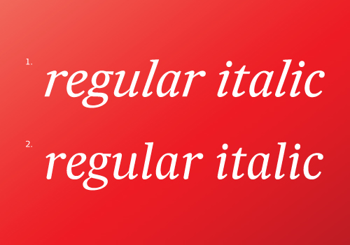
Above: Sueca Text italic, (1.) original version and (2.) redrawn especially for Eye magazine.
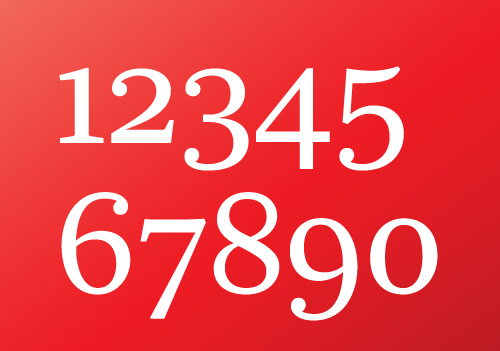
After supplying Eye with the font, Feliciano made some new changes to Sueca specifically for the magazine. The italic version of the text face was redrawn (above), and he added a complete set of non-lining figures to the typeface (below), both of which were used for the first time in Eye 80.
Above: Sueca Text, non-lining figures created for Eye magazine.
On the changes, Feliciano said ‘the original italic was designed specifically for SvD, where not many italics were to be used, so we wanted an italic that would really stand out from the roman. The new italic suggested by Eye – which will be the official italic from now on – is less sloped and less dependent on the roman.
'My way of work hasn’t changed much in the past six years. Webfonts are the future and I’m slowly moving to it. I have developed a special version of Sueca for the Web, used on the SvD website.’
See also: felicianotypefoundry.com.
Type Tuesday is the Eye blog’s new weekly column on typography and type design, featuring a mixture of new articles and material from the extensive Eye archive. For more Type Tuesday articles, click here.
Eye is the world’s most beautiful and collectable graphic design journal, published quarterly for professional designers, students and anyone interested in critical, informed writing about graphic design and visual culture. It’s available from all good design bookshops and online at the Eye shop. For a taste of the new issue, see Eye before you buy on Issuu. Eye 80, Summer 2011, is out now.

