Tuesday, 9:19am
9 August 2011
Type Tuesday
Scholarly and beautiful, a 1918 book by typographer Frederic W. Goudy
Frederic W. Goudy was one of the most prolific type designers of the twentieth century, writes Alex Cameron. At a time when Europe was contending with social, technical and cultural revolution, Goudy remained an uncompromising and unapologetic defender of the classical typographic faith. (See ‘Goudy, the good ol’ boy’, Matthew Carter’s review of D. J. R. Bruckner’s biography, in Eye 3.)
His life’s work revolved around perfecting the roman letterform and railed against the increasing mechanisation of rampant early twentieth-century capitalism. Depending on the strictness of the typographic classification system, Goudy is credited with anything between 80 and 120 distinct type designs. He saw himself initially as a titling designer, so it is no slight of hand that he classified an italic design as a distinct face.
Goudy’s The Alphabet: fifteen interpretative designs, published in 1918 in the USA and Britain, is an excellent account of both the history of the profession and the man. Its beauty as a piece of publishing is only surpassed by the scholarly nature of the work.
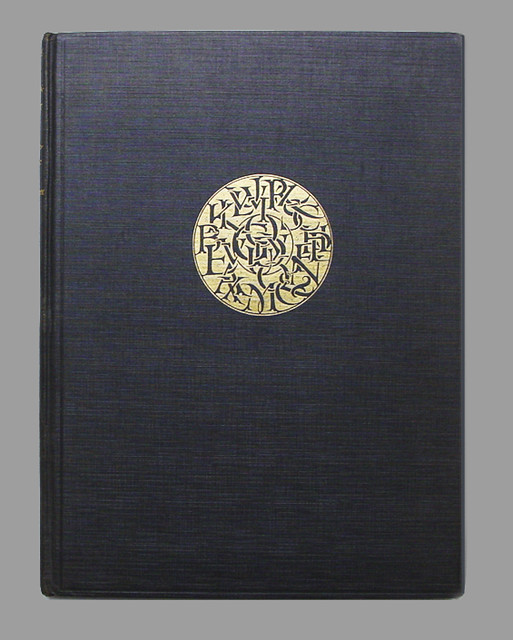
Top: Black hardback cover with gold foil embossed symbol including each letter of the alphabet.
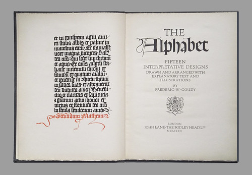
Below: Frontispiece is in gothic lettering from c. fifteenth century manuscript. Title page, the capital ‘A’ is a Lombardic capital.
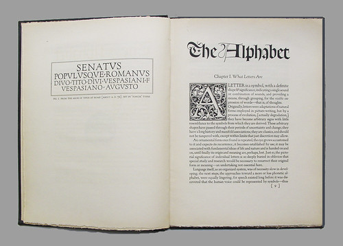
Above: Left page is text from the Arch of Titus at Rome (AD 72) and is set in Goudy’s ‘Forum’ capitals. Chapter 1 with ornamental capital ‘A’.
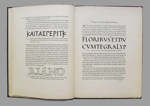
Below: Left page showing Greek letters from an inscription in the Temple of Athene Polias (third century BC). The letters are approximately full size and would have been coloured red after cutting. Chapter 2 shows square capitals, from Virgil’s Aeneid, originally written in vellum (fourth century).
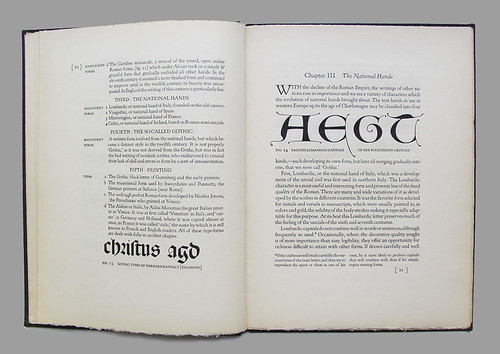
Above: Chapter 3 shows Lombardic capitals (fourth century) illustrating the rise of national ‘hands’ with the decline of the Roman Empire. Lombardic capitals developed from northern Italy.
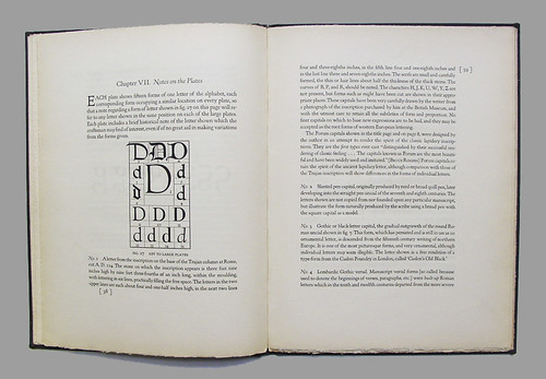
Below: Chapter 7 introduces the book plates and a description of each letterform.
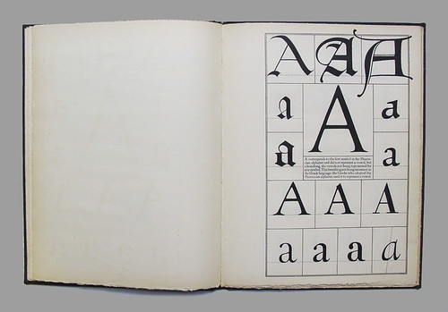
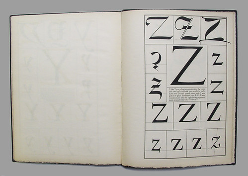
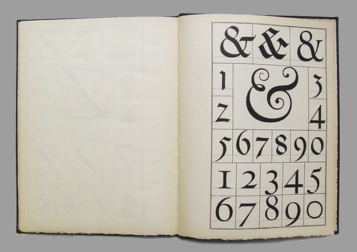
Below: Plates show ‘A’, ‘Z’ and ‘&’ in the following letterforms: Trajan column, Slanted pen, Blackletter capital, Lombardic Gothic versal, Italian round-hand minuscule, Blackletter minuscule, the second type of Sweynheym and Pannartz, Jenson, Kennerly (Goudy), Caslon and Bodoni.
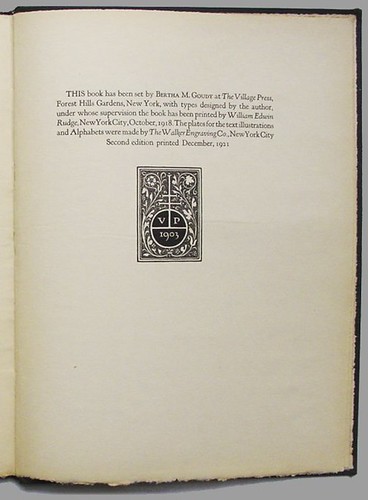
Below: Endnote credits: typesetting by Bertha M. Goudy (Goudy’s wife) at The Village Press, New York; types designed by Goudy; the printer, William Edwin Rudge; and plates and illustrations by The Walker Engraving Co. The stamp is that of the Village Press.
Eye is the world’s most beautiful and collectable graphic design journal, published quarterly for professional designers, students and anyone interested in critical, informed writing about graphic design and visual culture. It’s available from all good design bookshops and online at the Eye shop. For a taste of the new issue, see Eye before you buy on Issuu. Eye 80, Summer 2011, is out now.

