Monday, 4:31pm
16 May 2011
Type Tuesday
How lettering is made for public display: hand-cutting wood
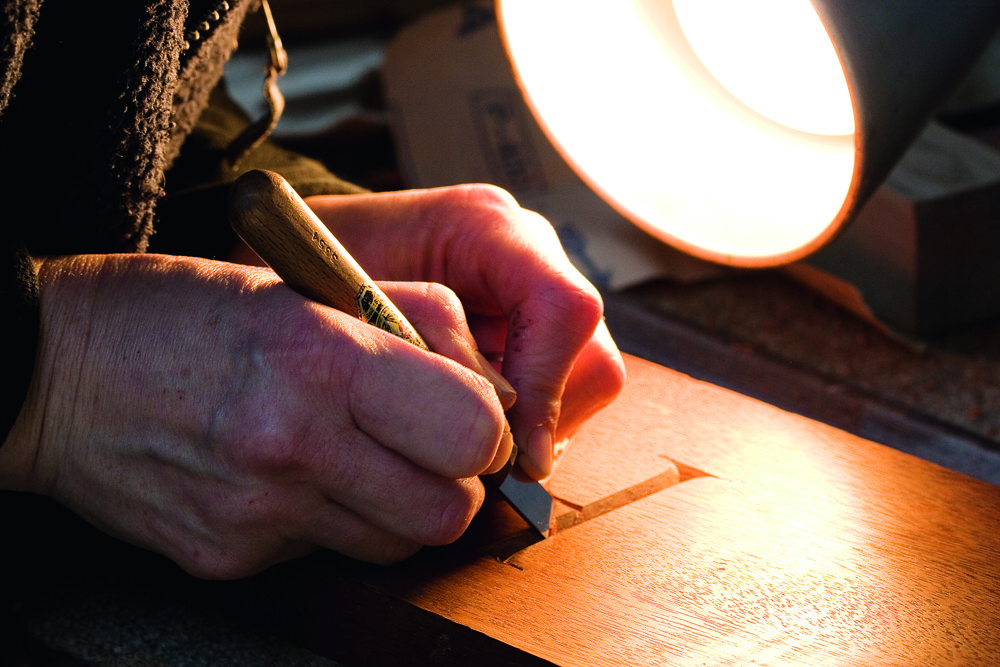
Andrew Haslam looks at the production of display lettering, and, in this instalment, hand-cutting letterforms in wood by Caroline Webb.
Wood letter-cutters draw their forms with a soft pencil outline, but they must take note of the wood’s grain: broad deep vertical ‘v’ cuts are best made across the grain. Some carvers cover the wood with masking tape and draw the letters on the tape, then cutting straight through it: this minimises the risk of chipping the edge of a letter.
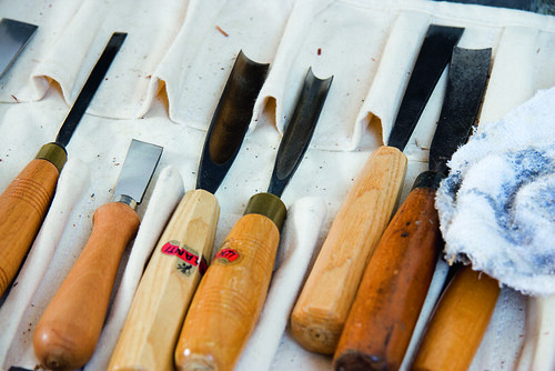
1. Letter-cutters who work in wood need a large collection of tools, including straight-edged chisels and gouges – whose rounded blades are used for cutting away large sections of wood. The arc radius on a gouge varies; deeper gouges can remove more wood with a single cut. Curved gouges (far right) have a blade that curves away to the left or right of the handle and are used for paring wood round a circle.
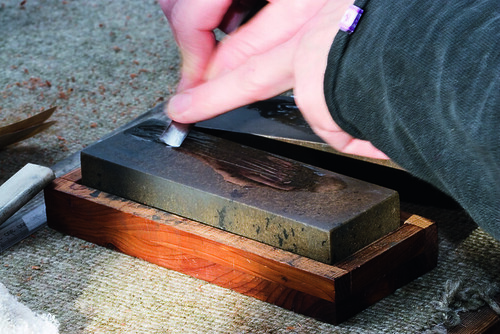
2. Tools must be extremely sharp. Here, the back of the blade of a small gouge is sharpened on an oil stone.
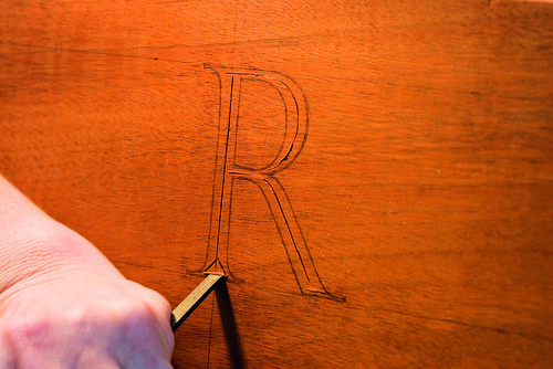
3. Before the first cut is made, the three-inch high letter is drawn by eye in soft pencil outline between a cap and baseline – just as it would be on stone.
4. A square-edged chisel marks the centre of the ‘v’ cut, which is not drawn but estimated as half way between the outer and inner edges. The chisel is tapped into the wood using a small round mallet. Two nicks are cut into the wood at the base of the letter at approx. 45 degrees.
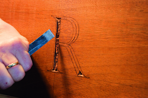
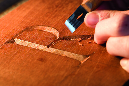
5. The bulk of the wood has been ‘chopped out’ with a broad chisel. The rough ‘v’ cut finishes inside the pencil strokes.
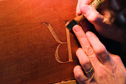
6. The cutter has inverted the piece to work down the broad stroke of the ‘R’. Some carvers work with fine square chisels, but here the cutter works with a chip or paring knife.
7. The chip knife is turned over and worked away from the carver. Both hands are used to guide the knife, the left hand pushing the base of the handle and blade, the right hand holding the handle to create resistance. This form of two-handed cutting brings both power and control to the cutting edge, preventing the knife slipping and cutting away essential wood or scoring the work with an unsightly gouge.
8. Here the cutter pares away the final edge of the letter up to the pencil outline with the chip knife.
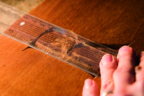
9. A straight edge is used to check that the serifs extend equally from the down stroke.
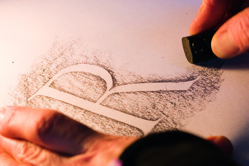
10. The cutter places a sheet of layout paper over the letter and makes a rubbing using a graphite stick. This flat, reversed-out form will expose tiny imperfections that can then be corrected. Some cutters archive their rubbings as a resource, alongside their original designs.
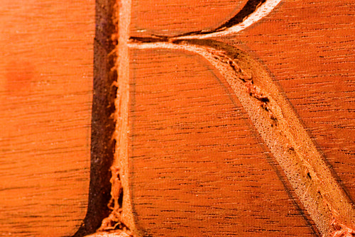
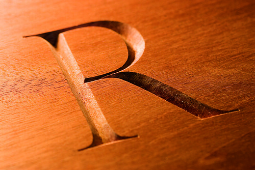
11. The final letter has taken an hour to draw and cut. Note the length and refinement of the point where the upper bowl joins the centre bar, which could not be achieved in stone. The serifs are square-ended rather than tapering to a point.
Type Tuesday is our new weekly column on typography and type design, featuring a mixture of brand new articles and material from the extensive Eye archive. For more Type Tuesday articles, click here.
Physical Display by Andrew Haslam was originally published in Eye 67, Spring 2008.
Eye is the world’s most beautiful and collectable graphic design journal, published quarterly for professional designers, students and anyone interested in critical, informed writing about graphic design and visual culture. It’s available from all good design bookshops and online at the Eye shop, where you can buy subscriptions, back issues and single copies of the latest issue. The latest issue is Eye 79, a type special.

