
Tuesday, 10:00am
12 November 2019
(Typographic) Noted #95
Soy Yo campaign; Fontsmith microsite; the Malee Scholarship; new Swiss typefaces based on work by Jost Hochuli and Roland Stieger
Here is a selection of type-related things – a typographic mural, variable font website, a type design scholarship for women of colour and typographic siblings – that have caught our attention in recent weeks.
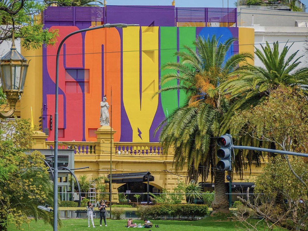
The ‘Soy Yo’ campaign on the exterior of Centro Cultural Recoleta in Buenos Aires, designed by Guille Vizzari of Yani&Guille.
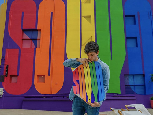
For the month of November, the exterior of the Centro Cultural Recoleta in Buenos Aires is emblazoned with the words ‘SOY YO’ / ‘It’s me’. The campaign – designed by Guille Vizzari of design studio Yani&Guille – celebrates Pride in Argentina. Vizzari says that ‘in a world obsessed with labels’, there remains the opportunity to take ownership of our own identity in the gender spectrum: ‘I am what I choose to be today. It’s me. Soy yo.’
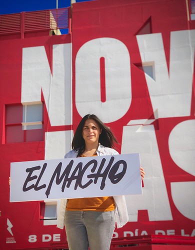
It is the second of two commissioned murals for the centre, predated by ‘No Va Más’ / ‘No More’ in March for International Women’s Day designed by Yani Arabena of Yani&Guille. That campaign had twenty iterations including ‘No more harrassment’ and ‘No more violence’.
The ‘No Va Más’ campaign on the exterior of Centro Cultural Recoleta in Buenos Aires, designed by Yani Arabena of Yani&Guille.
FS Meridian VF.
Fontsmith has launched an interactive microsite dedicated to variable fonts. It currently features a collection of nine variable fonts including FS Meridian VF, FS Pimlico VF and FS Kim VF.
The Malee Scholarship. Website design by What The, 2019.


In October, Sharp Type announced the inaugural Malee Scholarship, which aims to seek out female type designers of colour and ‘provide them with financial resources and mentorship to help them pursue a career in type design.’ The scholarship is named after Chantra Malee Montoya-Pimolwatana, co-founder of Sharp Type, and the initiative features a logotype designed by TienMin Liao and custom typefaces designed by My-Lan Thuong. More information about the application – deadline 15 April 2020 – can be found here.
NN Allegra and NN Alena, by Nouvelle Noire, 2019.
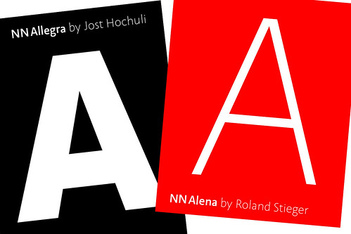
The Nouvelle Noire foundry claims that NN Allegra and NN Alena are ‘probably the first type siblings in the world’. The two typefaces are humanist sans-serifs informed by the initial designs of Jost Hochuli and Roland Stieger, and now re-engineered for contemporary use in a wide variety of weights. Nouvelle Noire’s Rektorat type family, based on Ernst Keller’s original letters for what is now the Museum für Gestaltung in Zürich, was featured in Eye 98.
The new release continues the foundry’s interest in exploring the legacy of ‘the Swiss school’. Co-founder Clovis Vallois notes that Hochuli, also known as a type historian (see review in Eye 94), was taught by Walter Käch. (See Peter Bain’s article ‘A manual of hand-made Modernism’ in Eye 92.)
Eye is the world’s most beautiful and collectable graphic design journal, published quarterly for professional designers, students and anyone interested in critical, informed writing about graphic design and visual culture. It is available from all good design bookshops and online at the Eye shop, where you can buy subscriptions and single issues.