
Sunday, 11:01pm
12 January 2014
Typorama spectacular
This Paris retrospective of Philippe Apeloig’s cerebral, conceptual design and typography is a triumph that exceeds high expectations, reports Steven Heller

The last time I saw a gaggle of teenage art students sitting quietly on the floor in a museum gallery intently making sketches of posters hanging on a wall, as though they were drawing from classical plaster casts or painted masterworks, writes Steven Heller, was … never!
This was the first thing that surprised me when I stepped off the elevator at the Musée Les Arts Décoratifs in Paris for a walkthrough of ‘Typorama, Philippe Apeloig, Design graphique’, an incredible exhibition on view from Autumn 2013 until March 2014. Getting students to be that attentive and having the exhibit at France’s most important design museum are both impressive and deserved accomplishments. My next surprise was that ‘Typorama’, designed by Apeloig, exceeded my expectations.
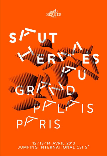
Philippe Apeloig, poster for horse-jumping contest at the Grand Palais, Paris, organised by Hermès, 2013.
Top: Apeloig’s poster for the Yves Saint Laurentretrospective held at the Petit Palais Musée des Beaux-Arts de la Ville de Paris, 2008.
From the entrance, a wall-size video animating the construction and deconstruction of the exhibition logo from simple abstract marks to comprehensible letters, ‘Typorama’ is an exuberant multimedia display that follows Apeloig’s Modernist typographical beginnings through bouts of postmodern experimentation and idiosyncratic contemporary manifestation.
Essentially chronological and decidedly didactic, the large space with multiple galleries opens with a selection of brief video clips showing personal influences and inspirations – including a vintage loop of his Polish family’s shtetl before it was destroyed by the Nazis, a scene from Federico Fellini’s 8½ with a procession of eclectic characters and a curiously haunting gestural dance by Pina Bausch, the erotic Kontakthof. The inclusion of these short films is meant as an autobiographical background for the subtle visual culture clashes that pervade Apeloig’s work. They also underscore the rationale for why his custom type is both sculptural and balletic.
Later on in the exhibition is one poster each of April Greiman and Wim Crouwel who significantly influenced his design. They serve as evolutionary markers. Throughout the exhibition Metro-sized posters, mostly for art, literature and theatre clients (although he shows work done for Yves Saint Laurent and Hermès) dominate the walls. Various printed pieces and sketches fill numerous vitrines with examples of a process that routinely starts with a tight grid which, in recent years, has become increasingly more abstract as he delves further into challenging legibility.
Studio Apeloig, identity for VNF (Voies Navigables de France or French Navigable Waterways), 2013. The design is an enhanced version of the VNF’s former logo.
Studio Apeloig, logotype for the Médiateur Européen (European Ombudsman),
2009.

Apeloig’s work is unapologetically cerebral, yet he injects emotional components that are revealed in three standout features of Typorama worth noting: First, multiple iterations (sometimes as many as nine each) of many of the posters on view fill three walls of one of the galleries. And while variations on the specific themes of each are often radically different, they nonetheless show Apeloig’s decidedly logical, mathematical precision at play. Second, a dozen or so brief type videos evidence how Apeloig relates his custom letters to echo the themes of his posters. Third, a long hall devoted to ten custom typefaces that he designed for the exhibition envelope the viewer in each letter and their origins. Almost all are variations of the stencil family (which are Apeloig’s favourites as stencils are such unpretentious letterforms).
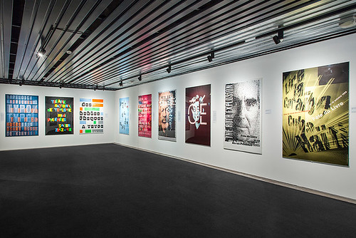
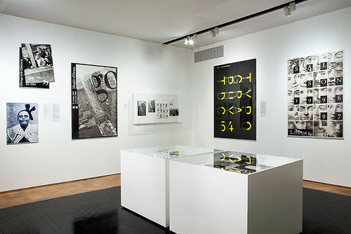
‘Typorama, Philippe Apeloig, Design graphique’. Installation photographs by Prisca Martaguet, Musée Les Arts Décoratifs, 2013.

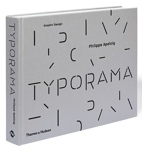
Typorama (Thames & Hudson, £48) designed by Tino Grass and Anna Brugger for Studio Apeloig. Cover design: Philippe Apeloig, 2013.
This retrospective (and a thick stand-alone book with the same title) of Apeloig’s past 30 years of conceptual typography is not merely a reliquary of exemplary and stunning graphic design – typographic posters and animations, books, logos and fonts – it is an ingenious reveal of the designer’s precisionist iterative process. No wonder that on the day I visited, dozens of admiring art students from various institutions were furiously shuffling from gallery to gallery filling their sketchbooks with notes and copies, perhaps believing that through mimicry and osmosis Apeloig’s work will affect their own.
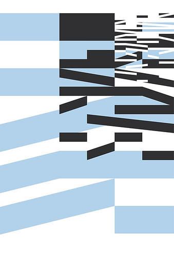
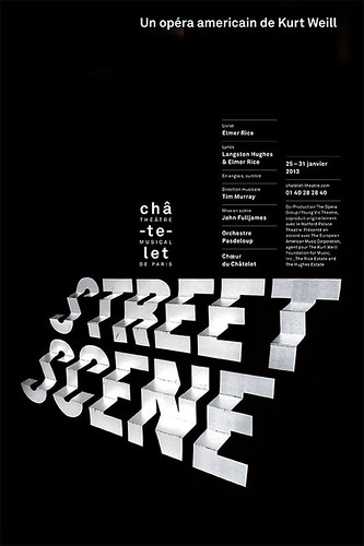
Philippe Apeloig, poster for Théâtre du Châtelet, 2012.
Steven Heller, design writer, New York
Eye is the world’s most beautiful and collectable graphic design journal, published quarterly for professional designers, students and anyone interested in critical, informed writing about graphic design and visual culture. It is available from all good design bookshops and online at the Eye shop, where you can buy subscriptions and single issues.