Summer 2011
A certain smile
Sara De Bondt is a shaker and mover, who leads a studio with a decisively contemporary approach to identity design

In her subtle way, Belgian designer Sara De Bondt has become a key presence on the British design scene. Working steadily in London for most of the decade since she graduated, she has made her mark as graphic designer, publisher, conference organiser and teacher.
New projects – identities, books, magazines, websites, exhibitions – stream out of her tiny studio in East London, where she works with two assistant designers and an intern.
In person De Bondt is soft-spoken and humorous, with a smile that plays around her lips as she describes the details of her work. Yet she is clearly ambitious and determined to develop her practice – you can imagine the confidence she inspires in clients as she describes the thinking behind her proposals. The best of De Bondt’s work brings together theory, common sense and contemporary visual language into seductive synthesis. She appears to relish challenges and difficulties as opportunities to learn new things, stretch the practice and collaborate with experts.
Making things
On one of the occasions I interview her for this article, in Dalston’s Café Oto, she is most keen to speak about her latest project, the identity design for Artissima 2011. This is a contemporary art fair, similar in intent to London’s Frieze Art Fair, which will take place in Turin, Italy, in November. Her winning pitch was that the identity design would be defined by the event’s statistics.
‘It’s a very exciting project because we proposed to them that we work with data visualisation and statistics about the fair. During the fair week, we’ll turn the studio into an “office of statistics” and we’ll be at the fair recording and creating live statistics about the visitors and the buying and selling and all the things that are going on, and that will inform the design. There won’t be any images of artworks – all the visuals will be data.’
When I remark that this sounds like a lot of work, and ask whether there are enough people in her team to handle it, the smile returns: ‘This is what all my clients ask! I think so. I’ll just have to say no to new work.’
De Bondt’s interest in visual culture began with her parents, who ‘always dragged me along to see cultural things on holiday’. She spent a lot of time on her own in a tree house, making things for her family: ‘Cookies or marzipan or enamelled brooches. I’d always make stuff for other people and my parents encouraged that.’
Yet when she left school it was her art-loving father – once an aspiring architect who was compelled to become a lawyer – who wanted her to study law in turn. ‘He insisted on me getting a university degree because it would offer more financial security.’
De Bondt dithered for a long time, and came across graphic design by chance when she went to a fine art open day at Sint-Lukas college of art in Brussels. She ran into a designer who taught there, the father of a girl she had done theatre with. ‘He said, “It’s not for you, you’re way too shy, you shouldn’t do graphic design.” But when I looked at it I thought it doesn’t look too hard!’
De Bondt decided that design would be an acceptable compromise between the possible penury of fine art and the professional security of law, and applied herself diligently, getting high marks for the first three years of the course. ‘Because both my parents and teachers were against it, it really made me want to prove myself, so I worked like crazy.’
But in the fourth year, she went to Spain on an exchange programme and began to reassess what she had learnt. ‘I came back and almost failed quite badly … it was my first time.’ She had realised that her course omitted several important elements of design, including typography. ‘It was called Master in Fine Arts, Option Graphic Design. We did have to do logos and packaging and illustration and a bit of advertising, too. But it was mostly taught by artists and illustrators. We had one typographer.’
De Bondt had also done internships. One was at a printer, where they told her: ‘You’re a graphic designer, we’re going to make you suffer because you’re going to make us suffer later.’ She spent a month doing nothing but shrink-wrapping. At Total Design in Brussels, where there was little work for her to do, she ‘reorganised the bookshelves and made coffee’.
The Spanish experience, though difficult, gave her the confidence to take a major step. “I did my dissertation about the social responsibility of graphic design at Sint-Lukas. The Jan van Toorn book Design Beyond Design had just come out, and really influenced me a lot. So I became interested in the Jan van Eyck Academie (where Van Toorn had been director) and what was going on there.
De Bondt decided to go to Maastricht in Holland to study at Jan van Eyck and learn more about typography and the theoretical aspects of graphic design. She arrived at an interesting, difficult time for the institution. ‘There were all these great teachers. Dawn Barrett was head of department. In the first year we had Michael Rock, Armand Mevis, Irma Boom, Rick Poynor, Karel Martens, J. Abbott Miller and Skart [Serbia] visiting – that was exciting.’ She also met Ryan Gander, the British artist, who became her boyfriend, and a collaborator, for a while.
She found the experience difficult but life-changing. ‘Armand Mevis said “I don’t think you’re a graphic designer … you don’t care what typeface it’s in.” Which at the time was true. And Karel Martens said to me, “Your work is too girly.” I don’t know if that was related to gender or age. That really did influence me. And then, halfway through the course, they all resigned.
The second year was even more challenging. ‘I was 22 and I had come from a college where we had focused briefs and deadlines. Here there were no briefs, no deadlines, no marking – you could do anything you wanted, but there was no follow-up, I didn’t have a regular tutor who would check up on me. I got really lost.’
Gander introduced her to Stuart Bailey, who had just launched Dot Dot Dot with Peter Bil’ak. After De Bondt finished her two-year course at Jan van Eyck, and was wondering what to do next, Bailey put her in contact with Daniel Eatock.
De Bondt says: ‘There were some text-based pieces that Dan and I had both done independently that were really similar: his Beatles poster and my 2000 New Year’s card were both very ideas-based, where the type and look didn’t matter.’ Eatock offered her a job with Foundation 33, which he had founded with Sam Solhaug in 2000.
‘I didn’t really feel like going back to Belgium,’ says De Bondt, ‘so I thought why not? It was also inspiring. They just totally went for it and took it really seriously. They took big Channel 4 projects as seriously as tiny, silly self-initiated things.’
At Foundation 33, De Bondt was plunged into Channel 4’s Big Brother and its billboard campaigns, plus pitches for Piaggio and the practice’s promotion book. What she learnt from her time there was how to make a presentation: to present ideas rather than finished results.
‘It’s more interesting,’ she says. ‘If the project doesn’t go ahead, at least you’ve learnt something. I’ve done a few pitches for the Barbican where I’ve used them as a reason to research or learn.’
With this approach, according to De Bondt, she always gains, even if she doesn’t get the job. But is her design approach similar to Foundation 33’s?
She doesn’t think so. ‘The way something looks is much more important for me than it was for Foundation 33,’ she says. ‘I care a lot about typography, and an idea is not just something in your head. The way something looks is an idea. There is a cliché that there’s a separation between the two, but I don’t think that is true or real.
‘Also, if you make the statement that it’s about ideas and it doesn’t matter how it looks, if you present that to a client then they are able to say, “OK then, make it pink and make it blue.” Because it doesn’t matter. But if the way it looks is part of the idea, then it’s more difficult to untangle them.’
So does she have a visual style? ‘Style is a different thing to caring about the visuals. I try not to have a style, although I have one! That’s why collaboration is important.’
Collaborative efforts
De Bondt has collaborated with some remarkable talents in the past, including Gander, and designers Fraser Muggeridge and James Goggin [of Practise, now director of design, print and digital media at Chicago’s Museum of Contemporary Art], with whom she used to share studio space. However she regards her assistants, Mark El-khatib and Merel van den Berg, as her chief collaborators. ‘It’s maybe less visible, but I try to give them a lot of freedom. They will start the project and end it, and I try not to touch it too much. I like to have this input, and to be experimental and let the work maybe go somewhere new.’
One continuing design collaboration is the series of Camden Arts Centre exhibition booklets devised with Goggin in 2005. Each slender publication has the same dimensions but in aggregate they employ strikingly different imagery, typography, layout and feel. Metal staples allow the publications to be collected and read in a binder, resulting in a richly varied loose-leaf ‘book’ of the centre’s activities, using dozens of different paper stocks and techniques. Goggin and De Bondt do not work together on these but rather tend to alternate jobs: De Bondt’s latest is about artist-photographer Anne Hardy.
The publishing venture Occasional Papers (occasionalpapers.org) is another highly visible collaboration, founded three years ago with her partner, Antony Hudek. Their list is eccentric and eclectic, academic and experimental, including titles as different in form and content as The Master Builder: Talking with Ken Briggs, The Form of the Book Book and The Portable John Latham, a collection of documents about the late British artist. Their latest publication, Born in Flames, is an illustrated transcript of Lizzie Borden’s 1983 film of that name, edited and designed by Kaisa Lassinaro. Occasional Papers books are not difficult to spot in a design bookshop, yet the series has no logo. Nor does De Bondt’s studio. ‘Every time I write an invoice I think about what font to use!’ she says.
Other editorial design projects have ranged from artists’ catalogues for Book Works and others, to Tate Etc. where she and El-khatib have just succeeded Cornel Windlin as art directors of the thrice-yearly magazine.
De Bondt’s design education included smatterings of design history: ‘There was very little graphics, just Philippe Starck … a bit of Jugendstil and Bauhaus, and art history, so I’m grateful for that, but graphic design history, nothing. That’s why I like to teach and do these conferences [see review of ‘History in the Making’ St Bride, p.112] so that I can teach myself.’
She is keen to redress an imbalance she detects in current education and design publishing: ‘My students are almost embarrassed to talk about graphic design. They’re more into art or writing, it’s almost not cool to say you want to do graphic design. They’re publishing things, but it’s about everything else but graphic design.’
Could this be because this generation worries that graphic design is too insular, that designers are obsessed by themselves? Do her students come to the Royal College already knowing plenty about graphic design history? ‘Not really, not at all,’ says De Bondt. ‘There’s a little bit of an obsession about 1970s conceptual art, all these mythical heroes, usually guys! And they are super interesting people but there is a lot of stuff written about them already, by experts in the field. If you talk about them to other graphic designers you are going to get a lot of positive response but you are not really generating any new knowledge. We need much more than John Cage, even though he’s extremely interesting. The field of graphic design history is so barren, and art isn’t.’
She bristles at the suggestion that design history might be perceived as designers’ self-obsession: ‘What’s this deal about being too insular and looking inward? You’re not going to say that to a doctor or a builder when they talk about medicine or buildings, are you? What’s wrong with talking about graphic design?’
For De Bondt, knowing about design history, and understanding what has gone before has a direct benefit to the everyday practice of graphic design: ‘When I talk to a client like Artissima, and I know who made a typeface and where it’s from, they have more respect for me than if I didn’t. It’s about being taken seriously as a professional.’
There is no doubt about her seriousness. She gives several examples of the way history affects her practice, including her innovative identity for INTERIEUR 2010, the Belgian design fair.
‘They had had the same designer, Boudewijn Delaere, from 1968 until 2000, and because of this interest of mine the first thing I wanted to do was go and meet him and interview him and learn about him. He had drawn the original logo and we turned that into a typeface.’
Her identity for BAM, the Flemish institute for visual, audiovisual and media art, in Ghent, provides both an explanation of its origins and a process for future variations. Three separate organisations had joined to become one big one: she made a logo from the three interlocking circles that contains the letters of its acronym. ‘The idea for the identity was that you can deconstruct the logo and use this element of a circle as a way of making graphics; there are all these different applications.’
Non-identity identities
For the 2009 SuperStories fashion and design triennial in Hasselt, the idea behind the identity (made with local designer Geoffrey Brusatto) was that every piece of print was a reference to a way of telling a story. Each letter, postcard, poster or Web element carries their ‘double-S’ logo, white out of a red hexagon.

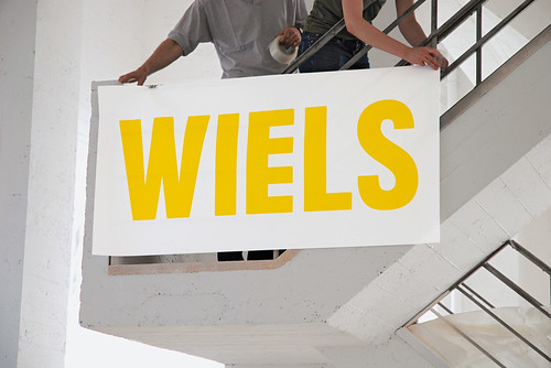
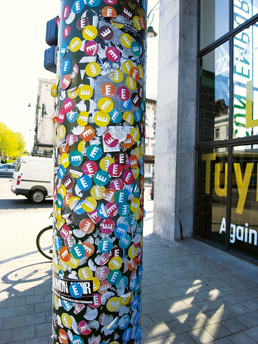
Her biggest project to date is the identity for the Wiels contemporary art centre in Brussels, a venue that opened five years ago in a refurbished 1930s brewery. The name was appropriated from the beer (‘Wiel’s’) once brewed there. The ‘E’ with the extra bar in De Bondt’s logotype comes directly from the building’s bold Art Deco exterior. De Bondt explained the long gestation of her identity design in a 48-page booklet, Wiels: The birth of a visual identity. Her article references many elements, from Nick Bell’s Eye 53 essay ‘The steamroller of branding’ to Marcel Broodthaers’ typography on the plaque for his ‘Musée d’Art Modern, Dt. Des Aigles’.
The client’s largely positive response to herfirst proposals included this: ‘We like the logo, but concrete grey is too serious … The logo looks too aggressive. The horizontal lines are too imposing.’ Wiels, explains De Bondt, was concerned that the centre should be ‘accessible to a broad audience and not just the art crowd’.

In response to this feedback, she adapted the logotype to make the letters slightly more rounded, and chose yellow as a colour. The jury liked the changes in typography but couldn’t agree on the colours. Dirk Snauwaert, the Weils artistic director, intervened with an ingenious plan: use a different colour every year. Once the logo had been agreed, De Bondt started work with fellow Belgian designer (and Reading graduate) Jo De Baerdemaeker on a typeface for Wiels. Their published correspondence references the aforementioned Broodthaers, Richard Hollis’s use of Block for the Whitechapel Art Gallery (see Eye 59), a 1960s cologne label and Belgian road signs: history gets everywhere.
For Nottingham Contemporary’s identity (also designed with De Baerdemaeker) they digitised a typeface from books made during typesetting classes at a printing school in the city.
However, her original idea was not to have a typeface but to ask artists to write it – a kind of ‘open-source’ identity. Instead, she applied this thinking to the logo. De Bondt sent an open invitation to several artists – including Pae White, Flávia Müller Medeiros, Loris Gréaud, Klaus Weber, Chris Evans and S. Mark Gubb – to make logos for the gallery, and the identity became an exhibition of sorts. ‘The logos are used almost like a stamp, usually in gold, and they are always credited,’ she says.
Her identity for the MK Gallery in Milton Keynes strips away even more design elements. Hit refresh while browsing the gallery’s site and you encounter a random selectionof system typefaces – Times New Roman, Courier and so on.
‘It’s another way of trying to do an identity without doing an identity,’ she says. ‘Without a logo, without a typeface, without a colour. The main thing is the joining of the “M” and the “K”,’ she says. ‘And then this “washing-line” grid, which comes from Milton Keynes as a gridded city. So it’s a way of organising information. And the colours speak to the colour in the artwork, so the identity has no colour palette.’
Yet an admirer of De Bondt’s work will spot a few familiar elements, such as the cross-hatched patterns in the coloured square panels used throughout the site. She winces at the mention of this: ‘I’m not happy with it, it’s too much like a stylistic trick.’
Many of De Bondt’s projects bear such traces of her struggles – both internal and external – with the very nature of graphic identity. She sometimes appears to solve problems by asking new questions. Her solutions make a critical point but at the same time they provide information and graphic delight. And though she works hard to expunge style, the confidence and technique with which she and her collaborators execute the most minor elements mean that her graphic framework for the clients’ content communicates in the most stylish and contemporary manner imaginable.
Given her enthusiasm for ‘non-identity identities’, I wondered whether she thinks the world might be a better place with fewer logos and branded elements. Her reply is characteristically thoughtful.
‘I am a big fan of well designed logos such as British Rail or IBM, but I do find the current “must-brand-everything” obsession a little bit too much. I saw a poster for a pop festival the other day, and each band in the festival had its own logo on it, to the detriment of the poster, which looked terrible because of the lack of visual unity.
‘Too many people shouting their identity can be counter-productive. I find the London Underground really difficult to bear, there is nowhere you can look without advertising screaming in your face.
‘People think that by having a logo they have a brand,’ she says. ‘But what you do, and how you do it, are stronger “brand signals” than a logo.’
First published in Eye no. 80 vol. 20.
Eye is the world’s most beautiful and collectable graphic design journal, published quarterly for professional designers, students and anyone interested in critical, informed writing about graphic design and visual culture. It is available from all good design bookshops and online at the Eye shop, where you can buy subscriptions, back issues and single copies of the latest issue.


