Summer 2016
A manual of hand-made Modernism
In 1949, a comprehensive portfolio by Swiss designer Walter Käch helped set the stage for postwar innovation in letterform design
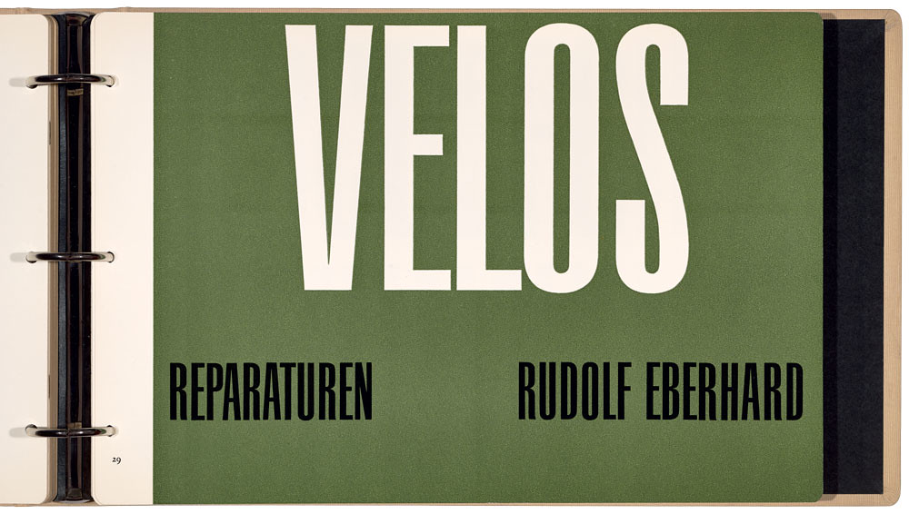
In 1949 a loose-leaf manual was published in Switzerland entitled Schriften Lettering Écritures. It remains a most impressive book. The title of this fully trilingual publication, in German, English and French, gave only a modest indication of its contents. The title page added a distinction between ‘running hand’ or written, calligraphic letters and drawn ‘characters’. Yet none of the subtitles indicated that the author, Walter Käch, who was a designer and teacher at the Zurich Kunstgewerbeschule, had rendered a vista of the future of typeface design. More than 65 years ago this instructional portfolio made an outstanding contribution to Swiss letterform design in the twentieth century.
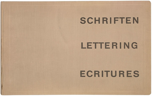
Schriften Lettering Écritures, 1949, is a loose-leaf manual of 100 pages devoted to hand-made letters that influenced Swiss Modernism. Right: Detail of binder spine and the rounded corners intended to prevent damage from frequent handling.
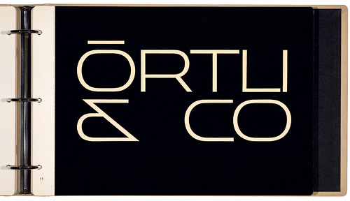
Top: A highly condensed sans serif follows Käch’s scheme for modulated stress with a striking ‘O’ that evokes a velodrome.
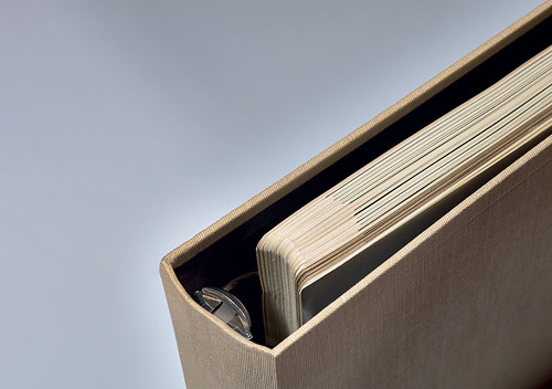
The wide, oversize ring binder contains pages 370mm wide by 250mm deep (about 14 ½ in x 9 7/8 in). There are 77 numbered plates, some printed in two colours, and more than twenty pages of separate notes in columns of German, English and French. The book is split into two sections. The first, taking up about a third of the manual, is devoted to ‘Calligraphy’ (‘Die Geschriebene Schrift’ / ‘Les caractères écrit’). Notes in this section include a synopsis of named styles, historical period, and geographical origin, from the first to the seventeenth centuries.
The first 24 plates, limited to black ink, are printed on darker, more substantial paper. Käch presents twentieth-century interpretations, written with the broad-edged pen, of European hands and inscriptional Roman capitals. Each style is typically represented by an alphabet: minuscule, majuscule or both combined. Names for a style and short texts are often incorporated into the writing specimens, with flourished or overlapping capitals in a few cases following the tradition of a writing master’s exemplar.
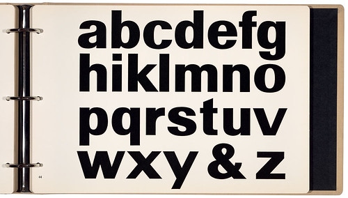
This lowercase alphabet has distinctive horizontal terminals that anticipate both Helvetica and Univers. It is also used for ‘Röntgen Therapie’, lower down.
Extended capitals with a subtle stress are assembled into a cohesive group of echoed shapes. Käch writes: ‘… the word picture should also be taken into consideration at the same time …’ A bar substitutes for the dots of an umlaut.
The second section, ‘Lettering’ (‘Die Gezeichnete Schrift’ / ‘Les caractères dessinés’), similarly begins with fifteen pages of notes plus letterform diagrams. Certain illustrations are labelled ‘example’, ‘right’, and ‘wrong’, indicating Käch’s propositions. He endorses the Roman capital as a model and criticises a vernacular grotesk (sans serif). He draws a correspondence between a pen-written minuscule and his own lowercase letters, explaining a concept for a stressed sans serif. The notes instruct how to balance the strokes or positive shapes of letters with their empty or negative space, through constructions that encompass both capitals and lowercase as a group. Käch treats the ‘i’ dot with equal seriousness.
Next are 53 plates on a stock equal in weight to the first group, but lighter in colour. These alphabets, in some cases extending to figures and ampersands, are in familiar categories: sans serifs, slab serifs, didones (or moderns), a copperplate script, and drawn serifs inspired by stone-cutting. Each style is preceded by a sample or caption page of a few words, suggesting its usage, but style names are not provided. None of the alphabets fits on a single page, and the enlarged details support their potential use in teaching.
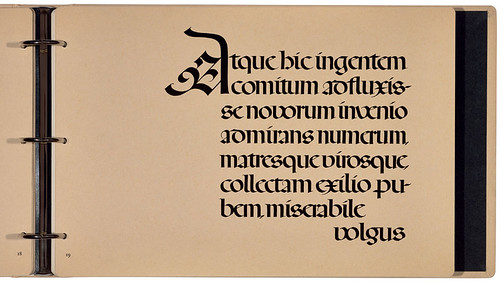
Rotunda calligraphy specimen, using Latin text from Virgil’s Aeneid.
The sans serif capitals stamped on the binder’s cover follow the same style as the first drawn alphabet. The carefully rendered title seems to foreshadow Neue Haas Grotesk, now better known as Helvetica, which would not be released until eight years later. The ubiquity of sans serif typefaces in the twentieth century was not simply the result of Modernism; in the nineteenth century sans serifs were widely used in Europe and elsewhere. Yet there was a Swiss context for the grotesk or sans serif in Käch’s case.
The designer and historian Richard Hollis, in Swiss Graphic Design, points out that jobbing or commercial grotesks were known and used by Modernist designers in Switzerland. Generally linear in their underlying structure, another typical aspect of these typefaces, including the famous Akzidenz Grotesk from the Berthold type foundry, was their angled stroke endings. Käch’s first drawn alphabet shares with the later Helvetica and Univers the rationalisation of stroke endings into horizontals and verticals, nearly eliminating any angled terminals.
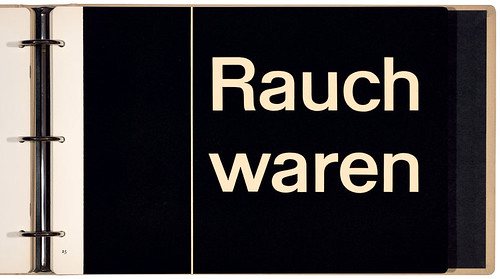
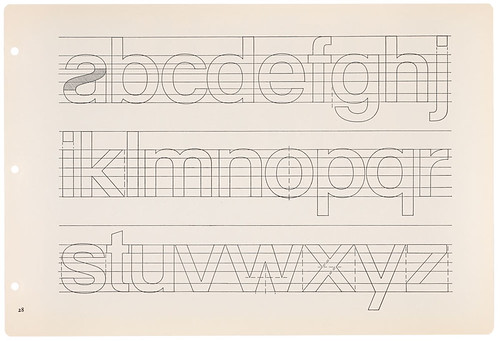
Inside, this alphabet is introduced by the caption ‘Rauchwaren’, indicating a tobacconist’s shop. Shown in outline only, lines across the pages emphasise horizontal terminals and aligned components within the alphabet. Notably, Käch’s letterforms differ from the commercial grotesk or future Helvetica, through a careful hierarchy of stroke thicknesses and stresses as described in his notes. The beard on the G and the angled top of the lowercase ‘t’ are other distinguishing features.
Display caption of ‘Röntgen Therapie’ [‘X-ray Therapy’] using the alphabet seen second from top.
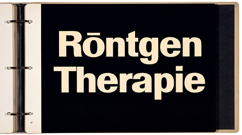
The page, ‘Röntgen Therapie’ introduces a related bold sans serif, with stronger contrast in stress, again nearly free of angled terminals. The impression is reminiscent of the Univers type family designed by Käch’s student Adrian Frutiger. The Univers typefaces incorporate a subtle stress similar to Käch’s system. Frutiger developed his first concepts for the family while in school at Zurich, but equally acknowledges Alfred Willimann, another faculty member at the Zurich Kunstgewerbeschule, as a formative influence.
However, Frutiger specifically credits his understanding of letters drawn on a grid to Walter Käch. These grids, and construction modules for shared components, were devised by Käch for drawing, and point towards a theory of typeface design. Through this publication by Käch, the innovations of Helvetica and Univers can be seen as a continuum of Modernist typeface design with Swiss roots, rather than achievements created in isolation.
The education of Walter Käch explains the foundation for this work. He had the good fortune to be a student of the Swiss designer Ernst Keller, as well as studying with F. H. Ehmcke, Rudolf von Larisch, and Anna Simons – all important designers of lettering or calligraphers of the period in German-speaking countries. He followed Ehmcke to Munich for a year, returned to Zurich, then began teaching in 1925, until he started his freelance career in 1929. Käch’s Modernist posters in the early 1930s used drawn letters related to those in the manual, and are shown by Hollis in Swiss Graphic Design.
Käch continued design work until retirement, and from 1940 until 1967 taught at the Zurich Kunstgewerbeschule. His students, in addition to Frutiger, included Jost Hochuli and Emil Ruder.
While not all the alphabets followed his scheme, and today we might find individual faults, in 1949 there was certainly no equivalent in North America. The best guide to calligraphic letterforms, Benson and Carey’s The Elements of Lettering (1940), did not treat drawn letters with anything close to such thoroughness or precision. The extensive display phototype ranges developed in Chicago and New York polished and expanded familiar gothics, but showed no equivalent attempt at restructuring. At the very least, the letterform refinements Käch explained were previously unpublished; and any prior understanding limited to skilled practitioners.
The interior of the binder offers other evidence that Käch’s manual falls within Swiss Modernism. It combines an asymmetric layout with conventions from book typography; the typefaces are Garamond and Bembo. Yet there are no paragraph indents, in keeping with Modernist practice, and text pages are arranged on a four-column grid. Likewise, Käch’s specific programme for sans serif design was based on involvement with historical forms. Yet on the cover and within the drawn lettering portion of the manual he went beyond mere revival. Clearly, some of his alphabets were Modernist in origin and influenced later Swiss typeface design. This firmly plants his extensive lettering manual within a larger landscape of Modernist typography in the twentieth century.
This alphabet, also seen in the two pictures below, is suggested for signage indicating ‘Rauchwaren’ [Smoking Supplies]. The details show a different intent from typefaces existing at that time.
This lowercase alphabet complements the capitals on the cover (below). Käch’s notes explain a historical basis for the link between the upper stroke and bowl of the ‘a’.
Schriften Lettering Écritures cover, 1949. The corresponding lowercase alphabet is above. The introduction pays tribute to Edward Johnston, ‘the founder of the “Modern Style”,’ stating that Writing & Illuminating & Lettering ‘has served as a basis for the teaching of fine writing in the German-speaking world.’
Peter Bain, designer, writer, Birmingham, Alabama
First published in Eye no. 92 vol. 23, 2016
Eye is the world’s most beautiful and collectable graphic design journal, published quarterly for professional designers, students and anyone interested in critical, informed writing about graphic design and visual culture. It is available from all good design bookshops and online at the Eye shop, where you can buy subscriptions and single issues. You can see what Eye 92 looks like at Eye before You Buy on Vimeo.

