Spring 2000
All you need is love: pictures, words and worship
Sister Corita Kent’s freewheeling assemblages of text and image provide a new perspective on the 1960s obsession with messages and media.
Charismatic nun, artist and activist – in 1960s America the combination was irresistible, guaranteeing Sister Corita Kent a place in popular culture, if only as the woman who spawned ‘nun art’ and made the Love stamp. Her public persona and artistic output were hugely influential, but although her picture appeared on the cover of Newsweek magazine (25 December 1967), Corita was never part of the mainstream, being too radical for the Church, too Catholic (and priced too low) for the art world and too much of a maverick to be pigeonholed in the broader contexts of social and political conflicts of the 1960s.
Frances Elizabeth Kent was born in Fort Dodge, Iowa, in 1918, the fifth of six children in an Irish Catholic family that later moved to Los Angeles. After finishing high school, she entered the Immaculate Heart of Mary Religious Community, taking the name Sister Mary Corita. She studied at the Immaculate Heart College in Hollywood and then at the University of South California, where she learnt serigraphy [silkscreen printing] and gained an MA in Art History in 1951.
For emergency use soft sholder, serigraph, 1967.
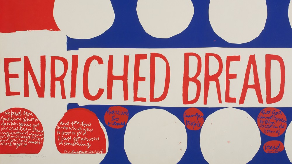
Top: Enriched bread, 30x36in, 1965.
Between 1938 and 1968 Corita lived and worked in the cloistered environment of the Immaculate Heart Community (IHC). In 1962, Pope John XXIII issued his Vatican II decree on the ‘Adaptation and Renewal of Religious Life’. This called for movement toward modern values, including fewer restrictions on nuns’ daily lives and a new focus on social action and service. The IHC, in the way of many Catholic institutions, was divided on how to implement these changes, but the nuns largely favoured a progressive reading of the decree. Dramatic, widely reported conflicts with the conservative Archbishop of Los Angeles ensued, with the result that the Immaculate Heart sisters were banned from teaching in diocesan schools. In 1969, given an ultimatum to conform or seek dispensation from their vows, the community chose the latter and formed an independent entity, which still exists today. They kept their name and structure, but removed themselves from Catholic Church supervision.
Corita’s celebrity ran in parallel with that of the community. In her art, and in her capacity as teacher and chair of the college’s art department from 1964 to 1968, she seemed to personify the ‘modern nun’, in step with the widespread questioning of authority that epitomised America in the 1960s. Her classroom, where she taught ‘layout and lettering’ and ‘art structure’, among other subjects, was renowned for its lively interdisciplinary environment. Multiple films were screened simultaneously, rock music played on the stereo, and large-scale collaborative projects were usually in process. Buckminster Fuller, the visionary architect and designer of the geodesic dome, described visiting her classroom as ‘one of the most fundamentally inspiring experiences of my life.’
Corita regarded printmaking as ‘a very democratic form, since it enables me to produce a quantity of original art for those who cannot afford to purchase high-priced art.’ [1] The forms she used – serigraphs, greeting cards, posters, murals – and the way she disseminated her work – through churches, community centres, galleries and fairs – made her art widely accessible, without ever descending to an imagined lowest common denominator of visual literacy.
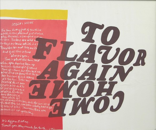
To flavor come home again, 30x36in, 1966.
In the 1950s her art was heavily influenced by Abstract Expressionist painting. The richly coloured prints she made during that period were painterly, typically referring to religious figures or themes from the Bible. She began to introduce words into her pictures around 1954, and gradually increased their usage until word became image. ‘I started early putting words into my prints and the words just got bigger and bigger. I think my words gentle people who are afraid of art.’ [2]
thank god for city scapes – they have signs.
thank god for magazines – they have ads.
this sign language is infinitely rich. [3]
The increasing scale and quantity of words in Corita’s prints can be linked to her growing interest in her immediate urban environment and its signage systems. In the early 1960s, she began quoting advertising slogans and mimicking package design motifs. She was appropriating the colours of the marketplace and the aesthetics of promotion to ground her spiritual and political philosophies in contemporary urban life. ‘Our time is a time of erasing the lines that divided things neatly. Today we find all the superlatives and the infinite fulfilment man hungers for portrayed not only in fairy stories or poems but also in billboards and magazine ads and TV commercials. We are doing an age-old thing in new media. But when we learn (or teach) how to take fairy stories and myths and parables we must also learn (or teach) how to take billboards and magazine ads and TV commercials. In a sense this is simply to take signs as signs.’ [4]
Her pivotal 1962 work, wonderbread, consisted only of red, yellow and blue polka dots, inspired by the bread company’s packaging. From then on, her palette, cultural references and pictorial treatment became increasingly more Pop. By 1964, Corita’s iconography was predominantly derived from urban surroundings and the fast-expanding mass media of the time.
The city is decorated and all the newspapers and magazines are in the game. [5]
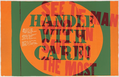
See the man who can save you the most, serigraph, 23x35in, 1867. In the original sign, ‘the man’ is your Chevrolet car dealer and what he can save you is money.
Clang and clatter
Corita’s fascination with advertisements and the languages of commercial culture also extended to the vernacular landscape of the city: the signage, billboards, ‘decorated sheds’ and ‘Long Island ducklings’ – all the things that made la look like ‘God’s Own Junkyard’ according to Peter Blake, the architectural critic [not the artist]. Corita, however, welcomed the ‘clang and clatter’ of what she called the ‘marvellously unfinished Los Angeles’. [6] The theologian Harvey Cox commented that ‘she revelled in the junk and hand-outs and throwaways and labels and ads that most people experience merely as a suffocating wave of mind-deadening trivia’. [7]
From the 1960s on, Corita’s work diverges more and more from the rules of legibility central to Modernist design. Language is excerpted, disassembled, re-assembled, recontextualised. Typography is distorted, reversed and turned upside down. Letterforms float and interlock. Pictorial space becomes a forum for a carefully orchestrated typographic dialogue. She quotes, combines, extracts, highlights and layers elements from a wide array of cultural sources, including song lyrics, advertising slogans, scripture, newspapers and magazines, street and grocery store signage, poetry, theological debate and philosophy.
I admire people who march.
I admire people who go to jail.
I don’t have the guts to do that.
so I do what I can. [8]
In 1967 she turned her attention to issues of racism and poverty, the brutality of the US military in Vietnam and conflicts between radical and conservative in the Catholic Church – using her art as a platform. Corita wrote in 1968: ‘If we separate ourselves from the great arts of our time, we cannot be leaven enriching our society from within. We may well be peripheral to our society – unaware of its pains and joys, unable to communicate with it, to benefit from it or to help it.’ [9]
Prints from this period are coloured with inks so bright they are nearly fluorescent, with complementary colours juxtaposed to elicit dynamic effects, and composed of densely layered, overlapping and interlocking textual fragments. The resultant dialogues were emblematic of the debates over social and political issues that defined the late 1960s.
In 1969, she made a series of small-scale prints called ‘Heroes and Sheroes’, which combined documentary material such as images from Life or Newsweek with other pictorial and textual fragments, to make compelling statements about the political landscape of the time. In the culture of protest, posters and graphic materials not only carried information, they galvanised people. ‘Heroes and Sheroes’ had a visual affinity with both the graphics of political protest and the psychedelic posters for rock concerts. Corita’s visual processes were informed by a rather rigid distinction between the content and the aesthetic aspects of artworks. In Baylis Glascock’s documentary film On Teaching and Celebration, she advises her students never to start a project with a content-driven idea, but to focus first on shapes and colours or whatever visually interests them, which then – in the process of engagement – would naturally produce content. Although her prints seem to exemplify a more integrated approach to the problematic opposition of form and content, some of the conceptual tools she used to generate them illustrate how decontextualisation and recontextualisation functioned as productive forces for her printmaking.
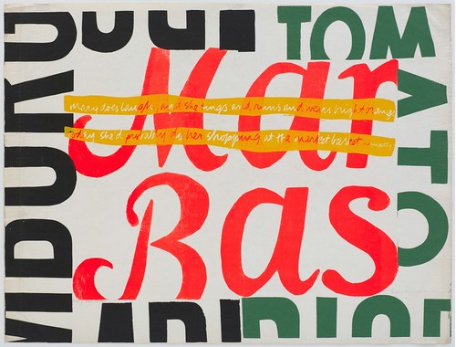
Mary does laugh, 30x39in, 1964. The central text fragment in this image refers to the Market Basket supermarket chain – a source of materials and inspiration for Corita. Across the street from Immaculate Heart College was a gigantic Market Basket store from which she collected discarded signage.
Tools and techniques
Key to her process of decontextualisation is a simple tool, a look-through rectangle she called a ‘finder’, a device that ‘helps take things out of context, allows to see for the sake of seeing, and enhances our quick-looking and decision-making skills’. [10] Corita’s finder could be an empty slide frame, a cut piece of cardboard or a camera. Using it as a cropping device, as an instrument to look at the world, she pointed it at various surfaces from magazine page to cityscape to her own prints. By excluding everything around it, the finder decontextualises what it finds, and, in Corita’s words, allows for ‘[viewing] life without being distracted by content. You can make visual decisions – in fact, they are made for you’. [11]
She often took her students on field trips to busy intersections – a visual riot of petrol stations, supermarkets and car dealerships – and instructed them to look through cardboard finders. She told them to look close up as well as from a distance, declaring that at a single intersection there was enough raw material for at least sixteen hours’ scrutiny.
In her own practice she mostly used the viewfinder of a camera, allowing her to document ‘visual decisions’ for further use. Her interest in photography, which was to become obsessive, had begun in the 1940s when she recorded her travels to the Near East and Europe with an art department colleague, Sister Magdalen Mary. However, these photographs were documentary snapshots and seem to have been unconnected to her artistic practice at the time.
In the 1950s and 1960s Charles Eames was a frequent visitor to the college’s art department, and Magdalen Mary, Corita and their students sometimes visited Charles and Ray Eames’s home in Pacific Palisades on field trips. Corita regarded Charles Eames as one of her greatest influences, a teacher who ‘passed on concepts, not only strings of facts’. She observed and learnt from the couple’s preoccupation with photography, particularly their use of the camera to investigate the visual details of everyday life, and – through scaling and zooming – to generate fresh new perspectives.
Throughout the 1960s Corita photographed magazine ads, billboards, hand-painted signage, and other references. The aim was to isolate fragments and – in the process of framing an image through the camera’s viewfinder – to highlight a particular shape, part of a slogan, or to cut up a section of an image. The photographs were not themselves final images, but raw material for her process.
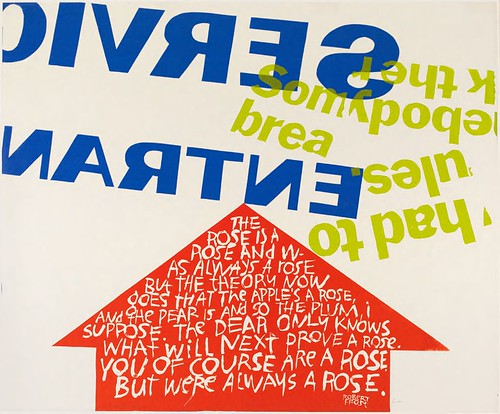
Somebody had to break the rules, 30x36in, 1966.
Photography became a tool for mediating between the multi-dimensional experience of looking at the visual world and the two-dimensional possibilities of a serigraph. Corita noticed that, if looked at through a viewfinder from various angles, type on a flat page or billboard appears three-dimensional and suggests an almost architectural space. She began to use the camera as an instrument to capture such images of dynamically distorted type and to flatten it onto the two-dimensional surface of the photograph. Pushing the distortion process even further, she crumpled already cropped or torn advertisements and photographed them. The resulting images were then further cropped, the distorted type isolated, transferred and used as stencils to produce individual layers in the overall composition. Type thus manipulated and layered was made to suggest a graphic three-dimensional space that offered an architectural sensibility different from the typographic conventions and phototype possibilities of the 1960s. The effective results of her (low-tech) type manipulations have meanwhile become defining features of several recent technologically sophisticated illustration and layout applications for computers.
The graphic space in many of Corita’s works, particularly those from 1967, is also layered with handwritten quotes, which are integrated into typographic components or individual letterforms. The handwriting – Corita’s – became so recognisable in the 1960s that a type company produced it as a type-transfer sheet. The font Corita was used as a typographic blueprint for laying out Bible verses on church posters.
Another important design strategy was her use of cut and paste techniques, which predated punk graphics by more than a decade. In collaboration with Sister Magdalen Mary and ‘industrious students and dedicated professors’, Corita laid out the many pages of the Immaculate Heart Community newsletter, The Irregular Bulletin, as collages of cut-out type and recycled or found images. Headlines are pasted together from newspaper clippings in a ransom note style; typewritten essays are cut up into individual words, phrases and paragraphs and scattered across pages, interconnecting and overlapping with images. The flyers she designed for her “one-nun exhibitions”, curiously, resemble Jamie Reid’s designs for the Sex Pistols’ Never Mind the Bollocks.
Corita’s imaginative use of collage might be graphically less legible in her silkscreen prints but played an important conceptual role in her image-making. Whereas the viewfinder is essential to her investment in formal decontextualisation, the clashes and juxtapositions resulting from her cut-and-paste strategies are important to her recontextualisation processes – and thus the production of ‘new content’.
Just how clashes and juxtapositions produce new contexts and generate content is vividly demonstrated in Corita’s 1967 artist’s book Footnotes and Headlines. The 52-page ‘play-pray book’ is a tableau of typographic experimentation combining brightly coloured type collages with prayers that read like a grocery list. The collages turn fragments of large letterforms into colourgrounds on top of which advertising slogans in various configurations, sizes and typefaces are laid out. Footnotes and Headlines explores and challenges the conventions of reading. It constructs what Marshall McLuhan in a cover blurb called ‘a new form of book … an X-ray of human thought and social situations’.
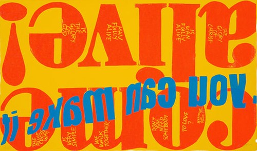
Come alive, 18x23in, 1967. Words taken from the slogan ‘Come alive, you’re in the Pepsi generation!’
Baking the bread of life
By pushing the boundaries of cutting and pasting as a graphic strategy Corita turned decontextualisation and recontextualisation into emblems for the production of meaning, and, in the process, resolved her own distinction between form and content. From the late 1950s through to 1968, Corita followed a strenuous teaching, lecturing and exhibiting schedule that allowed only two week’s annual holiday in which to make her prints. Her increasing engagement with political issues also took its toll. By 1968 she was exhausted: close friends considered her to be on the verge of physical breakdown. Corita left the Order that year and moved to Boston to concentrate on her art. Yet deprived of familiar contexts and influences, her work began to lose its critical force. Her art grew more sentimental and increasingly reliant on platitudes and colour splashes. By the mid-1970s, intense colours and dense pictorial space were replaced by pastel tones and watercolour-derived airiness, and multivoiced compositions gave way to solitary aphorisms. Reaching broad audiences nevertheless remained important and Corita accepted commissions from the likes of IBM and the US Postal Authority, for whom she designed the Love stamp (it was issued in 1985 in an edition of 700 million). She died in Boston in 1986.
Corita’s cultural contribution spanned several decades. Although she described herself as an artist rather than a design professional, her 1960s work spanned both fields. Graphic strategies such as lettering and layout were central to her artistic voice. At the same time, she had no qualms about accepting commissions for magazine covers, book jackets, album sleeves, ads and posters, although even here she should be seen less as a jobbing designer than as an artist with a distinctive and easily recognisable graphic sensibility. As Harvey Cox said, ‘The world of signs and sales slogans and plastic containers was not, for her, an empty wasteland. It was the dough out of which she baked the bread of life.’ [12] At its best, her work proposed a symbolic template that blurred the boundaries between art, design and communication, between a life of worship and the everyday life of her time.
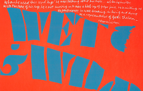
Wet and wild, 18x23in, 1967.
1. Corita Kent, quoted in Corita at the De Cordorva Museum, A Retrospective Exhibition, exhibition brochure. Lincoln, Massachusetts: 1980.
2. Ibid.
3. Corita Kent, ‘art and beauty in the life of the sister’, in Sister Corita. Boston: Pilgrim Press, 1968.
4. Ibid.
5. Sister Corita, Footnotes and Headlines. A play-pray book. New York: Herder and Herder, 1967.
6. Corita Kent quoted in: Kenneth Woodward, ‘The Nun: A Joyous Revolution’, Newsweek, 25 December 1967.
7. Harvey Cox, Commonweal, 24 October 1986.
8. Corita Kent, ‘art and beauty in the life of the sister’, in: Sister Corita. Boston: Pilgrim Press, 1968.
9. Ibid.
10. Corita Kent and Jan Steward, Learning by Heart. Teachings to Free Creative Spirit. New York: Bantam Books, 1992.
11. Ibid.
12. Harvey Cox, Commonweal, 24 October 1986.
First published in Eye no. 35 vol. 9, 2000
Eye is the world’s most beautiful and collectable graphic design journal, published quarterly for professional designers, students and anyone interested in critical, informed writing about graphic design and visual culture. It is available from all good design bookshops and online at the Eye shop, where you can buy subscriptions and single issues.