
Spring 1992
American Gothic
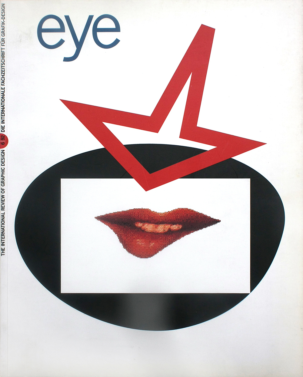
Barry Deck’s Template Gothic is vernacular in inspiration and futuristic in effect. Is it a bizarre one-off, or the shape of typefaces to come?
The process by which particular typefaces come to embody the look, mood and aspirations of a period is mysterious and fascinating. It cannot be predicted with any accuracy and no single designer can will it to happen, but somehow a typeface will look fresh, unexpected, precisely attuned to the moment – and a consensus emerges. Eventually, with repeated applications in less and less appropriate contexts, the face becomes exhausted, incapable of inducing the required frisson and falls into disuse, until such time (it may well never happen) when it is revived.
In Britain, such a fate has overtaken the angular post-constructivist type designs of Neville Brody, Zuzana Licko and Max Kisman. By a curious paradox (helped along in Brody’s case by himself) these faces, once so urgently new, are judged less ‘contemporary’ than sans serif stalwarts that one might have supposed to be irredeemably passé.
Now, just a year or two into the 1990s, comes a typeface so far removed from the unbending geometries of the 1980s that it evokes an authentic sense of what the art critic Robert Hughes called ‘the shock of the new’. The uses it has found give a good sense of its flavour – from the soundtrack album for Wim Wender’s new science fiction film Until the End of the World, to a flyer announcing a season called Towards the Aesthetic of the Future at London’s Institute of Contemporary Arts.
Template Gothic, designed by CalArts graduate Barry Deck, might set a boffin-like brow towards the future, but it also maintains an affectionate toehold on the past. Tony Arefin, a British designer who was one of the first to use the face, compares its effect to the street market/super-building contrasts of Blade Runner: ‘It has a mixture of low-tech with high-tech.’ The low-tech, we know from Deck’s account, comes from the typeface’s origins in a stencilled sign he saw in his local Laundromat. On this level, he suggests, it is a ‘homage to the vernacular’. The irregular, tapering strokes, thickened junctions, inconsistent weight and lopsided rhythm combine to suggest letters afflicted by what the designer calls the ‘distortive ravages of photomechanical reproduction’. Created digitally with the type design program Fontographer, the face embodies a post-modern narrative on the methods of character-generation it supersedes.
Template Gothic’s ‘high-tech’, too, is impeccably postmodern. This is a playful reminder (and revision) of the future as it was imagined in the 1950s – an organic age of kidney dish-shaped tables from which the straight line and the right angle have been expelled. These are fuzzy forms – suggestively vague rather than robotically exact – to match the dawning era of fuzzy logic. Deliberately ‘imperfect’, though oddly lucid, Template Gothic is sufficiently malleable to withstand the most casual designs. There is no way of knowing how it will look in five years’ time, let alone fifty. For now, it is one of the most interesting and original new faces we have.
First published in Eye no. 6 vol. 2, 1992
Eye is the world’s most beautiful and collectable graphic design journal, published for professional designers, students and anyone interested in critical, informed writing about graphic design and visual culture. It is available from all good design bookshops and online at the Eye shop, where you can buy subscriptions and single issues.