
Spring 2019
Bram de Does: the king of (functional) swing
An insistence that technology should match design spurred typographer Bram de Does to create two of the twentieth century’s most beautiful types

To have designed two great text typefaces is not unusual among the celebrated names of type design, but to have designed only two types is. Dutch designer Bram de Does (1934-2015) was that unusual person; his Trinité and Lexicon are widely regarded as among the most beautiful types of the twentieth century, perhaps of any era.
De Does did not set out to be a type designer; he was a typographer first of all. As a book designer he worked under the star of Jan van Krimpen, and his books sit comfortably among the highest expressions of classical thinking in typography. He was in his forties when he designed Trinité; Lexicon came in his late fifties. Both were the response to an absence, the need for a type that was not there, whether for aesthetic or technical reasons. They were shaped as much by this void as by existing historical models, aligning classical form with new technologies in ways that released fresh waves of expression in typography.
Each of the three heights of Trinité was also drawn in two widths, offering the typographer a further level of flexibility.
Top: Bram de Does at home in Orvelte, the Netherlands, 2006. The hand-lettered text reads: ‘To decorate or not to decorate, that is the question.’ Photograph: Mathieu Lommen.

Trinité was a serious attempt to overcome the limitations of photocomposition. Instead of all sizes being generated from one master, De Does designed three sets of glyphs, with a range of ascender and descender lengths. This allowed typographers to echo the optical sizing of hand-cut types.

The conception of Trinité as a whole family came from the depth of De Does’s experience as a typographic designer. For all that De Does loved Romanée and Monotype Bembo, he knew that the new phototypesetting equipment could not reproduce the sense of them in print. Instead, he chose to make a completely new type.

De Does was also a renowned private-press printer, taking the empirical spirit of his type design into his own press, the Spectatorpers. Here he worked with traditional forms and techniques – letterpress printing from hand-set type in small runs – at the very time they were disappearing from his day job as a typographer. The result was a small but perfectly formed output: discreet delicacies of word and image, ink and paper. And the final issue of the press, Kaba Ornament, Volume 1, Form, would be the culmination of all his experiences as designer, typographer and printer. This slim volume introduced the Kaba, a single typographical unit and its mirror image, which could be combined and reflected into arabesques and blooms of decorative imagery – a beautifully reduced, original approach to typographic ornament.
One of De Does’s original drawings for Lexicon, December 1989. Lexicon was initially designed as a space-saving dictionary type with slightly condensed forms and short ascenders and descenders. De Does’s drawings were digitised by Peter Matthias Noordzij and then adjusted and revised by both designers. Collection Allard Pierson, University of Amsterdam.
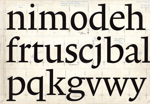
Preliminary drawing for Trinité, March 1979. The subtlety of Trinité and its origins in the work of Nicolas Jenson are clearly evident in this early drawing. Every stroke is curved: the verticals have a sprung tension, as if anchored by the asymmetric serifs. The whole drawing already has the flowing quality of the original photocomposition Trinité; it would be another ten years before digital type technology was capable of reproducing these curves to De Does’s satisfaction. Collection Allard Pierson, University of Amsterdam.

At 44, De Does already had twenty years’ experience as a typographer when he started work on Trinité. He had become the leading typographic designer at Joh. Enschedé en Zonen in Haarlem, the Netherlands, following in the footsteps of Jan van Krimpen and Sem Hartz. The company was in the process of replacing its Monophoto equipment with the Autologic APS 153, a second-generation phototypesetting machine. Autologic wanted to adapt Van Krimpen’s Romanée type, designed in 1928, for its new phototypesetter; the Enschedé management sought De Does’s view on their proposal. This was 1978, and the progression of typesetting technology – away from metal and towards filmsetting – had revealed a fracture in the relationship between type design and typesetting techniques.
In addition to Romanée, De Does favoured Monotype Bembo in his typographic work, and had been dissatisfied with its adaptation for Monotype’s Monophoto system. He wrote later that however much they experimented, it seemed impossible to match ‘the harmony of the letterpress version’. De Does advised his employers to reject Autologic’s plan for a photo Romanée, pointing to the fact that foundry Romanée’s forms varied from one size to another, a subtlety that is impossible when all sizes are generated from a single photographic master. ‘What is Romanée?’, he asked. ‘Would it not be better … to have a new face made, specially for use with phototypesetting?’ The Enschedé management agreed, and to his surprise, given that he had never designed a type before, asked him to design the face.
Lexicon in use in Frans A. Janssen’s Technique & design in the history of printing, 2004, 250 × 175mm, designed by De Does.

Although Lexicon was initially commissioned for dictionary typography, De Does also designed a version with longer ascenders and descenders which turned out to be extremely comfortable as a longer-reading text type.
To counter the impracticality of using a single master for all sizes, Trinité’s first principles included two widths and the three ascender and descender lengths that gave it its name. Very small type could be set in the wider version with short ascenders and descenders, while reading text sizes (8-12 pt) would use the medium length and display sizes the longest extenders. This was a serious attempt to overcome one of the primary limitations of phototypesetting. It was not an entirely new idea – Monotype had made a version of Plantin with lengthened extenders for Francis Meynell’s Nonesuch Press, for example. But the Nonesuch Plantin aimed to restore the ascenders and descenders that had been truncated for efficiency when Monotype developed the original Plantin design, whereas De Does’s plan for the three versions of Trinité was a complete response to the technology that was both practical and aesthetic, and related the new technical conditions to the handwork of the punchcutter.
The original photographic Trinité used in Frans A. Janssen’s Auteur en drukker in de geschiedenis van de typografische vormgeving (Author and printer in the history of typographical design), 1989, 210 × 140mm. Designed by De Does, with a drawn initial.


Photographic adaptations of metal types were also affected by the lack of impression in offset printing and the smoother surface of contemporary papers. When original drawings for metal type were taken as the basis for photographic letterforms, the resulting printed letters were much thinner and lighter than their metal counterparts, ‘terribly emaciated’ in De Does’s words. Type had to be designed with its reproductive technology in mind (as Monotype’s faces of the early twentieth century had been). Now De Does would design a face specifically for phototypesetting which would, in his words, reflect ‘all the measurable proportions and ratios that might be useful in the phototypesetting technology to improve legibility, reliability, and, above all, harmony.’
Harmony and unrest
Although Trinité began as a kind of alternative to Romanée, in the end it was something completely different. In contrast to Romanée’s stately splendour and vertical balance, Trinité is all graceful curves and springing rhythm, infused with what De Does called ‘functional swing’. In Trinité, every stroke is curved, its asymmetric serifs and one-degree slant flicking and bundling the eye forward. In the search for harmony he had produced a design of particular beauty – warm, inviting and romantic. However by the time it was complete (1982), typesetting had evolved again with the emergence of digital technology. De Does was not satisfied that the resolution could reproduce Trinité’s curves, and the face was marooned on legacy equipment as a new wave of digital types swept in. The development of Ikarus-M software and the PostScript Type 1 font format at the end of the 1980s made higher-resolution digital types possible, and in 1989 Enschedé commissioned Peter Matthias Noordzij to work with De Does on a digital Trinité. Finally the design and the technology came into alignment, and Trinité’s reach among designers and typographers began to expand.
Lexicon No.1 Roman A, Lexicon No.1 Italic A

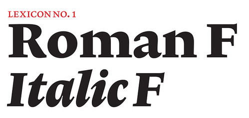
Lexicon F, intended for dictionary headwords. Unlike many other ultra-bold types, the F, the most extreme of Lexicon’s six weights, resists any tendency to caricature. www.teff.nl
The stimulus for Lexicon, De Does’s second typeface, came directly from Trinité. Bernard C. van Bercum was designing a new edition of the definitive Dutch dictionary, the Van Dale. In late 1989, Van Bercum asked De Does whether the new digital Trinité would be available for the project. Instead De Does proposed a new type, designed specifically for small sizes and coarse resolution printing. Now his primary focus would be on legibility rather than harmony; ten years after Trinité, he had come to question whether the earlier focus on harmony had resulted in greater legibility, as he had initially thought. He was not convinced: ‘Optimal harmony and optimal legibility are in competition with each other. A little vertical unrest is good for legibility.’
The design process of Lexicon started in the same way as Trinité, with a detailed examination of enlargements of historical types. This time De Does focused on small, economical bible types, particularly Granjon’s Gaillarde Roman from 1568. Lexicon would be produced in a range of weights and with two ascender and descender lengths; there would also be an extreme bold weight intended for dictionary headwords. De Does’s drawings would be digitised by Noordzij and returned, then overdrawn and adjusted in a process of continuous revision and refinement between pen and digital outline. The text weights of Lexicon are a revelation, its horizontal economy and the potential interlinear space created by its short ascenders and descenders all contributing to legibility in cramped conditions, while the version with longer extenders gives back some air and a measured dignity to the word image. And the headword bold, both energetic and balanced despite its extreme stroke widths, thrives in the microtypographic environment of the dictionary.
Looking back on his two type designs, De Does wrote: ‘With Trinité I hoped to achieve the greatest possible harmony in text – while retaining, of course, more than acceptable legibility; with Lexicon I tried to achieve the greatest possible legibility and practicality – while retaining, of course, more than acceptable harmony. Is it possible that harmony, on the one hand, and legibility, on the other, are, after all, intimately connected?’ Reflecting on whether his contribution had been sufficiently original, he ruled out a third design: ‘Lexicon and Trinité are already original enough due to the way in which they reconcile a number of historically evolved elements with optimally balanced dimensions attuned to modern technologies. In other words, besides striving after harmony and practicality I have already made ample efforts to strive after originality.’
After two decades of work as a typographer, De Does arrived fully formed as a type designer. Each type is a full and rounded expression of its own ambition. The romantic poetry of Trinité is equalled by Lexicon’s poetics of the everyday. If Trinité is sometimes too beautiful, too harmonious, then Lexicon closes the gap.
Lexicon’s sense of objectivity reaches for type’s ineffable dream: to communicate thought without the means of communication casting its own shadow. Where Trinité is a literary face that imbues language with the elegance of dramatic fiction, Lexicon is an unmissable reference point for anyone attempting to design or use a text face where economy and legibility are paramount. Despite their almost opposite starting points, both typefaces have the kind of character that comes from within, the hand of their author. They are recognisably siblings.
Trinité and Lexicon resonate with a graphical, historical and technical consistency of evolution. They stand with Romanée, or with Gill’s Joanna among foundry types, or with Martin Majoor’s Scala or Fred Smeijers’ Quadraat among digital designs, as complete statements of a typographic form expressed through specific technology. These days there are a vast number of typefaces being designed, but the brilliance of Trinité and Lexicon is a simple reminder that proliferation does not equal quality: the base of the type pyramid is increasingly wide, but the tip is never more than a point.
Ultimate self-effacement
De Does joined his father’s printing company in Amsterdam at eighteen; at nineteen he designed the company’s font specimen and his obsession with type began. At the Amsterdamse Grafische School he studied print management rather than design, on a course with practical modules in typesetting and bookbinding. In 1958, aged 24, he joined Enschedé as a typographic designer. Enschedé was the largest printing company in the Netherlands, printing the nation’s banknotes and stamps as well as having a rich history in the printing of books. But most important to De Does, Enschedé had been the employer of Van Krimpen.
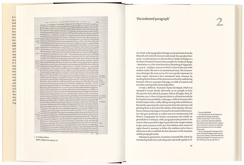
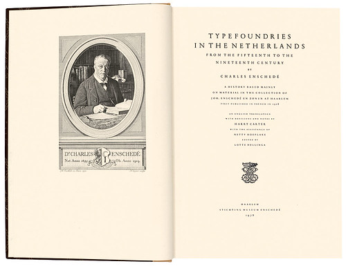
De Does’s work for Enschedé shows a deep affinity with the principles of classical typography – beautiful symmetrical title pages, rational margins and minimal flourishes. Just as the greatest work of Van Krimpen breathes a certain cathedral austerity, De Does’s evident restraint propelled him to a high plane of reduction and self-effacement – ideal qualities for a typographic book designer. The ultimate expression of these qualities for Enschedé would be the monumental Typefoundries in the Netherlands from the fifteenth to the nineteenth century, Harry Carter’s translation of Charles Enschedé’s 1908 history based on physical type from the company’s archives. The text of this lectern-sized book, published in 1978, was hand-set in Romanée, and many of the historical examples were printed from standing type that had been cast from the original matrices for use in the 1908 edition. Some standing type from Enschedé’s type specimens of 1768 and 1867 was also used; the book spans the centuries in form and technique as well as in its subject.
In Typefoundries in the Netherlands, (1978, 380 × 256mm) De Does designed one of the landmarks of classical typography in the twentieth century.
The book was entirely hand set and printed letterpress by a single pressman over the course of a year, on paper made to De Does’s specification. That its subject is type and the art and craft of typography and composition is even more fitting.

Van Krimpen’s Romanée is at its best in this volume: crisp, tall and elegant. The beauty of De Does’s symmetrical title page is the equal of Van Krimpen’s finest work.
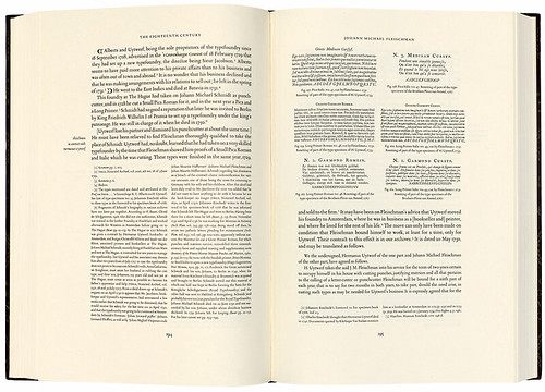
Stories of the production of this volume illustrate De Does’s legendary precision. At the planning stage he convinced the management at Enschedé that if he was to design and produce the book, it would have to be set by a single compositor and printed by a single pressman, always on the same press, in a closed environment, and on paper made to De Does’s specification. He was dissatisfied with the first batch and rejected it – some 7000 kilos of paper. All this ensured a consistent quality of production; De Does felt that this was as important as the choice of materials and the design. The printing took a year – at 1500 copies this is a trade-length print run, not a private press edition.
Typefoundries is a landmark in publishing as much for the complexity and beauty of its content as for the fact that it was the last major work from Enschedé to be set entirely by hand and printed in letterpress. In that sense it is a summary story of metal type and letterpress printing, told at its terminal moment: an endpiece. Its – and De Does’s – command of the reader is absolute and unflinching; there is no escaping its massive architecture of columns and vaults. The design is classical book typography perfectly expressed, and the typesetting and printing are on the same plane. And the combination of Romanée and De Does’s paper is exquisite, at least matching Van Krimpen’s own Homer from 1931, in which Romanée was used for the first time.
Revealing ornament
At Enschedé, De Does’s precision had earned him the nickname ‘Puntje in, puntje uit’ (a point more, a point less) – a reminder that the tolerances to which the truly great work are extremely, sometimes almost imperceptibly fine. He would find an untrammelled outlet for this precision in his own private press, the Spectatorpers. The press launched in 1961 with a statement of intent and a small book of poetry by Pierre Kemp, An English Alphabet, set in 12 point Romanée that De Does had purchased from Enschedé, and printed on his father’s presses in the evenings. Nothing more was published until 1984, when he bought more sizes of Romanée and a few other types, and began to produce a steady stream of beautiful hand-set books, printed on his own Victoria platen press, many of which were bound in decorated paper designed and printed by De Does himself. The subjects were often connected to type or Enschedé; they included his own Romanée en Trinité as well as books for other publishers such as a bilingual edition of Ludovico Ariosto’s Orlando Furioso (Stichting De Roos, Utrecht, 1994).
Perhaps the most beautiful of all the Spectatorpers books is the last: Kaba Ornament, Volume 1, Form (2002). By the late twentieth century, ornament had become a dusty corner of typographic history – hand-set decorated borders had first been purged by the new typography of the 1920s and 30s, then left way down the road when metal gave way to phototypesetting. De Does was interested in classical forms and practices – as a student he had wilfully rejected the ‘modern’ style of asymmetric design then being taught – and the ambitions and setup of the Spectatorpers drew heavily on historical models. He designed a simple unit, the kaba (cube) ornament, and had two iterations – the unit and its reflection – cast at Enschedé. Kaba Ornament, Volume 1, Form is an exploration of the combinatorial possibilities of the unit when it is set in lines with different patterns of orientation. Illustrated with brilliant ‘kaba-cadenzas’, the book is both an intriguing view of the decorative potential of a single unit and a masterly example of design and letterpress printing in multiple colours.
Repetition and modulation
For all that De Does wondered about his originality in type design, the kaba ornament itself and its exposition in this book are an original union of typography and mathematics, which also reveals glimpses of their deeper relations to architecture and music – another of his passions. There are obvious parallels with Bach in the cascading variations, with the architectonic and decorative in the mandala-like arrangements, and with the work of Constructivist and Op artists in the elaboration of visual form through repetition and modulation.
Kaba Ornament, Volume 1, Form, 2002, designed, set, printed and published by De Does under his imprint Spectatorpers.
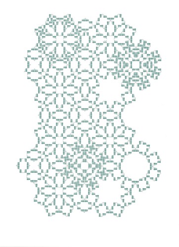
Do these parallels imply an unexpected Modernism in De Does? Where Modernism is seen as opposed to tradition, perhaps not, but his relation to both the traditional and the modern is complex. He spent a life producing symmetrical book designs with respect to the highest traditions of typography and production. He joked that his ‘Modernism’ amounted to the occasional mixing of capitals and lower case on a book cover.
Kaba Ornament, Volume 1, Form, 2002, designed, set, printed and published by De Does under his imprint Spectatorpers.


And yet De Does’s approach was fundamentally not traditional in the slow-moving, conservative sense. He was guided instead by a perpetual inventiveness – in refusing to recommend Romanée for photocomposition, preferring instead to make something new for the prevailing conditions; in creating (and funding) Lexicon for a specific purpose when there was an opportunity to reap some reward from the maturing Trinité; in designing and elaborating a system of typographic ornament at a time when such things were considered excess baggage from another era; in his insistence that technology should match design rather than design being a by-product of technology.
In his concern with harmony and legibility in type design De Does placed the reader, not the designer, at the centre of the work. Even if he had never designed or printed a single book, the achievements of Trinité and Lexicon alone would be enough to place him among the great designers of the twentieth century. Above this, his work for Enschedé and Spectatorpers is the product of a sublime talent, and a reverberating call for the enduring values of modesty and restraint in typographic form and visual language.
With thanks to Peter Matthias Noordzij, Mathieu Lommen and Fred Smeijers for their contributions to the research for this article.
Mark Thomson, designer, London
First published in Eye no. 98 vol. 25, 2019
Eye is the world’s most beautiful and collectable graphic design journal, published quarterly for professional designers, students and anyone interested in critical, informed writing about graphic design and visual culture. It is available from all good design bookshops and online at the Eye shop, where you can buy subscriptions and single issues. You can see what Eye 98 looks like at Eye Before You Buy on Vimeo.