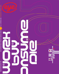
Spring 2009
Britain’s signature
Margaret Calvert signed the UK – from road to rail to air. Now Henrik Kubel has digitised her Rail Alphabet
You can’t brand a decade any more than you can brand a nation. But for many, Margaret Calvert’s lettering left a big stamp on Britain in the 1960s. The public projects carried out by Jock Kinneir and Calvert, from the late 1950s, when they designed signs for Gatwick airport, through to 1965, when they completed the signing system for British Railways, bear the hand of South African-born Calvert, who drew the letterforms.
Kinneir Calvert signed the motorways and roads with their Transport alphabet (see Eye no. 34 vol. 9). Rail Alphabet was drawn to be read in a slower, pedestrian context: signs for NHS hospitals and airports and rail stations. The original Rail Alphabet was produced purely for signing, and later adopted by DSB, the Danish railway corporation, where it was used until 1997.
In Britain, Kinneir Calvert’s sign system began to disappear in the 1990s, as British Rail was privatised and split into smaller companies, each with its own logo and type. Station signs, the responsibility of Railtrack (the group in charge of the infrastructure), were eventually replaced by The Foundry’s custom typeface Brunel.
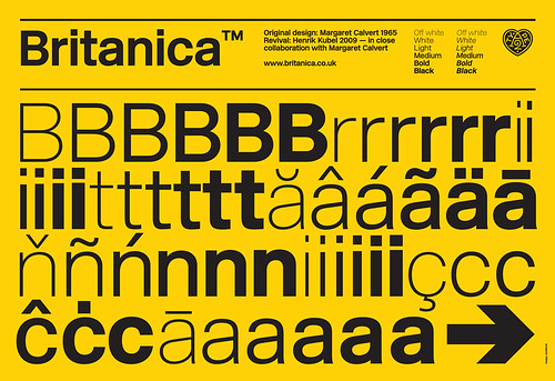
Type sample from the new company A2 Type, 2009, demonstrating the six weights of New Rail Alphabet (originally named Britanica), designed with corresponding italics, non-aligning numbers and a full set of Eastern European characters.
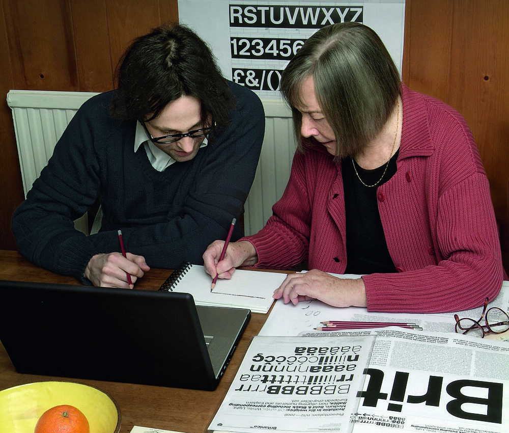
Top: A2’s Henrik Kubel and Margaret Calvert work on New Rail Alphabet at the table in Calvert’s home in north London. Photograph: Anthony Oliver, February 2009.
In 2005, A2’s Henrik Kubel and Scott Williams approached Calvert with the idea of digitising Rail Alphabet for a touring British art project. Calvert, who had taught the Danish-born Kubel at the Royal College of Art in the 1990s, agreed. Kubel traced the original letterforms and produced a complete typeface in one weight. He and Williams never got to use it for that project, but subsequently employed it in their catalogue Jane and Louise Wilson for the QUAD exhibition in 2008.
Then, early in 2008, Calvert received a call from a Spanish company that wanted to produce a version of Rail Alphabet for a corporate client. She replied that the typeface was already in the process of digitisation, and promptly renewed contact with Kubel. ‘I asked Henrik if he was interested and of course he was.’
Turning a signing alphabet into a commercial typeface for text was a gargantuan task. Kubel resumed work, drawing and reshaping the new typeface, plus italics, in six weights: off white, white, light, medium, bold and black. The project had a personal dimension, too. Kubel had been familiar with Calvert’s letters since childhood, because his father worked for the DSB.
Kinneir Calvert’s original sketches and materials had been consigned to a skip when the company closed, so all Kubel had to work from were printed copies of the British Airports specifications for sign-makers. Each poster showed one of two sets of lettering: light on dark (for warning signs such as ‘Do not cross’), and dark on light. Kubel scanned the originals, traced the characters and started from there.
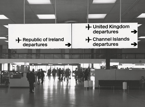
Internally illuminated black-on-yellow direction sign at Heathrow airport showing application of British Rail signing system, early 1970s. This was also installed in Sydney and Melbourne.
‘You do different things when you do text faces and signing faces,’ says Kubel. He points to small changes he has made in the original alphabet’s capitals (to stop them ‘spotting out’ in text), and x-height. ‘In the 1970s, having a high x-height was actually a fashionable thing, and we don’t want any fashion associated with this!’ says Calvert.
‘It’s a balance, because you can quite easily end up with a different face,’ says Kubel. Calvert speaks warmly of her former student’s prodigious industry: ‘He works round the clock, almost. There was a lot of to-ing and fro-ing.’ It was only when Kubel started to draw the lighter weights that Calvert became concerned. ‘You have to keep Henrik reined in,’ she says, with a smile. ‘I said: “Henrik, the minute you veer off that quite flat British Rail look, it’s another typeface.” ’
A solution came from Calvert’s own body of work: her slab serif typeface Calvert, released by Monotype in three weights in 1980. Kubel observes that this is ‘essentially Brit Rail with slabs on – they come from the same origin, really’, referring to Calvert’s letters for the Tyne & Wear Metro signs, on which her typeface is based. ‘Now it is literally Calvert without serifs!’ she says.
This is the first time that Kubel has collaborated with another type designer. But New Rail Alphabet [changed from Britanica, a name that acknowledged the typeface’s origins in both Helvetica and British Rail after Eye 71 went to press] is not a ‘revival’, he explains: ‘We set out to make a well crafted typeface that follows the original as much as we can … the result is 93 per cent Margaret’s face and seven per cent mine.’
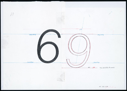
One of Margaret Calvert’s drawings for the italic version of New Rail Alphabet, initialled by Calvert and Kubel.
Pushed to explain what makes it different from Helvetica, Kubel says: ‘I would say this is a very female version of a sans, it’s warmer than Helvetica, it oozes Margaret in every detail. But my typefaces are very feminine, so I think we complement each other very well. If you know that Margaret did Transport as well, you see that it’s a natural way for her to draw another sans, a more “Swiss” sans.’ Like Calvert, Kubel draws by hand: ‘I think we share many things, though there are decades between us. Drawing is essential.’
Asked how her letters differ from rival systems, Calvert recalls the time she would drive all over Europe to see everyone else’s signs: ‘I was obsessive about looking at road signs … it sits with you for the rest of your life. We always thought the Swiss and Germans were better – there was an inferiority complex in this country.
‘This sounds a bit vain, but it’s not meant to be. When we’d done our road signs I thought – they’re not aggressive, there’s something rounded about the characters, and the colours and the coolness and the straightforwardness of them. And it’s possibly that that’s how I draw.’
John L. Walters, Eye editor, London
First published in Eye no. 71 vol. 18 2009
Eye is the world’s most beautiful and collectable graphic design journal, published quarterly for professional designers, students and anyone interested in critical, informed writing about graphic design and visual culture. It is available from all good design bookshops and online at the Eye shop, where you can buy subscriptions and single issues.