
Spring 1991
Cranbrook in close-up
Projects by David Frej, Katherine McCoy, Edward Fella and Allen Hori
David Frej
For David Frej, who studied painting and photography before attending Cranbrook from 1985-87, the starting point for graphic design lies in private myth. Deconstruction and the linguistic theories influential at the academy confirmed a way of working he had arrived at intuitively; uncertainty was a means of liberating graphic form. Frej’s two-dimensional world during this period was one of hesitant lines, hand-drawn letters and mysterious shape in which the spectator was expected to play an active role in the construction of meaning. “Obscurity is accepted and instinctual conviction essential,” he explained. Since Frej set up Influx, a three-person design team, in Chicago, projects “which are art, but which look like graphic design” have given way to commercial commissions for Design Logic, Details, an office accessories company, and the First College Bank. He continues, however, to apply the “ordering system” he derived from his Cranbrook experiments. Frej’s solutions might be idiosyncratic, as in the die-cut business card, but the needs of the client are never forgotten.
Katherine McCoy
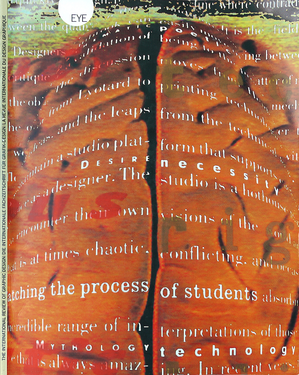
Katherine McCoy began her career a Unimark International in the 1980s and carried many of the company’s Bauhaus-derived assumptions with her when she became co-chair of the Cranbrook design department with her husband, Mike, in 1971. McCoy’s early work at Cranbrook betrayed a strong Swiss influence, favouring rigorous analysis and a commitment to the grid. Modernist principles continue to underpin McCoy’s approach, but the grids have become increasingly complex and contradictory and irrational elements are allowed to intrude on the rational. McCoy’s posters invariably function as commentaries on their subject matter. In the Cranbook Design Program poster examples of the students’ work are overlaid with a list of opposing values (“conceptual/aesthetic” etc.) and the communications theory diagram. “Graphic design is now seen as a visual language,” McCoy wrote in Design Quarterly in 1990. “Its audience is approached as readers as well as viewers. In the best of this new design, content is once again at center stage. Images are to be read and interpreted, as well as seen; typography is to be seen as well as read.”
Edward Fella
Edward Fella’s designs are the antithesis of slick. Drawing on seemingly limitless powers of invention, he self-consciously disregards every rule in the book. Letters are sliced, distorted, drawn in by hand; letterspacing is extended, linespacing collapsed; doodles spill across gridless layouts and type is brushed on with the freedom of paint. Fella, now 53, worked as an illustrator, collage-maker, draughtsman and photographer in his early career in Detroit. His experiments as a commercial artist (“I was the vernacular!”) were an influence on students at Cranbrook even before he signed up for the masters programme at the end of the 1980s. Fella uses his art world clients, in particular his flyers for Detroit Focus Gallery, to explore typographic ideas that, by his own admission, have nothing to do with the artists he promotes. He exposes his own role in the usually reverent and seamless process of presentation and asserts the designer’s position as a creator in his own right. Conventions of legibility are overturned with wild, scattershot, compositions that turn out, on closer inspection, to be surprisingly readable.
Allen Hori
Allen Hori is one of the most striking talents to have emerged from Cranbrook’s graphic design programme in the last two years. Like all of the academy’s graduates, he now faces the problem of how to integrate the department’s experimentalism into his professional career. “The period of post-Cranbrook trauma is definitely something real,” Hori notes. At present, he is engaged on a series of internships at Dutch design companies, including Hard Werken and Studio Dumbar, which has close ties with Cranbrook – former student Robert Nakata is a permanent staff member and David Frej worked there for six months in the 1980s. Some of Hori’s recent projects, such as the Contemporary Improvised Music poster for Studio Dumbar, are entirely typographic, recalling his linguistically based Cranbrook work. But Hori’s must fluent designs – his posters and a book cover for the Detroit-based Typocraft company – layer type and photographic imagery with a subtlety and resonance that brings to mind the more personal creations of April Greiman.
First published in Eye no. 3 vol. 1 1991
Eye is the world’s most beautiful and collectable graphic design journal, published for professional designers, students and anyone interested in critical, informed writing about graphic design and visual culture. It is available from all good design bookshops and online at the Eye shop, where you can buy subscriptions and single issues.