Summer 2011
Credits where due
Momoco’s TV and film titles mix animation and typography to distinctive (and award-winning) effect
In the twelve years since Miki Kato and Nic Benns set up their London studio, Momoco, they have been doing some quite extraordinary things with on-screen typography. Few who saw An Education (2009) can have failed to notice the title sequence with its pedagogic animations brilliantly overlaid on scenes from an early 1960s girls’ school life (it won them a New York Type Directors’ Club award). And the monochrome textures in the opening credits for E4’s Misfits, a comedy about young offenders with superpowers, now in its third series, was nominated for a Bafta award.
Film titles, Benns believes, are simply ‘the best combination of typography related to image and storytelling’. Which is why it was disappointing that there seemed to be no graphic designers at their recent Bafta masterclass at the ICA in London. Maybe they didn’t know what they were missing: Saul Bass and Kyle Cooper apart, those who design film and TV credit sequences are rarely household names; sometimes they don’t even merit a mention themselves. That isn’t a problem, says Benns, firmly: ‘Our job is to give other people credit, and I’m happy with that’.
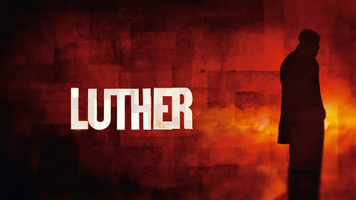
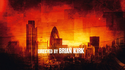
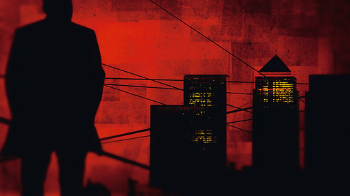
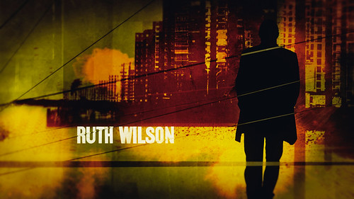
Momoco’s portfolio ranges across romantic comedy (Love Actually and this summer’s One Day), generic horror, drama and sci-fi thrillers such as Ice, released as both movie and TV series according to territory. In the past year, UK viewers have been treated to Luther (London police thriller), Zen (glamorous Italian crime fantasy), Silk (courtroom soap), Episodes (Hollywood satire), Monroe (medical drama) and Injustice (legal thriller). Later this year their new look for the Sky / HBO action series Strike Back: Project Dawn will be revealed. All are different, and many, dare one say it, are more engaging than the episodes they introduce.
But whatever the genre, whatever the style, ‘type is always the key character’, Benns says. Animating type is a passion he and Kato have shared since they were students at CalArts in the 1990s. Benns, a would-be comic artist and musician, had come from England to study animation but quickly discovered that graphic design ‘had amazing lecturers, people like Ed Fella’. Kato comes from Japan, and the studio’s name, a derivation of the Japanese for peach, comes from her graphics graduation project, an interactive game about Japanese culture (see ‘Cute culture’, Eye 44).
Sometimes they make their own lettering – for Day of the Triffids, for example – but in what is basically a two-person studio that is something of a luxury. As it is, pitching for film work is a labour of love: animating each letter takes time – ‘they have to look good as stills, so you have to choreograph them and there’s no plug-in for that’ and a single storyboard can take a day to paint – and pays nothing. ‘We do a lot of ads,’ Benns says, ‘but we don’t talk about them. They’re not our ideas.’ But he admits that commercials for clients such as O2, Weight Watchers and Coca-Cola account for 90 per cent of the studio’s turnover.
Brainstorming about fonts is the fun part, they say. The sequences that result can be abstract and austere, like Kato’s minimalist boxes for the psychological thriller Hard Candy, or highly decorative, like the moving curlicues and clefs for Paul McCartney’s Chaos & Creation concert. Letters rarely stand still, being gusted around by the wind (Miss Pettigrew Lives for a Day), popping up with a slice of toast (One Day), distorted by the liquid in an alcoholic’s glass (Dangerous Parking), dancing on water, converted into alien languages, sinisterly degraded or jazzily elongated. ‘We like cutting into stuff and manipulating it,’ says Benns.
One favourite type designer is Jonathan Barnbrook, a hero of Kato’s since college days. The main font on their website is his Priori Serif (2003); and the Silk sequence uses a modified version of his Prototype (1997) with Carlos Segura’s unsettling Time in Hell (1993) to suggest the discrepancy between the heroine’s court successes and her private life.
The most significant font in their repertoire is FellaParts (Emigre, 1993), Ed Fella’s collection of illustration fragments (see Eye 23). ‘I love that font,’ says Benns. ‘I used those little abstract shapes as building blocks for a project, and then I used those building blocks for another project and it kept evolving.’
The most important of these projects is the feature film they have been planning for years. As a calling card, they have made a short sci-fi film, Copelia, where they pull images from FellaParts and fonts such as Miles Newlyn’s Missionary (1991), extruding and overlaying them to create a kind of living architecture.
The Three Musketeers in 3D is scheduled for October 2011. Even if you don’t care for the video game sensibility of Resident Evil director Paul W.S. Anderson, stay with it for the opening credits, which show the letters of the title cut up and rotated like the workings of an intricate war machine, taking the studio’s work literally into another dimension.
Is stereoscope the future of credits typography, then? ‘You don’t need it for stories about people’s emotions,’ Kato points out. But they like the way it opens up avenues of exploration. ‘In 3D, you have to imagine what’s on the other side, how that can evolve, shift. Type can have another angle to it, possibly another meaning,’ explains Benns. ‘It’s not appropriate for everything, but it is fascinating – and it is one thing that can really advance motion graphics.’
First published in Eye no. 80 vol. 20.