Autumn 2010
David Pearson: inside out
The man who made series design fashionable (and profitable) at Penguin is also a publisher who relishes the ‘big puzzle’ of books.

Contemporary publishing can sometimes seem to be engaged in a version of Aesop’s Fable of The Hare and the Tortoise. The Hare of digital publishing, of websites, e-readers and electronic papers keeps racing ahead, easily distracted or diverted through obscure alleyways, while the Tortoise of traditional print publishing plods ahead, stoically avoiding the regular rumours of its demise.
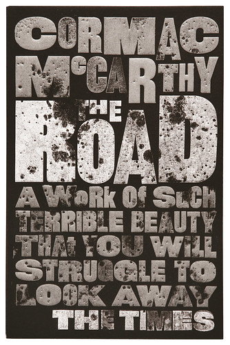
Above: From the series of ten Cormac McCarthy novels for Picador (2010.
Top: Portrait by Julian Anderson.
Despite the twin spectres of dumbed-down content and closed-down bookstores, the process of making books – with worthwhile text, good typography and inspiring covers – still lives. Publishers want to make books; readers want to read them. Digital publishing is a chimerical shape-shifter, a potentially lucrative Holy Grail (now that the iPad, Kindle and other tablets appear to promise profitable new platforms) but for twenty years it has progressed in fits and starts like Aesop’s Hare: despite its advantages – for sustainability, economy, ease of search and portability – the ebook has yet to evolve into its natural form.
In just under a decade since leaving college, David Pearson (b.1978) has emerged as an energetic and innovative advocate for serious and thoughtful book design. A self-described ‘technophobe’ (he doesn’t have a mobile phone), Pearson aimed for the heart of traditional publishing, going to the text department of Penguin Books straight from college in 2002.
This may not have been the most promising moment to join a declining sector, nor even the best time for Penguin itself, which, despite its honourable design lineage, was struggling to deal with the 21st century realities of celebrity bios and movie tie-ins. But Pearson knew where he wanted to go, visiting the publishers’ website every week during his last year at college to look for job vacancies.
After a childhood in Cleethorpes, a Humberside seaside resort, Pearson first studied design at Grimsby Art College and Leeds College of Art & Design before moving to London’s Central Saint Martins (CSM), where he graduated with first class honours in graphic design. Starting at Penguin the day after graduating from CSM, he enjoyed the challenges of text-setting and interior book design. He appreciates his good fortune in joining a department where he could learn on the job. He says that his boss, ex-Reading graduate Andrew Barker, taught him more in six months than he’d learnt up to then. He quickly realised that much of text design is about measuring and maths, and quizzed Barker on the finer points of typography: ‘I used to limit myself to a couple of questions a day.’
Then, just six months after he joined, the entire text design department was made redundant. Fortunately for Pearson, Penguin Press art director Jim Stoddart plucked him out of the ‘redundancy pile’, finding him a job in the cover design department.
In this new setting, he realised that high volume and quick turnaround meant that each designer, however lowly, had considerable autonomy. ‘As a junior you get the experimental projects that have no sales expectations,’ he says, referring to the ‘Great Ideas’ series, now in its fifth and final incarnation, that first drew attention to his talent as an art director.
Penguin editor Simon Winder had devised the ‘Great Ideas’ series after a visit to Italy, where he saw philosophy books on sale in tobacconists’ kiosks. Pearson decided that the cover for each bite-sized volume should be typographic, more like the frontspiece of a book than a conventional cover, and that the type or lettering on the cover should reflect the time in which the essays were written. To spread the workload, he enlisted the help of Phil Baines and Catherine Dixon, two of his former tutors at Central Saint Martins, plus Alistair Hall of We Made This, and designed the remaining covers himself.
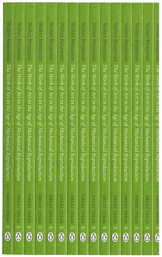
Above: ‘The title told me what to do,’ claims Pearson about his postmodern cover, 2008, for Benjamin's influential essay. ‘It helps to have limitations.’
He admits that he involved Baines and Dixon as a ‘panic measure’ when he suddenly realised the scale of the project, relying on the knowledge and taste of his former tutors to prevent him making ‘grotesque historical inaccuracies’. Yet they surprised Pearson by contributing covers that were much more expressive than he had imagined: ‘They bent the rules straight away!’
Penguin By Design, published to celebrate the publisher’s 70th anniversary in 2005 gave Pearson a chance to explore the archive.
‘I wanted to learn more about the company’s history. Jim Stoddart let me propose it to all the bigwigs and they liked it and attached it to the anniversary.’ Pearson brought Baines into the project as writer because ‘he was never going to write a frothy account of the company’s history, he was going to say where it was good and where it was bad … the archive is quite dubious in places – when it gets to film and TV tie-ins it’s quite depressing.’
Within the company, Pearson got known for series designs: ‘My temperament was more geared towards multiples, and working on systems.’ He worked on popular classics, ‘Pocket Penguins’ (also for the 70th anniversary), ‘Great Loves’ (2007) and other things ‘that had got bent out of place’ such as the reference books.
Pearson points out that ‘Penguin’s reference list is poor compared to Oxford,’ but chose to regard this as a challenge rather than an obstacle: ‘You have to create something completely different. And that’s where it gets exciting and you can reposition them.’
After looking at the way the books were displayed in shops, Pearson decided to place emphasis on their spines rather than their covers. Rounded page edges added another small, tactile element to the series, which now runs to more than 100 volumes.
When I suggest he has become a brand expert without meaning to he agrees: ‘Stumbled on it is right. That’s a reflection of how warm and fuzzy the publishing industry still is … they don’t have that brand-savvy attitude. You would never get that freedom anywhere else. The best people are almost hobbyists.’
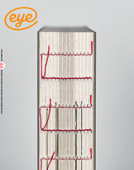
After five years at Penguin, Pearson left to found his own practice, admitting that ‘no-one ever leaves – I could have stayed in the same job forever. I needed to leave for that reason.’ His first outside clients included film director Ridley Scott and French publisher Zulma, though he continued to do work for Penguin, notably the third, fourth and fifth series of ‘Great Ideas’. Lately he’s designed a series of ten novels by Cormac McCarthy for Picador using book-size rubber stamps made from computer-set typographic designs to create wood-type-like variations.
Early in 2008, Pearson was approached by editor Jonathan Jackson (also an editorial director at Duckworth) to found White’s Books, which he describes as a company ‘without overheads’, since both of them manage to run the company while working. The imprint kicked off in style later that year with a series of cloth-bound popular classics, in wraparound covers by prominent illustrators, including Celia Birtwell (Wuthering Heights), Stanley Donwood (Treasure Island) and Joe McLaren (Dickens’ The Christmas Books), all selling for less than £20. They commissioned new introductions and carefully edited and typeset the text, adding ‘catchwords’ at the foot of each right-hand text, a device intended to aid reading aloud.
‘Classic books are a multi-million pound part of the market for books so all we need is a niche in it,’ says Jackson, who had admired Pearson’s Penguin designs with some degree of jealousy while working at rival publisher Weidenfeld & Nicolson. By placing emphasis on design and production, White’s Books has aimed for a wider range of customers than other publishers, selling them in classy department stores such as Fortnum & Mason’s, gift shops and smart gallery shops.
A second series of hardback classics, at the even more popular price of £6.99, uses McLaren’s illustrations throughout. Titles include Jane Eyre, Dr Jeckyll and Mr Hyde and Alice in Wonderland, for which Joe McLaren has completed a set of scraperboard interior illustrations as well as the cover. ‘One of the things I find most refreshing about working with David is that he’s not remotely concerned with being fashionable,’ says McLaren, ‘His work looks timeless.’
Pearson’s own illustrations tend to be pattern-based, as on the Zulma covers, or conscious homage, such as his ‘Great Ideas’ covers based on designs by Richard Paul Lohse. Despite his claim to be a technophobe, he’s comfortable using the computer to create endpapers and cover designs, often using step and repeat in Photoshop to create patterns from repeated shapes and signs. ‘On a simplistic level, just playing with pure form on screen feels like a departure from a day setting type – you can just push shapes around, it’s the nicest work I do in terms of passing time.
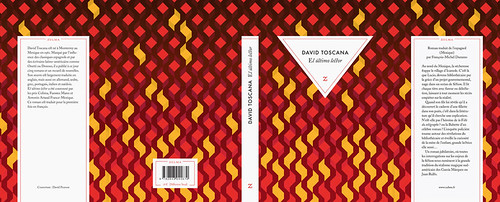
Above: El último lector, Éditions Zulma, 2008. Pearson explains that the design provides information about the ‘temperature and colour’ of the contents.
‘He doesn’t especially have a “look”,’ says Catherine Dixon, his former tutor at Central Saint Martins. ‘He twists and turns, always doing things that you would never expect, such as his Walter Benjamin cover for “Great Ideas”. He’s also very generous, taking great pleasure in commissioning people that he admires.’
Pearson, in his self-effacing way, isn’t entirely sure about the future of the physical book in the age of electronic dissemination, but he is happy to be embedded successfully in a sector where he can do what he loves best. Even his non-book jobs – a flexible identity design for Ridley Scott’s movie company, an album cover (Leave Your Sleep, 2010) for Natalie Merchant – are unapologetically book-like.
‘If I go away from books … doing music or branding,’ says Pearson, ‘I don’t ever enjoy those projects as much as I enjoy book covers. Of course you can make more money that way, but it feels like the time you spend designing is maybe the first five per cent of the schedule.’
Some of his future projects may rest on his own desire to curate and select visual material – a continuation of his work on Penguin By Design, based on his interest in arcane collections such as Belgian luggage labels, and illustrative matchbox covers from the former Soviet bloc: Bulgaria, Poland, Czech Republic.
Jackson, Pearson’s partner in White’s Books, is quite bullish about the future of publishing, both online and offline. ‘Our emphasis on books as objects is not a reactionary thing,’ says Jackson, ‘and it doesn’t mean you can’t welcome ebooks. Publishers will have to think about how to sell printed editorial, as well as being scared and excited about the digital future. You need to do more.’
Pearson has brought the insides of books to their outsides. He sees the book as a complete artefact, whose paper, binding, typography, cover, endpapers, etc., all contribute to the reader’s experience of the content. Pearson regards the White’s classics series as a test of his ability to make a book: ‘It’s a great leveller. If it’s a copyright-free text and anyone can publish it then it comes down to how well you can produce it.’ Such devotion to the time-consuming details of typesetting, editing, design and production – for which Pearson shows boundless enthusiasm – is now coming to be regarded as an essential element of the physical book’s reason to exist.
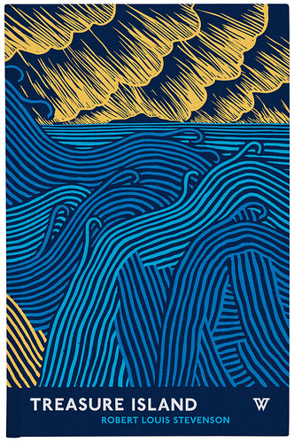
Above: Treasure Island cover by Stanley Donwood.
‘In the last three or four years you’ve had a lot of panicking publishers that are trying to get as much profit as possible to offset digitising all of their books. There’s been a horrible kind of workhouse vibe going on and it feels like now people are starting to get more focused,’ says Pearson.
His unforced talent for identity and branding, shown in his work for Penguin, Picador and White’s, may point to another means through which the physical book may thrive: collectable editions of multiple titles. ‘He’s made series book design fashionable again,’ says Dixon, ‘making things that people want a whole set of.’
‘I like detailing,’ says Pearson. ‘I have a lot of patience. I like collecting things, systems, micro-detailing and putting them in order. It’s like a big puzzle.’
First published in Eye no. 77 vol. 20.
Eye is the world’s most beautiful and collectable graphic design journal, published quarterly for professional designers, students and anyone interested in critical, informed writing about graphic design and visual culture. It is available from all good design bookshops and online at the Eye shop, where you can buy subscriptions, back issues and single copies of the latest issue. You can also browse visual samples of recent issues at Eye before You Buy.