Winter 2001
Day-Glo mind blow
Psychedelia hit late 1960s London in an explosion of silk-screen colour
Between 1966 and 1968 a small number of British designer-artists produced an extraordinary body of psychedelic posters, with stunning colours and highly individualistic and imaginative designs. Unlike their American counterparts (such as those producing dance posters for Bill Graham and the Family Dog), who generally used offset lithography, they produced their most striking posters using screen printing or a novel use of metallic foil-coated paper. [1]
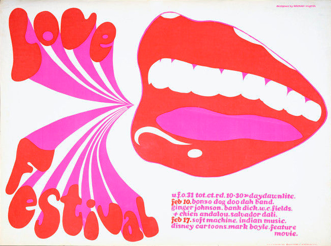
UFO Love Festival, screen print by Michael English (Osiris, 1967). Inspired by Man Ray’s detached lips (the programme included a screening of Un Chien Andalou by Salvador Dali and Luis Buñel) and the paintings of the Pop artist Tom Wesselman, English created an attention-grabbing poster image.
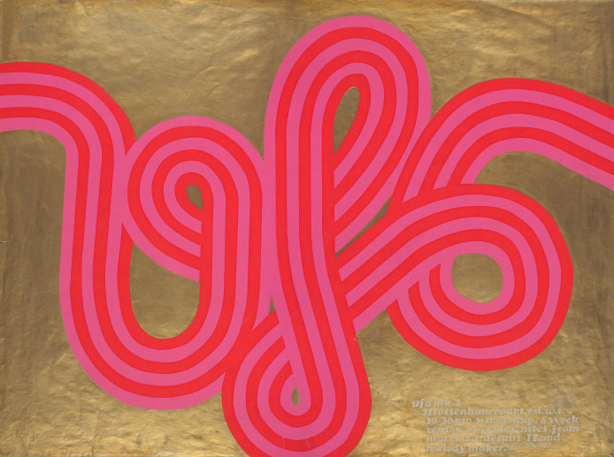
Top: UFO mk 2, screen print by Michael English and Nigel Waymouth, known collectively as Hapshash and the Coloured Coat (Osiris, 1967). This poster, the first by the duo, reflects their interest in Op Art and, with its gold background, introduces the use of metallic inks that became an important feature of their work.
The reasons for this were partly economic. In 1966, there were very few offset litho printers in Britain, [2] and since the late 1940s silk-screen had been the commercial printing technique most widely used for short runs of visually led display work, such as posters and point of sale material. By the 1960s, however, silk-screen was becoming identified with the ethos of the British underground scene, [3] and also as part of the artistic intention behind the posters.
Some of the earliest British psychedelic posters were designed by Michael English, initially on his own, and later with Nigel Waymouth in a partnership that became known as Hapshash and the Coloured Coat. English had trained at Ealing Art School and, after a short spell in an advertising agency, began producing Pop objects for the Carnaby Street boutique Gear. These included T-shirts with slogans which were commercially screen printed and carrier bags lettered with ‘Sex’ and ‘Kiss Me’, which the artist hand screened in his studio. From this beginning English became very interested in screen printing, appreciating its distinctive brilliance of colour and the tactile nature of the thick film of ink.
English had also been working for The International Times (IT), which, with Oz, was one of the main publications that catered for the British underground scene in the mid 1960s. [4] Since IT was published every two weeks, and was constantly short of money, it decided to set up a night club to raise funds to pay contributors. The UFO club was launched in December 1966 and was run by John ‘Hoppy’ Hopkins, one of IT’s founders, and Joe Boyd, whose Witchseason Productions promoted groups such as Fairport Convention and the Incredible String Band. In order to publicise the club’s very varied weekly programme, they commissioned posters from English. From January 1967 he produced a series of silk-screen posters, experimenting with fluid letterforms and printing in vivid Day-Glo colours. The lettering was often given a three-dimensional quality, which the opaque inks further enhanced, so that they leapt forward from the generally white background, The culmination of this series was UFO mk 2, where a gold background was used.
Fluorescent inks, which had been developed for American military use during the Second World War, were imported into the UK in 1950 under the brand name of Day-Glo, and quite widely used commercially for posters, display material and packaging, in particular for washing powders. [5] These inks required the thicker film of ink that silk-screen produced. Silk-screen was also the most effective means of printing with metallic inks – the bronze and aluminium powders were mixed by the printers to the designer’s requirements.
Through Boyd, English met Nigel Waymouth, part-owner of the trendy King’s Road boutique Granny Takes a Trip, who shared his interests in Pop and Op art, Art Nouveau, mysticism, science fiction and the supernatural – or, as English put it, ‘everything that contradicted the rational world’. Together they created some highly original poster designs. Their first figurative poster was for the rock group The Move at the UFO on 26 May 1967; it used gold on white paper with the lettering in a graduated pink to yellow blend, their first use of rainbow inking. Rainbow inking or blending was in fact a revival of a traditional technique – there are various examples in nineteenth-century printing. It was however particularly suited to silk-screen as the different inks could be poured on to the screen simultaneously and, where they met, allowed to blend together to create a gradual transition of colour. The psychedelic poster artists were excited by the idea that the inking of each poster would vary.
Commercial propositions
Boyd soon became aware that young people were collecting the posters and in the spring of 1967 set up a company, Osiris Visions, to sell the posters; he also established the Osiris Agency, which would find artists for record sleeves and promotional material for Witchseason Productions, as well as for other groups and record companies. The posters that were initially produced for flyposting were then also sold via Osiris. For the first run, around 1000 posters were printed: 500 for flyposting and 500 to sell. Initially they were printed by Associated Art Crafts and Cinema Signs in Camden, where semi-automated Kippax presses were used in combination with a high level of craft skills in hand-cutting and lettering.
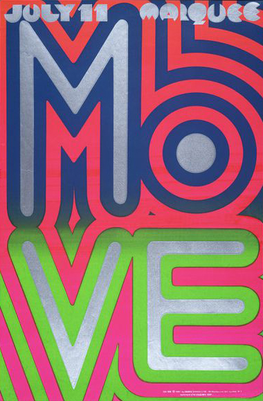
The Hapshash partnership was also interested in pure lettering, sharing contemporary art’s concern with optical effects. The opaqueness of the silk-screen inks allowed the simple design of the poster for The Move at the Marquee club to have maximum impact. This also demonstrates the economy of effort in rainbow inking – the blue / green rainbow has created two colours in one printing.
The poster artists had to provide both artwork and colour separations. The main artwork was black and white and contained the more complex part of the design; in the case of Hapshash, this would be the intricate line work. The artists also drew separate overlays on acrylic sheets for each colour. A photographic stencil would be made from the main artwork, while hand-cut stencils would be created from the overlays to mask out the separate colour screens.
According to English, Waymouth was the colourist at Hapshash. ‘Nigel worked with me on each poster. Nigel would do a bit and I would add to his work and he to mine until the poster was complete.’ [6] For a gig poster they were given total freedom but if it was promotional material for a group they would meet the musicians, find out their ideas and take photographs from which Waymouth could draw portraits to incorporate into the designs.
The restrictions of colour separation possibly helped to provide a strong design framework behind the detailed line work. Once the artwork was complete they would take it to Associated Art Crafts, where they would decide the inks in consultation with the printers. English and Waymouth would be present for the printing of the first colours, which were nearly always rainbow inked. Both the artists and the printer, George Blacknell, recall the excitement when the final printing of each poster was completed and it was possible to see the full impact of the combined colours. [7]
Michael McInnerney, who was art editor for IT from 1966 to 1967 and involved in various underground events, also designed several posters, sometimes with Dudley Edwards in a partnership known as Omtentacle. (Edwards was part of the Binder / Edwards / Vaughan artist trio who were best known for their psychedelic painted cars, musical instruments and murals, including commissions for members of The Beatles.) McInnerney, who trained at the London College of Printing, recalls the pleasure in working with silk-screen printers, who allowed designers to become involved in the process, in contrast to the other, strictly unionised printing trades. He admired contemporary painters and fairground artists whose skilfully blended colours introduced a spatial dimension into their work; for him silk-screen provided a similar opportunity. McInnerney and Edwards played on this spatial dimension, both in the three-dimensionality of the ‘organic’ melting forms and in the relationship between inner and outer states of mind, with reference to drug-taking and also spirituality and mysticism. Rather than use Day-Glo, they generally employed more subtle rainbow effects and colour contrasts to explore their emotional and symbolic meanings and to play on opposites.
Like Hapshash, McInnerney and Edwards were given complete liberty in their choice of subjects, which they fully exploited, using their posters to work out their own personal concerns, including their shared belief in Meher Baba. [8] The poster UFO Dawn to Dusk explores the liberation offered by UFO from the normal world of the ‘greys’, those still bound by the manacles of conventional daily life. Legalise Pot Rally recreates the hallucinatory effects of drugs but also hints at the dangers of drug-taking through its use of the image of Icarus. Jazz at the Roundhouse explores the nature of good and evil, and is more an object of contemplation than a gig promotion.
In reflective mode
Another striking Osiris artist was Martin Sharp, whose poster for the UFO at the Roundhouse, September 1967, with its wired image of sensory stimulation at the UFO, maximises the effect of combining Day-Glo and silver with the contrasting black of his expressionist line work. Sharp was however, more used to working in offset lithography, both in the intensely graphic content of Oz, for which he was largely responsible, and in his work issued by Big O, the poster company set up by Peter Ledeboer in September 1967. Ledeboer had been responsible for finding printers for Oz, a difficult task, since the printers would be legally liable for the content of the work they printed, and few wanted to run the risk of police raids. Furthermore, they also had to be capable of executing the designers’ ideas, such as fold-out covers and text with rainbow inking.
It was Ledeboer who discovered the metallic faced card, originally created for the inside of book covers, that Sharp used for his 1967 Legalise Cannabis Rally poster. A collage of figures taken from nineteenth-century engravings was lithographically printed in black with a separate red overlay on to gold faced card. The metallic foil meant that the inks rested on the surface and the transparent red ink allowed the reflective qualities of the foil to shine through. Although the ink layers were much thinner in offset lithography than silk-screen, this use of colour separations, as opposed to a screen, and the lack of porosity of the paper meant that the inks remained on the surface as they do in silk-screen. Sharp followed up this poster with the now well known image of Bob Dylan as Mister Tambourine Man. This was also printed in red and black on gold (a misunderstanding – purple on silver foil had been specified). This was reprinted around 40 times and by 1970 had sold over 100,000 impressions. Sharp designed a number of other posters on metallic faced card for Big O, as did David Vaughan, who had been part of Binder / Edwards / Vaughan, which had broken up in late 1967.
Silver card was also taken up by some poster designers who worked in silk-screen, such as Mal Dean, who was one of the key illustrators of IT and also designed posters for music, poetry and various underground events. His poster for the Anti-University, for example, involved silk-screening red onto silver. Jim Fitzpatrick in Dublin produced a series of striking posters, including images of Che Guevara, the warrior queen Morrigan and his poster poems, all silk-screened on to silver.
There must have been many other poster artists with silk-screens in their studios, producing work for local events. David Arnott, for example, made posters for colleges in Surrey, such as Ewell Technical College Student Union, as well as commissions for the music producer / manager Tony Stratton-Smith; he also created posters of musicians he admired, such as Pink Floyd and Soft Machine, to sell at concerts.
One artist who designed very large and powerful silk-screen posters was Larry Smart. After art college, he worked for a period at Battersea Fun Fair and became very influenced by fairground art. Having seen Smart’s painting of Jimi Hendrix, a musician whose incendiary performances the artist greatly admired, Michael Phillips immediately commissioned a limited edition of screen print posters for his new company, ForPosters. Others in the series include Frank Zappa, Mick Jagger and John Lennon.
An explosion of colour
The visual impact of the psychedelic posters was enormous: Waymouth recalls how their aim was to brighten up the streets and get away from dreary typographic posters. English describes driving to the UFO club: ‘Speeding through gloomy streets that were dark and empty and almost dead, suddenly bright splashes of colour flashed from the hoardings, all around the building sites there were bright fluorescent lips – sometimes only one, sometimes three or four together screaming: “Come to the UFO. OPENING TONIGHT”, twenty curving lips cried in unison: “Everybody’s Welcome”. Amazing pink lips lit up the night with an invitation: “Stay ’til it’s light”.’ According to John Hopkins the UFO posters were generally flyposted along the no. 31 bus route, which went from Notting Hill to the West End via Camden. Many ended up in student bedsits.
Brighter colour also dominated many areas of the visual arts: Op and Pop artists were also using silk-screen for their prints. They appreciated the anomaly of using a commercial printing technique for fine art, albeit a technique with a strong hand-craft basis allowing artists’ full involvement. They further appreciated the phenomenal skill of printers such as Chris Prater at Kelpra Studio, who was soon able to give up commercial work and specialise in fine art screen printing. Silk-screen’s richness of inks, the availability of photographic films and flexible systems, suited Pop artists, such as Richard Hamilton and Eduardo Paolozzi, whose interests in borrowing from popular culture and exploring visual perceptions many poster artists also shared.
The psychedelic posters also reflected the strongly visual nature of the counter-culture in Britain. Many of the underground newspapers were illustrated, particularly Oz, IT and Gandalf’s Garden. People went to UFO or the Roundhouse not just to hear the latest bands but also to see avant-garde films, experimental dance by the Exploding Galaxy, Yoko Ono’s ‘happenings’, performances of poetry, jazz and the sensational flying flaming helmet of Arthur Brown. On the walls there might be light shows by the artist Mark Boyle, or Chinese animated films projected with no sound tracks. Visual and cultural boundaries were continually being crossed.
Psychedelic posters lost their way when big commercial interests became involved. With the largest markets to be found in more affluent households than student bedsits, offset lithography became the dominant medium for posters. Not only did it allow the poster companies to commission much larger runs, but the number of offset lithography printers was increasing rapidly. The hand-drawn, silk-screen music poster that embodied the explosion of colour that was the 1960s was soon replaced by a lithographic reproduction of a photographic portrait.
1. This article does not look at the work of the Dutch group The Fool , who worked in London at this time, nor other artists who used offset lithography and whose work might still be included in the category of psychedelic posters.
2. The International Times discovered this to its dismay when it sought to emulate the American underground newspapers and print using offset litho. Finding that there were only half a dozen offset litho printers in the UK, IT was forced to use hot metal until the end of 1967.
3. The underground can be defined as a large, loosely knit body of young people interested in social, political and cultural change in reaction to postwar austerity.
4. IT was launched in October 1966 and Oz in February 1967
5. Some American psychedelic posters were printed using phosphorescent, or ‘black-light’ inks, but these required special lamps, such as ultra-violet, while the fluorescent inks used in the UK could be seen in daylight.
6. Information on their working practice from conversations with Michael English and Nigel Waymouth in September 2001. See also Michael English, 3d Eye, Paper Tiger, 1979.
7. Conversations with Michael English, Nigel Waymouth and George Blacknell
8. Meher Baba inspired a religious following in India and in the UK influenced a number of young people including Pete Townshend of The Who.
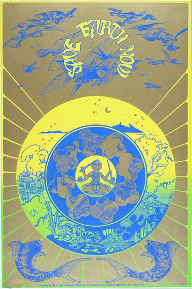
Screen-printed poster by Michael English and Nigel Waymouth, known collectively as Hapshash and the Coloured Coat. Save the Earth Now reflects an increasing interest in ecology in the 1960s. The black ink line work was printed in dark blue. Separate screens would have been used to print the different colours – first a green / yellow rainbow, then a gold and finally a dark blue screen.
Julia Bigham, curator, V&A, London
Eye is the world’s most beautiful and collectable graphic design journal, published quarterly for professional designers, students and anyone interested in critical, informed writing about graphic design and visual culture. It is available from all good design bookshops and online at the Eye shop, where you can buy subscriptions and single issues.