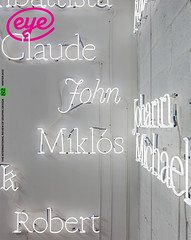
Winter 2011
Flights of fancy
Si Scott made his name with baroque combinations of type and image, but his 3D paper insects are taking his work in new directions.
‘My work polarises people, they either love it or hate it. I never wanted to be middle of the road,’ says illustrator Si Scott.
In five years of freelancing, Scott attracted a dream team of clients in the ‘love it’ category. His hand-drawn, sinuously ornamental and achingly detailed black and white type and image combinations graced projects as diverse as a title sequence for the BBC (The Secret of Drawing, 2005), a poster for the Royal Academy (2006), t-shirt designs for Matthew Williamson (2011) and an ad campaign for Adidas (2009). Other clients include Nike, Penguin, Tiffany & Co. and Wallpaper*.
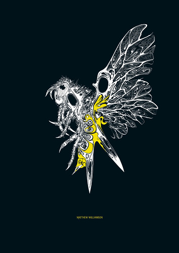
T-shirt design (2010) for Matthew Williamson, Spring-Summer 2011. Art direction by Matthew Williamson and Si Scott.
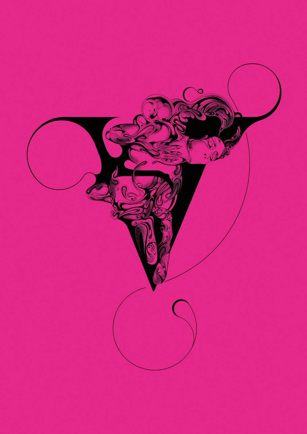
Top: Letter ‘V’, 2009 from the Type Tart Card project conceived by UK Type and published in Wallpaper*, July 2009.
Lawrence Zeegen, London College of Communication’s dean of design and an illustrator himself, puts Scott ahead of the zeitgeist: ‘He has occupied a space between illustration and typography for some five years, creating a unique blend of the decorative and the informative.’
‘I’ve always drawn; some of my earliest memories are of drawing,’ Scott says. ‘At college [he studied graphic design at Buckingham University], I drew type because I didn’t know how to use a computer, and so I found other ways to realise my ideas. Type worked for me, as photography or image-making worked for others, and I was able to put my vision across in a strong and direct way.’
Hence, the breakthrough project for him was type-based: bespoke headline treatments for the music magazine The Wire (2005, see ‘The decriminalisation of ornament’, Eye 58), commissioned by Non-Format (Kjell Ekhorn and Jon Forss). Wire proved to be a high-profile showcase, seen by soon-to-be clients across music, lifestyle and branding. Madonna’s management considered him for an album campaign, but the implication was that if the first lady of pop ‘went with it’, the illustrator could kiss goodbye any ‘ownership’ of that idea forever.
Drawing in pencil and inking in was never an option: that makes the end product ‘too forced’, says Scott. But working by hand, there is little margin for error: ‘I get an idea, plan it in my head and then get to work.’
So how does he accommodate the back and forth process, from brief to artwork, in commercial jobs? ‘I produce a sketch or a “work in progress” stage, to make sure the direction is right. With big advertising jobs, more often than not, there are strict guidelines and a watertight brief.
‘Saying that, I always give the client more than they’ve asked for, or try other directions if I think that might work.’
And even though his style is the product of long hours working alone, commissioned work is always a collaboration. ‘A creative director or art director has their idea of where they want the work to go and you have to respect that. But at the same time they’ve come to you for a reason, so they also need to listen to your ideas.
‘It has to be a collaborative process so that everybody gets what they want from the project, along with the best final outcome. I always think a project is never really finished; it’s just that time runs out!’
It seemed he had hit on a winning formula. Several of his projects were featured in Creative Review’s 2011 illustration annual, and over his career Scott has won a number of awards, starting off with D&AD’s New Blood in 2003 (by 2011 he was judging). He has also collected two Graphis Gold awards, and featured in ‘best of’ lists in Lürzer’s Archive, Computer Arts and Print.
‘I was really happy doing what I did. For the first three years I didn’t come up for air; I had no plan B. I was finally doing what I’d always wanted … and the jobs snowballed.’
But in late 2010, when decorative, embellished and ornamental were definitely the order of the day, the 34-year-old illustrator decided it was time for change. ‘It’s flattering that people want to copy me, but when clients and friends email me “bad” stuff and ask “Did you do that?”…’ He shakes his head.
Scott’s solution to being typecast and copied was to ‘come up with something even more intricate’, demonstrating what Zeegan describes as his ‘unfailing ability to stay ahead of the curve’. He took up a scalpel and began working in three dimensions by cutting and folding paper. With a subdued palette of shades of white, silver and grey, these ‘objects’ are more restrained than his pen-work but retain his signature baroque flourish.
‘It’s as important to evolve your style and its physical output as it is to keep your client base fresh,’ says Poke co-founder Simon Waterfall, whose own creative career has crossed design disciplines. ‘It’s a horrible thing to admit but the currency of new is precious and delicate – just like Si’s work – but it’s also transient.’
Discovering an online source for old museum display cases and insect specimen boxes had inspired Scott to look again at one of his personal projects: the ‘Airborne’ series of ‘re-imagined’ insects he had been working on since 2009. The series has never been exhibited but has garnered much attention via the internet, which led fashion designer Matthew Williamson to commission further images, of insects crafted with pattern-cutters’ scissors.
In the ‘Airborne’ series, Scott had rendered in hyper-detail several insects – ‘things that fly but look like they shouldn’t’. Now he re-imagined one of them, a butterfly, hand-drawing the wing pattern, scanning and printing it, in silver and grey, on to paper he cut and folded. Put in a display box, it is like the ghost of a collector’s prize specimen. ‘I used the grey and silver rather than a solid black as I wanted it to be more delicate, like a butterfly’s wing.’
Scott has already parlayed this new approach (with photography by Pantling Studio) into commissions, including a cover for Time Out New York (24 February 2011), a poster for James and a boxed butterfly for the 100 Project, the art education charity of digital agency Poke.
That butterfly was the first artwork to sell in the 100 Project’s weekly online auction (August 2011). ‘As soon as we saw the piece we knew it would be a cornerstone of the launch exhibition and the auction,’ says Nicolas Roope of Poke. ‘Its 3D nature made it feel somehow more valuable. You could argue that had Si produced a piece that was more identifiable as his style, it would have sold for more. But for us the 100 Project should be as much a vehicle for artists to showcase their new ideas as it is to sell work for charity.’
Scott’s level of commitment verges on obsession. ‘It’s hard to distance myself from this kind of work, because I spend so much time on a piece. I latch on to something, take it to an extreme, exhaust every avenue, then move on.’
Recently, Scott has been diagnosed with a bipolar disorder (‘My doctor said it isn’t a negative thing’), and after major back surgery last year decided to take some time off. ‘I needed to step away for a while so I could get back my motivation and passion for work. Over the last six years I hadn’t time for anything else.’
Now based in Manchester, Scott has some big commissions lined up. His 3D work is ‘stupidly detailed’, he admits. ‘[But] I wanted to turn my image-making back into an artefact; to make it more tangible, and to underline the fact that it takes ages to do!’
Liz Farrelly, writer, editor, curator and lecturer, Central Saint Martins, London and Brighton
See ‘The decriminalisation of ornament’ in Eye 58.
First published in Eye no. 82 vol. 21 2012
Eye is the world’s most beautiful and collectable graphic design journal, published quarterly for professional designers, students and anyone interested in critical, informed writing about graphic design and visual culture. It is available from all good design bookshops and online at the Eye shop, where you can buy subscriptions, back issues and single copies of the latest issue. You can also browse visual samples of recent issues at Eye before You Buy.