Winter 2004
Forensic types
Excavating the history of lettering gives this New York foundry a contemporary edge
For a couple of weeks mid-September 2004, type rose to the surface of public consciousness when there was intense debate over the authenticity of memos that discredited President Bush’s Vietnam-era service in the Texas Air National Guard. CBS News released the memos on 60 Minutes, but was soon forced to investigate their origins more closely. As people began to ask questions such as, ‘Was Times Roman widely available in 1977?’ and, ‘Were you able to do proportional letter spacing and superscript ‘th’s’ with office equipment of that time?’, it became clear that the star witness of the case was typography.
News programmes needing commentary on the topic turned to type designers Jonathan Hoefler and Tobias Frere-Jones – or the ‘forensic typographers’, as they were referred to during this period. Jonathan was invited on to National Public Radio to explain the role of typography in forensic document examination. His interviewer seemed more intrigued by the fact that someone’s profession could be making fonts. If he’d read the New York Times a few weeks before, however, he’d have encountered a feature in the Metro section devoted to a single typeface. Gotham, designed by Tobias and originally commissioned by GQ magazine, was the typeface chosen for inscription into the twenty-ton slab of granite in the cornerstone of the Freedom Tower, the building currently being erected upon the site of the World Trade Center. The choice of Gotham for such a prominent building has shot the typeface to an unprecedented level of fame. It also represents the neat completion of a circle, because Gotham was inspired by the lettering found on utilitarian buildings in New York; here it is refreshed and recontextualised on the city’s most blatant symbol of civic pride.
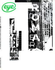
The germ of the typeface was the sign that read ‘Port Authority Bus Terminal’, and in order to find some ancillary sources that would help fill out the character set, Tobias focused on the fronts of office buildings in mid-town. ‘In that process I started noticing some other stuff on the street which, while it didn’t relate to Gotham at all, was worth taking pictures of.’ The ‘stuff’ he began photographing was what he calls ‘non-typographic lettering’ (he avoids using ‘vernacular’, a term he finds annoying) and which includes hand-painted, gilt and engraved letterforms. To keep track of his progress he has created his own map of the city made from satellite photos. His collection of photographs of signage lettering from the streets of New York currently numbers about 4000.
The designers are as comfortable extrapolating meaning and providing a sense of context for their work as they are talking in detail about making. When Tobias finishes describing his block-by-block photographic documentation project, Jonathan observes how the history of typography is largely a history of printing types and how it excludes forms of lettering such as stone-cutting and casting, calligraphy and handwriting. ‘The first example to cross this divide is Gotham,’ he says. ‘It’s the first thing that took an entire aesthetic from signage and adapted it for use in typography.’
Being an authority on type history gives Jonathan the advantage of being able to include his own. He is assiduous in ensuring that the Hoefler & Frere-Jones history is told correctly. When the designer Armin Vit posted on the Design Observer blog a video he had made in which passers-by were asked what they thought of Gotham (and none was able to say a good word for it), within minutes Jonathan had calmly set the record straight, writing: ‘Different recipes can dramatically alter the taste of the same bell pepper. But I wonder how many people foreign to the kitchen really know how to evaluate raw ingredients in the first place.’
Between them Jonathan and Tobias have designed some very visible typefaces that have had lasting cultural impact. In 1994 Tobias designed Interstate, based on the lettering used on us highway signs; and Hoefler’s eponymous text family has been a default on the Apple computer operating system since System 7 was launched.
Jonathan is a mostly self-taught designer. He established his own foundry at the age of eighteen, having spent just a year working with the magazine and newspaper art director Roger Black. It was Black who was responsible for introducing Jonathan to type specimens, which he has been collecting and studying ever since.
Tobias’s design education was more conventional. He studied graphic design at The Rhode Island School of Design, during which time he had his first typeface, Dolores, published by Font Shop. He was a senior designer at Font Bureau in Boston for seven years before joining Jonathan in New York in 1999. In 2004 they formalised their working relationship and Tobias became a principal at the foundry.
In retrospect, the alliance of the two designers (born six days apart in 1970) seems inevitable. ‘I think Tobias and I were the only two people under the age of twenty who subscribed to U&lc magazine,’ Jonathan remarks. Like other budding designers of the period, Jonathan was drawn to Letraset catalogues and Troy machines. Unlike most others, however, he was also drawn to the arcane world of typographic history. He remembers a defining moment in high school, when he first saw the typeface Galliard. ‘I wanted to know who was this Galliard? There was something palpably enduring about this typeface that seemed to put it in the same camp as typefaces like Caslon and Bodoni and so on, and yet I knew there was something different about it.’ Discovering that it was Matthew Carter’s revival of a Granjon face was galvanising. ‘I realised there was a history that became greater the more I looked at it – that it was not just the computer, or Letraset, or handmade type or even printing, or calligraphy, or epigraphy, or lapidary; it actually went back thousands of years.’
In 1988 the eighteen-year old Jonathan wrote a spirited letter to the satirical Spy magazine pointing out an inconsistency he had noted between the magazine’s critique of postmodern typography – as found in the company spelling of Filofax – and the magazine’s own idiosyncratic typography cultivated by art director Alex Isley. Meanwhile Tobias, was growing up in Brooklyn in a scholarly household (his brother Sasha would go on to be a music critic and his father unwound at weekends by writing operas about the fall of the House of Hapsburg.) At the age of sixteen he won a type competition with a typeface he composed with a rapidograph and drawing board.
They were often competitors for the choice jobs, and rivals for the best type specimens and books. ‘A dealer suddenly had a treasure trove of books on the Stempel Type Foundry in Germany,’ recalls Jonathan. ‘It’s very hard to find these, so I called immediately and started reading out the item numbers I wanted. They were all sold already. I called Tobias: “How’s it going?” I asked. “Oh I had a great day,” he said. “I bought all these amazing Stempel specimens”.’ Tobias nods gravely: ‘When the mail would come and I saw a dealer’s catalogue I would have to drop everything and go through it as fast as possible to get them before Jonathan.’
One of the defining factors of a typeface designed by the duo is the rigour of their research and development process. In the preparation of a typeface called Retina, ‘designed to live in a hermetic 5pt universe,’ on the Wall Street Journal stock pages, Jonathan and Tobias analysed 129 domestic and international newspapers. They show me a gigantic binder file that contains 3800 unique examples of ways in which news agate is used. Armed with this information they were able to test the efficiency of the typeface in every possible context – from fish counts to rodeo scores to grain prices to double acrostics in ten languages. They also tested the typeface on press to make sure that their solution, with its enlarged counters and ‘traps’ to collect pooling ink at the intersection of strokes, really could stand up to the effects of spread and ink squeeze that occur in newspaper printing.
‘If we don’t do this,’ says Jonathan, ‘there’ll be someone who says to us “I can’t use the font because I need a 64th fraction because that’s what’s used for German bond ratings.” Or “I need the discernible inch and degree mark for weather tables.” We diminish the amount of last-minute work by doing all this research up front.’
‘We’re also just kind of nerdy about doing research,’ observes Tobias.
‘We like having that behind us as we move forward, so we’re not doing things …’ Jonathan finishes the sentence: ‘Arbitrarily.’
Then there are the kerning pairs. Tobias has developed a new process for proofing them, and as he leafs through a stack of print-outs that contain tens of thousands of kerning pairs for the typeface he is currently developing, he can barely suppress his glee. ‘Looking at the capitals meeting up, there are 676 possible combinations,’ he explains. ‘The traditional sequence I had been taught was aa, ab, ac, ad, and so on. I realised it was more effective to ignore that alphabetical linear sequence, and to look at them based on their visual proximity, such as cge.’ All well and good so long as you are using a Latin-based language. But when applied to Cyrillic languages, for example, the logic falls apart. So Jonathan stepped in, took Tobias’s methodology, distilled it down to core lessons, and ‘built a tool that enables you to tell a typeface this character has these qualities and so it spits out a new proof with all the possibilities.’ To make the tool he used a programming language called Python, invented by Dutch software designer Guido van Rossum. It was included with RoboFog, the development platform released by his brother Just van Rossum and Erik van Blokland, with the result that the people who know Python now include not only rocket scientists and system analysts, but type designers, too.
Tobias wanted to refine the process still further by presenting the pairings in realistic contexts – in words. ‘So I put together a list of words so that for every possible letter combination there is a word that contains it somewhere in the middle of it.’ He recalls with relish how he found bizarre combinations, such as a ‘jz’ in Dutch and a ‘jx’ in Chinese. When he was testing Requiem, one of Jonathan’s typefaces that features decorative ligatures, he found that it was possible to have a ligature of the letters ‘stfj.’ Finding a word that contained this combination nearly stumped him until he happened upon an article about ships encountering difficulty from the Maelstrom in West Norway that mentioned a place called Westfjorden.
Using RoboFog, the duo is amassing a suite of customised tools with which they build new fonts or, like the kerning pairs proofing tool, can be used to evaluate fonts. Jonathan especially enjoys the program writing: ‘A lot of things we do these days are informed by and made with tools that we build ourselves.’ Tobias agrees: ‘I think that some of the work that I’m most proud of is stuff that no one actually sees; the tools we use here.’ This, Jonathan reminds me, isn’t a new thing: ‘Someone like Robert Granjon cut his own tools. You can go to his foundry and see the hammer, files and punches that he made himself. Dwiggins, too, he came up with a very smart method of cutting out letter parts on card stock using stencil primitives to outline letters and then paint them by hand. Type designers have always been involved in this customisation of the dominant technology.’
The duo is deeply embedded in the New York design community. Their foundry is housed in a building that commands the intersection of Houston and Broadway in the city’s SoHo district, which is veritable warren of design and architecture studios. In addition, their work is almost wholly informed by the needs of graphic designers and their dialogue with them. Barbara Glauber, principal of the firm Heavy Meta and an upstairs neighbour in the building, claims that she is often ‘hungrily knocking at their door asking, “Got some fonts for me?”’

Album cover for Factory Showroom by They Might Be Giants, designed by Barbara Glauber using a typeface that would become Giant. ‘We wanted the idea to be illogical to reflect the way TMBG work,’ says Glauber, ‘and stencil bevel doesn’t make any sense: a stencil is flat and a bevel is dimensional.’
A font that Glauber commissioned from Jonathan for the 1996 album Factory Showroom by the band They Might be Giants, has since been released as Giant. It’s a playful take on the bevelled gold signage you see in factory showroom windows. For another They Might Be Giants album, Dialasong, Glauber was searching for a font that would evoke the idea of a telephone book without having to resort to Bell Centennial. ‘I went down to Jonathan and asked what he was working on,’ says Glauber. ‘He showed me Gotham, which wasn’t yet released. The quotidian nature of it was so perfect for what I wanted to do. The system was already robust enough that I didn’t need to use anything else. And at that point nobody had it!’
Within the wider design community the two type designers are well respected – loved even – for the depth and breadth of their knowledge about all things pertaining to type. Art directors itch for the opportunity to commission a typeface just so they can work with the duo. Pentagram partner Michael Bierut remarks that, ‘there’s never a conversation with these guys where I don’t learn something.’
Another of their much-appreciated skills is the way in which they are able to intuit a designer’s needs. Glauber observes, ‘It’s rare to find designers who can articulate what they want from a typeface and how they want it to behave, to be constructed.’ Bierut recalls working on the signage for Lever House: ‘I had a lot of trouble articulating the brief. And that’s the best time to go to Jonathan and Tobias because they seem to understand exactly – and I mean exactly – what you want, even when you can’t explain it clearly.’ Likewise, when Scott Dadich was in the process of redesigning Texas Monthly magazine in 2003, he called Jonathan and Tobias with a brief that Jonathan describes as coming ‘out of an emotional place.’
The Texas Monthly commission also exemplifies the iterative nature of the process of developing a custom font with an art director. Dadich needed a typeface that would help distinguish the editorial pages from the encroaching advertising pages. ‘The editorial pages had to function as a solid stable platform, and I wanted to signal their identity purely through a typeface,’ he says.
‘It needed to look masculine and rugged and Western and no-nonsense,’ says Jonathan. ‘The typeface I delivered to them qualified for those things, but when I saw how it was being used in the magazine it totally failed. Scott was using it for text as well as for display – the bold was being used in very large sizes, being dropped out of photographs and so on. I began to correct the technical aspects of these things so that it would be more functional and legible.’ The final solution was Sentinel, a typeface that ‘has a strong flavour to it, which is what they are going for. I do think that art directors leave their fingerprints on typefaces in very useful ways.’
Dadich left his fingerprints on another typeface too. When he first saw Retina, he fell in love – ‘those inkwells, those amazing sharp angles.’ As a kind of a joke at first he tried it out really large and was delighted to see it had an interesting interplay with Sentinel. ‘Everything is so well crafted and finessed with an H&FJ typeface, that you can actually do something like take a typeface intended for 5pt stock listings and blow it up on the cover of a magazine. I do think I surprised Jonathan with this particular usage, though,’ says Dadich.
‘One of the best examples of that back and forth relationship was the two families we did for Barbara deWilde when she redesigned Martha Stewart Living magazine,’ says Tobias. ‘What’s the best place to start that story?’
Jonathan: ‘I would say it’s with Surveyor. We had the twin goals of making a typeface that felt very handmade, to evoke the craft philosophy of the magazine, and that could handle all of the charts, tables, recipes, graphs, almanacs and step-by-step instructions that they run in the magazine. We had been waiting to do a typeface based on the distinct style of lettering you find on engraved maps.’ He pulls out some maps to show me.
‘Merely romans and italics, upper and lower case, but there’s such a range of textures to be had in that – look at this capital ‘C’ with its beautiful ball terminal . . . One of the things that Martha Stewart Living often does is to have these gorgeous full page photographs and they’ll need to knock out the caption or a large block of text. And since they’re printing on a gravure press, reversing out of a four-colour photo is even more of a challenge. So in addition to all of the variants we had done to display and text – six versions of roman and six italics – there’s a doppelganger family right behind them that in each case is a little heavier and a little bit wider for use on those photo pages. The whole process took three years. We wanted to get things just right so that it would anticipate what the art department would need to do. Instead of just taking Barbara’s brief, we spent a lot of time talking about what they were going to do with it and what they would expect of it. A lot of the time, there are things that can be incorporated into the font that are relatively simple – like switching out an alternate character or interpolating a slightly different weight – that are easy for us to do in the process, but can save hundreds of hours in the client’s production department.’
‘Even the most modest typeface that requires little research will take eight solid weeks of one designer’s time to produce a single style,’ Jonathan tells me. ‘Most products we get involve three or four styles and involve two or three of us working on and off for months.’
So how can such a painstaking process be commercially viable? One reason is that after a period of exclusive use, custom-built typefaces become available for retail. H&FJ periodically puts out carefully written type specimens that encourage the purchase of font licenses via the website. Carleen Borsella, the foundry’s business and marketing manager, as well as Jonathan’s wife, explains another way the foundry recoups what it invests in the development of a typeface: ‘Clients don’t necessarily have only two options for type licenses – custom or retail – there is an in-between step, too. A client who wants a unique typeface, but has only a few weeks in which to develop it, can often turn to us for help synthesising new material from things we’ve already developed.’
When H&FJ was asked in 2000 to make a text face for Alex Isley who was redesigning The New Times, a chain of free weeklies, a limited budget and compressed schedule forced the two designers to consider their existing material. Jonathan had designed a font for Esquire in 1996 called Mercury. ‘It was designed as a display face, but I always thought it would lend itself quite well to text.’
Jonathan and Tobias are often called in to a project when a font needs to be constructed from a few elements. When Bierut was designing wayfinding signage for the renovation of Lever House in 2000, it was the ‘palaeontological’ aspects of the duo’s expertise that he sought. Bierut identified the original 1952 sign for the building as a point of departure.
‘I wasn’t asking for a “new” font, strictly speaking,’ Bierut recalls. ‘Instead I was asking them to reconstruct a font based on a few clues. Here, they’re like anthropologists who can reconstruct a whole lifelike representation of an extinct beast from just a few random fossils.’ There was speculation that Raymond Loewy may have been involved in the creation of the original lettering but Jonathan is reluctant to make such an attribution. ‘When we were in Copenhagen two weeks ago,’ he tells me, ‘I photographed a building that had the exact same lettering, so my guess is this was commercially available lettering.’
Another project that Bierut commissioned was a typeface for the New York Jets based on a logo created in the early 1960s. ‘We were not allowed to change the logo at all, which made the project more interesting for me,’ says Bierut. ‘We ended up extrapolating all the new branding elements from that basic 40-year-old logo, including the Jets Bold font which Jonathan and Tobias drew out based on the four letters in the team name.’ The resulting typeface, which Bierut considers ‘very contemporary’ is to be used on everything from venue signage to tickets to promotion to merchandise to their website. ‘We do projects that are taught by history rather than transcribing it,’ says Tobias. ‘We’ve each done literal historical revivals. But mostly it’s about continuing an idea rather than copying it, so the history becomes something more active than lumber we might use.’
Type design does not appear to be naturally a team sport. How is the labour divided between the two designers? ‘When we worked on Lever House, I did the numbers, you did the letters, right?’ says Jonathan. ‘It’s a very strange faultline, though.’ ‘We take turns over who has the micro and macro perspective on a project,’ says Tobias.
While editorial will always be at the core of H&FJ’s business, the designers relish the idea of commissions that are both more rarefied and more diverse: newspaper weather icons and chessmen, bitmapped fonts for mobile phones, embroidered garment tags, skywriting . . .
‘So much of the information we take in today is through typefaces that are not chosen or designed,’ reflects Jonathan. ‘Most of these areas have not been attended to the way magazines have been attended to. The technology is there to make them great, so there’s no reason they shouldn’t be.’
And the duo’s role as national typographic advisers? This still seems some way off. Despite the prominence of type in the debate over the validity of documents that suggested lapses in the President’s military record, and despite the designers’ sensible insights as recorded on blogs and in the national media, in the end, CBS news admitted that the memos could not be authenticated. Had CBS undertaken a thorough typographic examination of the documents, however, instead of putting emphasis on the results of outmoded handwriting analysis, they might have produced more conclusive evidence. In the mean time, Jonathan and Tobias will be waiting patiently.
First published in Eye no. 54 vol. 15, Winter 2004
Eye is the world’s most beautiful and collectable graphic design journal, published quarterly for professional designers, students and anyone interested in critical, informed writing about graphic design and visual culture. It is available from all good design bookshops and online at the Eye shop, where you can buy subscriptions, back issues and single copies of the latest issue. You can also browse visual samples of recent issues at Eye before You Buy.