
Summer 2012
Free for all
In designing the Ubuntu type family, Dalton Maag had to produce faces for print and screen in thirteen styles and numerous non-Latin languages – all under scrutiny from an online audience of millions. By John Ridpath
‘Personally I refuse to do it. If someone wants it they can do it, but I refuse.’ Switzerland-born type designer Bruno Maag has strong opinions about including the capital form of eszett (the German long ‘s’) in any of his typefaces. ‘Even the normal German double “s” is an archaic glyph,’ he tells me in the London office of Dalton Maag, the company he co-founded. ‘The Swiss got rid of it ages ago. We’re quite happy, we’re not missing it at all.’
In the normal course of the company’s work – its portfolio is typified by large-scale type design projects for corporates such as Nokia, BMW and Toyota – such decisions are not aired in the public realm. But with a new type family designed for Canonical, the company behind the Linux-based operating system Ubuntu, such controversies were thrown open to discussion. While Linux has a vocal body of supporters and users in the open-source computing community, Canonical’s vision is broader: to provide a nonproprietary operating system, with a polished graphical user interface, that can be used by less technically minded computer users free of charge.
‘Open’ is a key word for Mark Shuttleworth, the Isle of Man-based Web entrepreneur and venture capitalist who founded Canonical, a global company with more than 400 employees, and ‘a mix of non-profit and for-profit goals’, in 2004. His eponymous foundation in his homeland of South Africa, set up after he sold Thawte, his Web security firm, to VeriSign in 1999 for more than $550 million, describes itself as ‘an experiment in open philanthropy’, with an emphasis on alternative funding methodologies, new technologies and collaborative ways of working.
In his introduction to Shape My Language, Dalton Maag’s brochure about the Ubuntu project (October 2011), Shuttleworth spells out the plan for the typeface. The platform’s tens of millions of users had to be involved in the review and refinement process: ‘Dalton Maag [was] to lead the design process, working both with us as a customer and with a global audience of enthusiastic types, from teachers to rocket scientists, from developers to artists, from grandchildren to grandparents, from Cape Town to Moscow.’
Champions of open source believe that software should be freely distributed at each stage of development, allowing others to tinker, improve and reinvent as they see fit. The transparent development process of Dalton Maag’s typeface was to follow that ethos, with the designers regularly releasing work in progress and posting updates and questions on Canonical’s design blog.
As well as a big dispute about capitalising eszett (‘not helped by me putting out radical statements’, Maag concedes), more profitable discussions covered everything from a ‘crowded’ ‘m’ in one early design, to some helpful suggestions about which way the Hebrew italic should be slanted.
For Maag, being open to scrutiny was largely a positive experience – though one can sense that he wouldn’t want to work like this on every project: ‘You come up with a design, then you put it out there, and then you really have to defend and argue your design. It almost took me back to my college days – when you always had to have a reason for everything you did.’
Canonical’s brief for the Ubuntu type family was broad: to create a font that could be used both in its own corporate identity and on a new theme for the operating system, while being distributed freely for public use. For starters, that meant designing a font that could be used for body and display, one that would work in print and would also be highly legible on screens at varying resolutions.
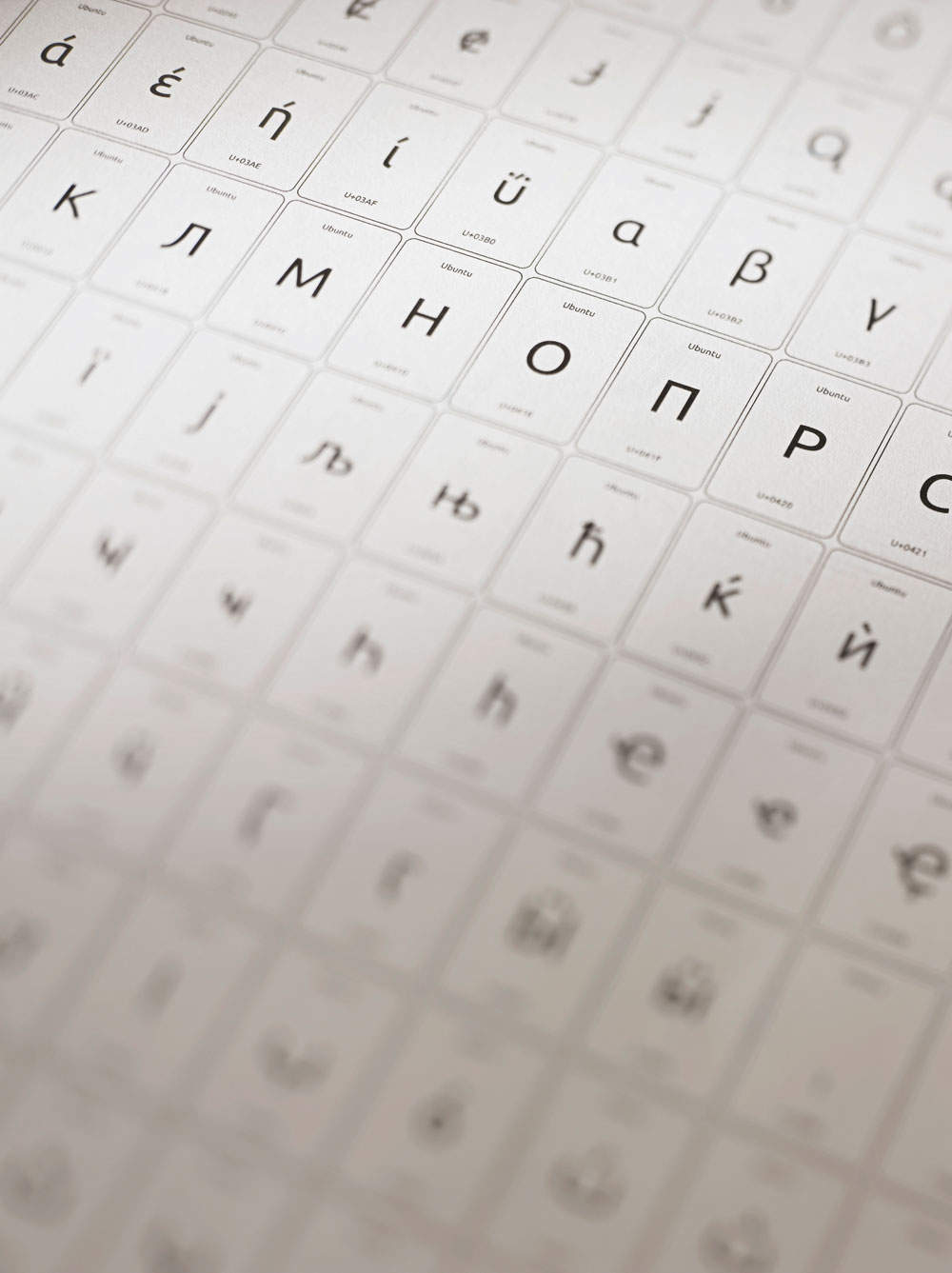
To complicate matters further, Canonical’s philosophy of inclusivity meant the typeface had to be available in as many languages as possible. Consequently Dalton Maag’s typeface reflects the scale of that ambition. Initially the idea was to have two or three font styles, but that number quickly ballooned to thirteen: standard (light, regular, medium and bold; plus a true italic for each); monospace (regular and bold, again with italic versions); and condensed regular. Each has been manually hinted for screen – and even been tweaked to work on older black and white displays.
Still more impressive, perhaps, is Ubuntu’s vast character set: Latin, Greek, Cyrillic, Hebrew and Arabic, plus Latin Extended A and B, giving a character range that can support a huge range of languages often neglected in typefaces. Arabic has been extended to fully support related alphabets such as Persian, Urdu, Kashmiri and Pashtu. It is a scale Dalton Maag is used to: its recent work with Nokia, which scooped the graphics award in the Design Museum’s Designs of the Year, goes even further in terms of international language support.
With a creative process driven by legibility, Dalton Maag quickly settled on a humanist style sans serif, with a distinctive lack of spurs on characters such as ‘n’ and ‘u’. Function guided form throughout; character width had to be limited because of the constraints faced by user interface designers, for instance. These qualities were carried over into Ubuntu’s non-Latin faces, where a less thorough project might simply have cobbled together characters from an existing typeface.
Within 30 days of being hosted on Google Web Fonts, Ubuntu had received 12 million views. But even before the final version had launched, there were already four or five different versions of the so-called ‘final’ product floating around, none of which was, in fact, final. Because the work in progress and the final fonts were all released under an open source licence, anyone can edit or add additional characters, then circulate their own version (although they cannot release it under the same name).
Even though the project – at least the first stage – has reached an end, Maag would like it to keep going: ‘My hope is that it will almost become a household font, that it replaces Arial … I really would like to take it on and make it become a global font.’
For that to happen, the next step would be a huge project to tackle CJKV (Chinese, Japanese, Korean and Vietnamese): tens of thousands of characters, each to be rendered in the typeface’s existing thirteen font styles. However, Ubuntu is already not that far off the standard Arial included on Windows systems, which has only a slightly larger glyph range, and also includes Vietnamese, Coptic and other non-Latin characters.
Community members could lead that process – but Maag feels that this kind of project needs someone to drive it forward: ‘With the open-source community some people get involved really deeply because they have time, then all of a sudden they get a job and move away, and then one of the drivers is gone … a lot of open-source font projects never have taken off properly, because it does require a lot of dedication.’ Dalton Maag has agreed to mentor typography students and provide continuing technical support for the font family.
Perhaps unsurprisingly, Maag found that while type-interested Ubuntu users got involved, few professional type designers did (the wider typography community knows very little about open source). But as designers become more used to designing for a digital world, could the future of typography lie in open source, sharing, modifications and discussion?
‘Some projects, yes, I can see it,’ says Maag, before pausing. ‘But then again, as type designers, we are quite an egotistical lot.’
First published in Eye 83, July 2012.
Eye is the world’s most beautiful and collectable graphic design journal, published quarterly for professional designers, students and anyone interested in critical, informed writing about graphic design and visual culture. It is available from all good design bookshops and online at the Eye shop, where you can buy subscriptions, back issues and single copies of the latest issue. You can also browse visual samples of recent issues at Eye before You Buy.